There are a variety of measures of an asset bubble. And each one points to an unsustainable bubble in the stock market.
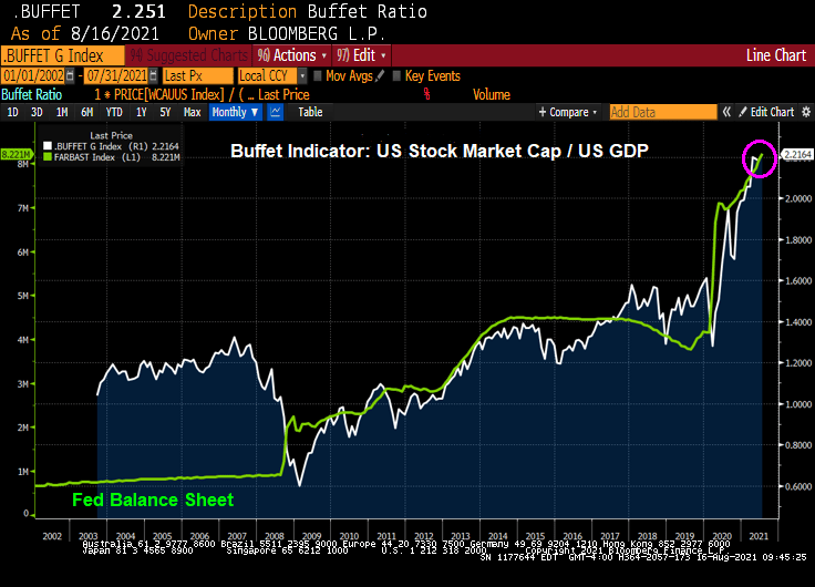
Let’s start with the Buffett Indicator. The ratio of Total Market Capitalization of all US stocks (WCAUUS ) to total nominal GDP of the United States (GDP CUR$ ).
There is also the GLOBAL Buffett ratio produced by Holger Zschäpitz. Global market cap now equal to 139% of global GDP, way above Buffett’s 100% bubble threshold.

Shiller’s Cyclically-adjusted Price-earnings ratio? Still climbing and resembles the Dot.com bubble of 2000.

How about gold to Average Hourly Earnings (similar to the Bichler and Nitzan “Power” measure. The spread (bottom chart) sees the S&P 500 index soaring away from average hourly earnings.
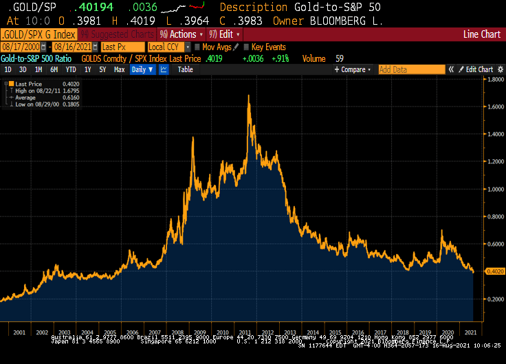
We also have the Gold to SPX ratio that is now back to pre-financial crisis levels.
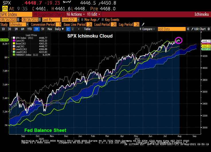
How about the Ichimoku cloud, where the SPX is currently ABOVE the cloud?
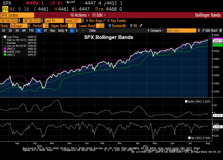
SPX and Bollinger Bands? The SPX index is close to the upper band.
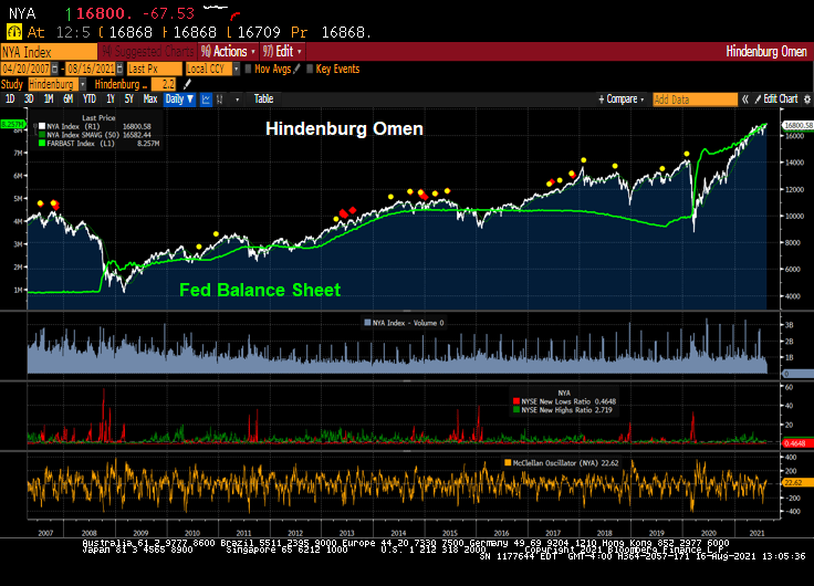
How about The Hindenburg Omen, a technical indicator that was designed to signal the increased probability of a stock market crash. It compares the percentage of new 52-week highs and new 52-week lows in stock prices to a predetermined reference percentage that is supposed to predict the increasing likelihood of a market crash.
So it looks like a have a bubble in the stock market.
Fed Chair Jerome Powell sees the ghost of the Dot.com bubble.


You must be logged in to post a comment.