It turns out that Powell’s “emergency” 50bps rate cut was – drumroll – another major policy mistake by the Fed. Or it is Presidential election interference by The Biden/Harris Administration giving Cacklin’ Kamala as talking point?
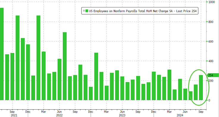
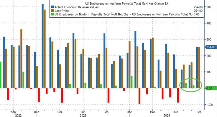
Moments ago, the BLS reported that at a time when prevailing consensus was for jobs to continue their recent downward slide sparked by the near-record annual jobs revision and several months of downbeat jobs reports, in September the US unexpectedly added a whopping 254K jobs, the biggest monthly increase since March…
There’s more: unlike previous months where we saw repeat downward job revisions, the BLS said that both prior months were revised up, to wit: the change in total nonfarm payroll employment for July was revised up by 55,000, from +89,000 to +144,000, and the change for August was revised up by 17,000, from +142,000 to +159,000. With these revisions, employment in July and August combined is 72,000 higher than previously reported.
Some context: as UBS notes, the moving six-month average on nonfarm payrolls is 167k. The estimate is that 150k is about consistent with a return of the economy to trend growth. Which means that inflation is about to come back with a vengeance, just as the Fed launches its easing cycle.
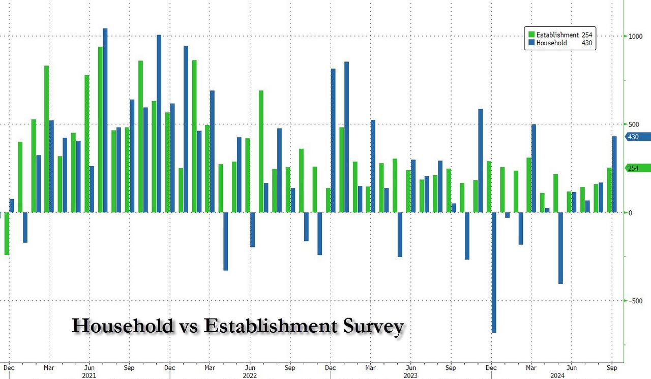
Remarkably, while payrolls jumped by the most in half a year, the number of employed people also surged, rising by a whopping 430K, also the biggest one-month jump since March.
It wasn’t just the payrolls, however, which came in far stronger than estimates: the unemployment rate also came in stronger than expected, and thanks to the jump in employed workers coupled with the decline in unemployed workers (from 7.115MM to 6.834MM), it dropped from 4.2% to 4.1% (and down from 4.3% two months ago which spared the entire recession panic).
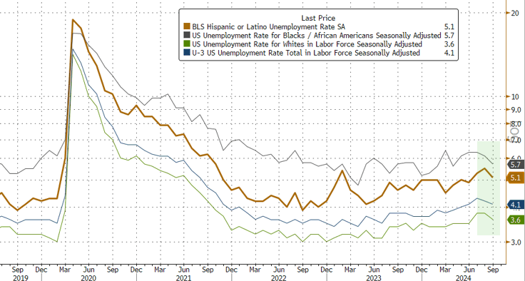
Among the major worker groups, the unemployment rate for adult men (3.7 percent) decreased in September. The jobless rates for adult women (3.6 percent), teenagers (14.3 percent), Whites (3.6 percent), Blacks (5.7 percent), Asians (4.1 percent), and Hispanics (5.1 percent) showed little or no change over the month.
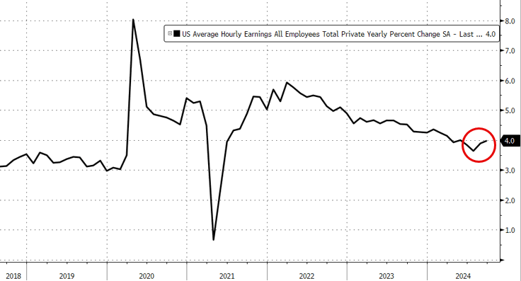
And here is the rub, because in a vacuum the super strong jobs numbers would have been fantastic, the only issue is that the September blowout comes as the Fed launches an easing cycle and as wages are once again rising as we have warned for the past 3 months. Indeed, in September, the average hourly earnings rose 0.4% sequentially, beating the estimate of 0.3%, while on an annual basis, wage growth was 4.0%, up from an upward revised 3.9% and beating the 3.8% estimate.
One note here: the average workweek for all employees edged down by 0.1 hour to 34.2 hours in September, which means the hourly earnings increase is not “pure” but rather a function of denominator adjustments. In manufacturing, the average workweek was unchanged at 40.0 hours, and overtime edged down by 0.1 hour to 2.9 hours. The average workweek for production and nonsupervisory employees on private nonfarm payrolls remained at 33.7 hours.
What sector had the biggest growth? UNPRODUCTIVE government workers! A record 785,000 government workers were added in September, pushing total govt workers also to a new record high.
The Biden/Harris Administration has given away billions of dollars to foreign nations (like Ukraine) and illegal immigrants so far this year,
– $24,400,000,000 to Ukraine.
– $11,300,000,000 to Israel.
– $1,950,000,000 to Ethiopia.
– $1,600,000,000 to Jordan.
– $1,400,000,000 to Egypt.
– $1,100,000,000 to Afghanistan.
– $1,100,000,000 to Somalia.
– $1,000,000,000 to Yemen.
– $987,000,000 to Congo.
– $896,000,000 to Syria.
– $9,000 per illegal immigrant that has entered the U.S.
And claim that FEMA has no money left for Hurricane Helene victims who have received only $750 per person. So I have plenty of reasons to have no trust or confidence in the Biden/Harris Mal-administration.
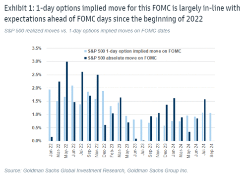
Options imply a +/-1.1% move in S&P 500 for the 18-Sept FOMC meeting; this compares to an average of +/-1.2% move priced into SPX ahead of FOMC meetings since the beginning of 2022.
Arguably, this is an unusually important FOMC meeting due to the expected start of a cutting cycle.
On average, the S&P 500 has moved +/-1.3% during FOMC events since the beginning of 2022, coming above options implied moves.
In the July FOMC meeting the index moved +/-1.6% vs. an options implied expectations for a +/-1.1% move.
Goldman’s economists expect the September FOMC meeting to be the start of the Fed easing cycle with a 25bp rate cut followed by two consecutive 25bp rate cuts in November and December, and an eventual terminal rate of 3.25-3.5%.
They see differing asset performances around the start of the easing cycle depending on what motivated the Fed cuts.
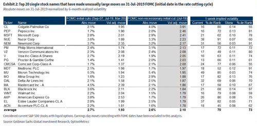
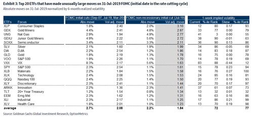
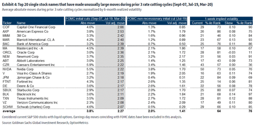
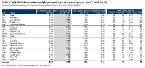
Goldman analyzed moves across stocks and ETFs during the first Fed rate cut in the prior 3 Fed easing cycles (18-Sep-2007, 31-Jul-2019 & 3-Mar-2020).
Rate cuts during the 2007 and 2020 easing cycles were associated with a recession while the 2019 cut was due to a growth scare.
In the tables below are the top 20 names that saw unusual moves during the prior 3 Fed easing cycles and for the 2019 cycle separately.
Financials and Tech were major movers during the beginning of the prior 3 Fed easing cycles while the 2019 cycle also saw unusual moves in Consumer Staples.
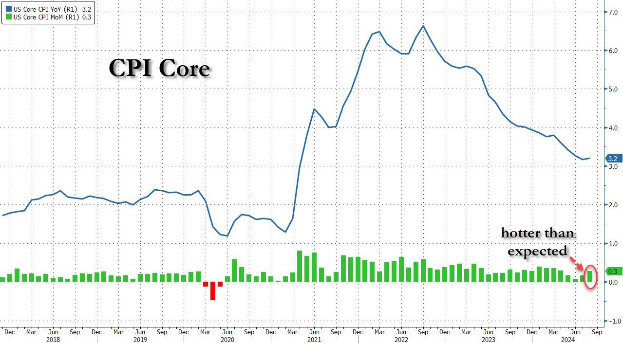
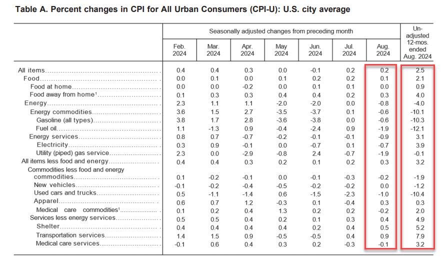
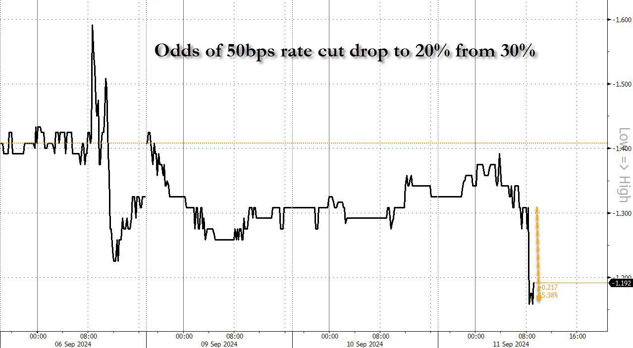
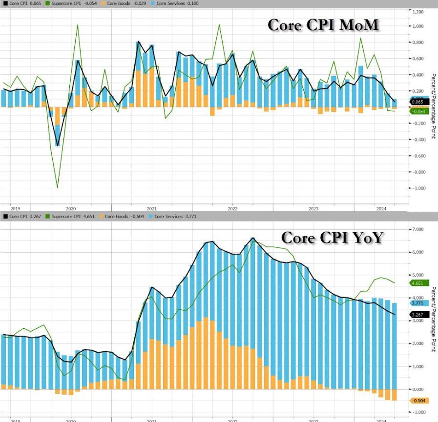
Following last month’s modest miss in CPI which sparked speculation about a 50bps cut, which was then boosted by the jobs report miss and the huge downward revision, moments ago the BLS reported that – as only a handful of Wall Street strategists warned – CPI actually came in hotter than expected at the core level, rising 0.3% MoM vs expectations of a 0.2% print, with all remaining metrics coming in line, to wit:
CPI 0.2% MoM (or 0.187% unrounded), Exp. 0.2% – in line
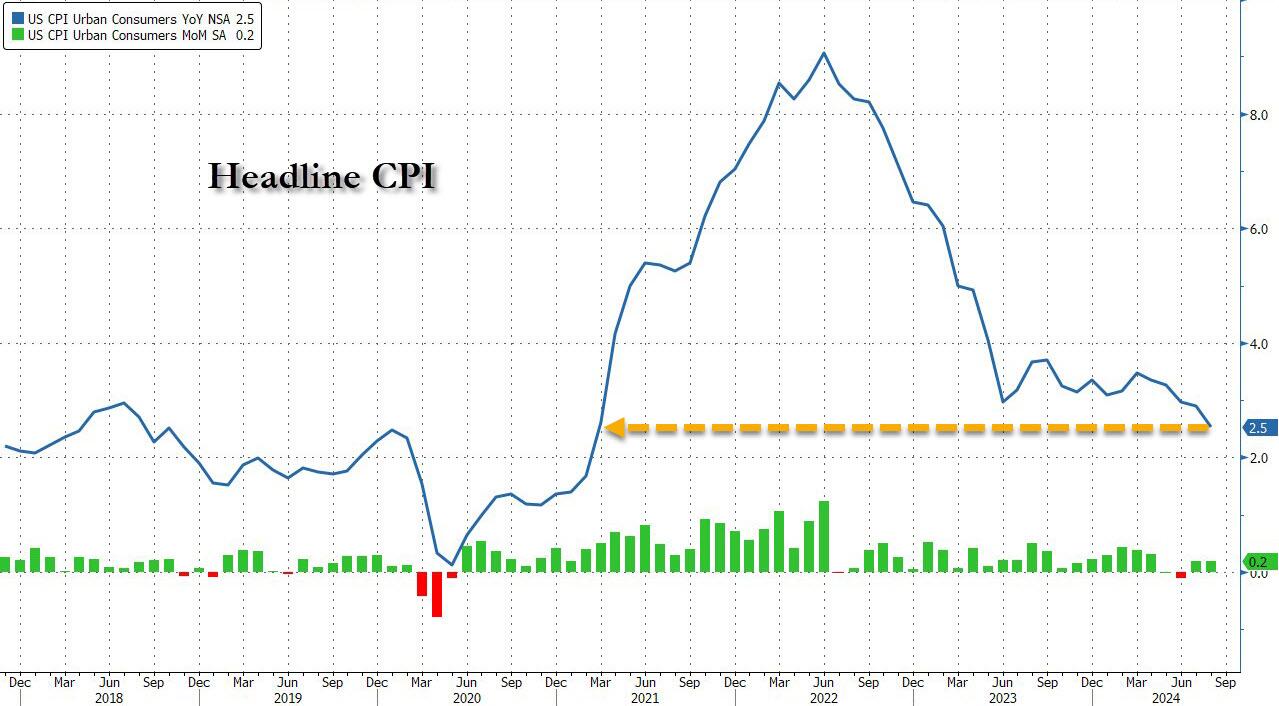
And visually, here is the headline print, where the annual CPI increase dropped to just 2.5% from 2.9%, the lowest since February 2021…
.. and the core….
…. as goods deflation is stalling and may even print positive in the coming months, while core service inflation remains the biggest driver.
That was s the 51st straight month of MoM increases in Core CPI, and a new record high.
Under the hood, used car prices fell 1.0%, moderating from last month’s 2.3% drop, while airline fares jumped 3.9%, a big reversal to last month’s bizarre -1.2% drop. Car insurance costs jumped another 0.6%, after rising 1.2%; furniture prices dropped 0.3% reversing last month’s 0.3% rise.
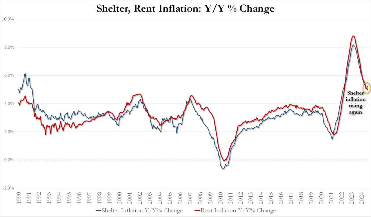
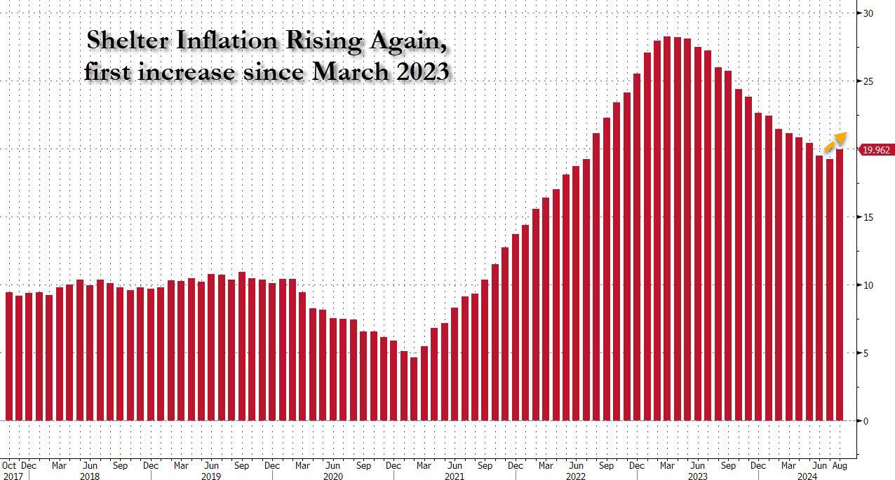
Perhaps more worrying is the fact that while rent inflation has flatlined, shelter inflation posted its first increase since early 2023!
August Shelter inflation up 0.43% MoM and up 5.23% YoY vs 5.05% in July
August Rent Inflation up 0.39% MoM and up 4.97% YoY vs 5.09% in July
And the first monthly increase since March 2023 highlighted:
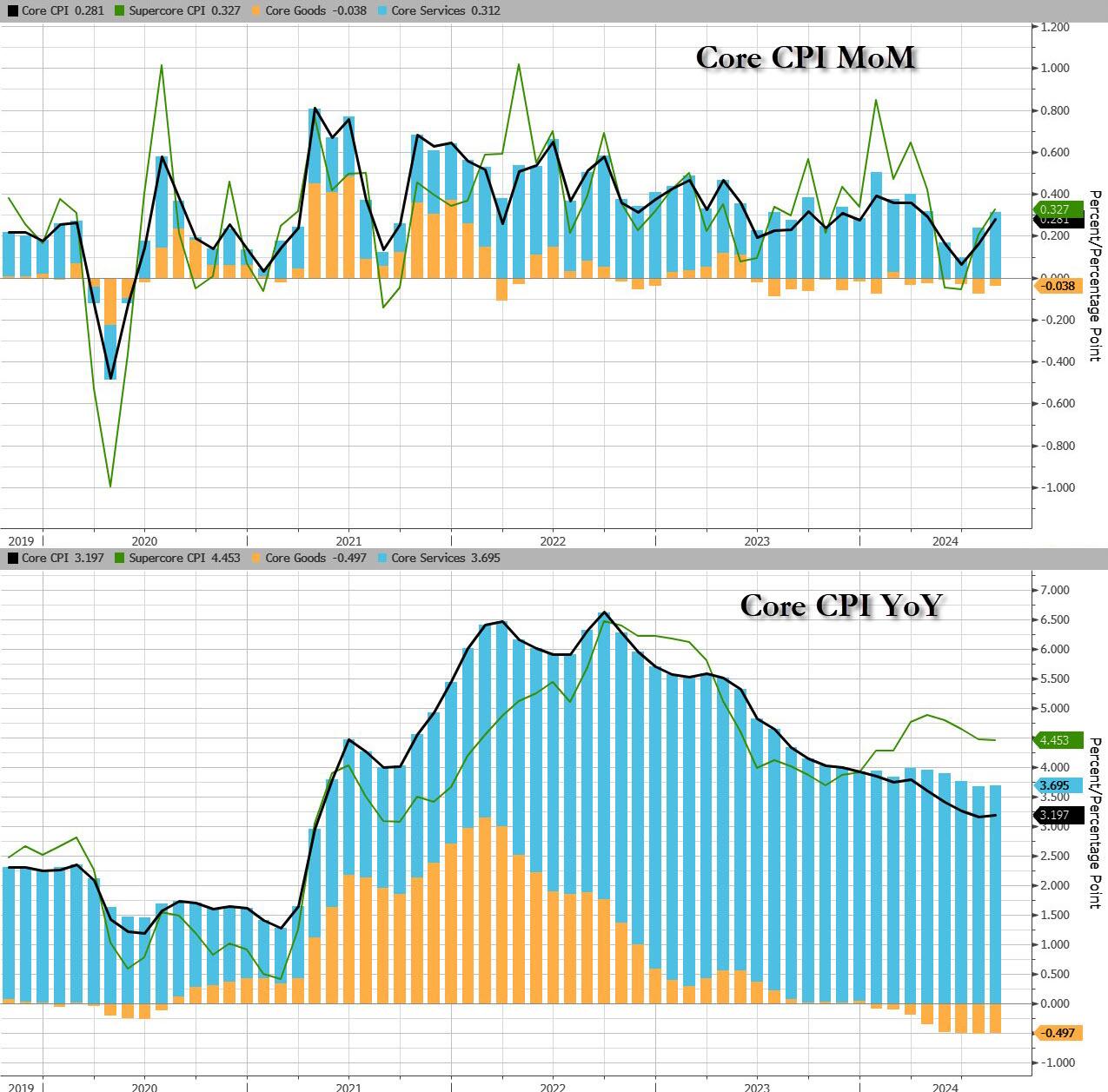
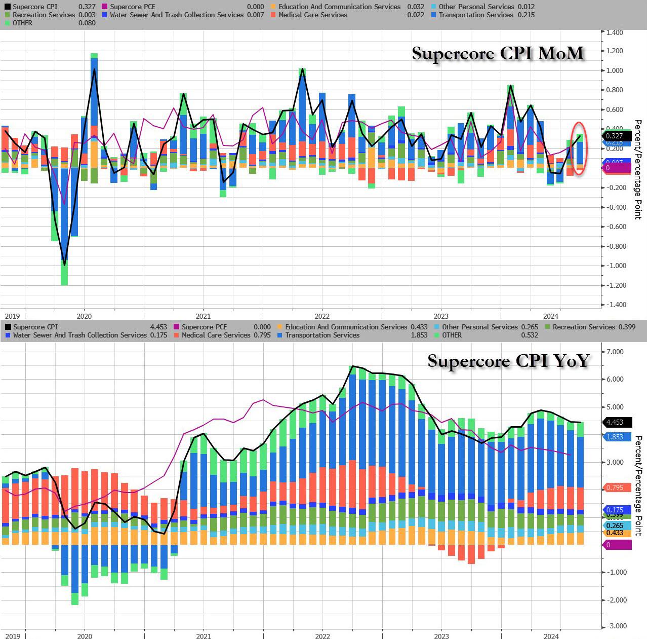
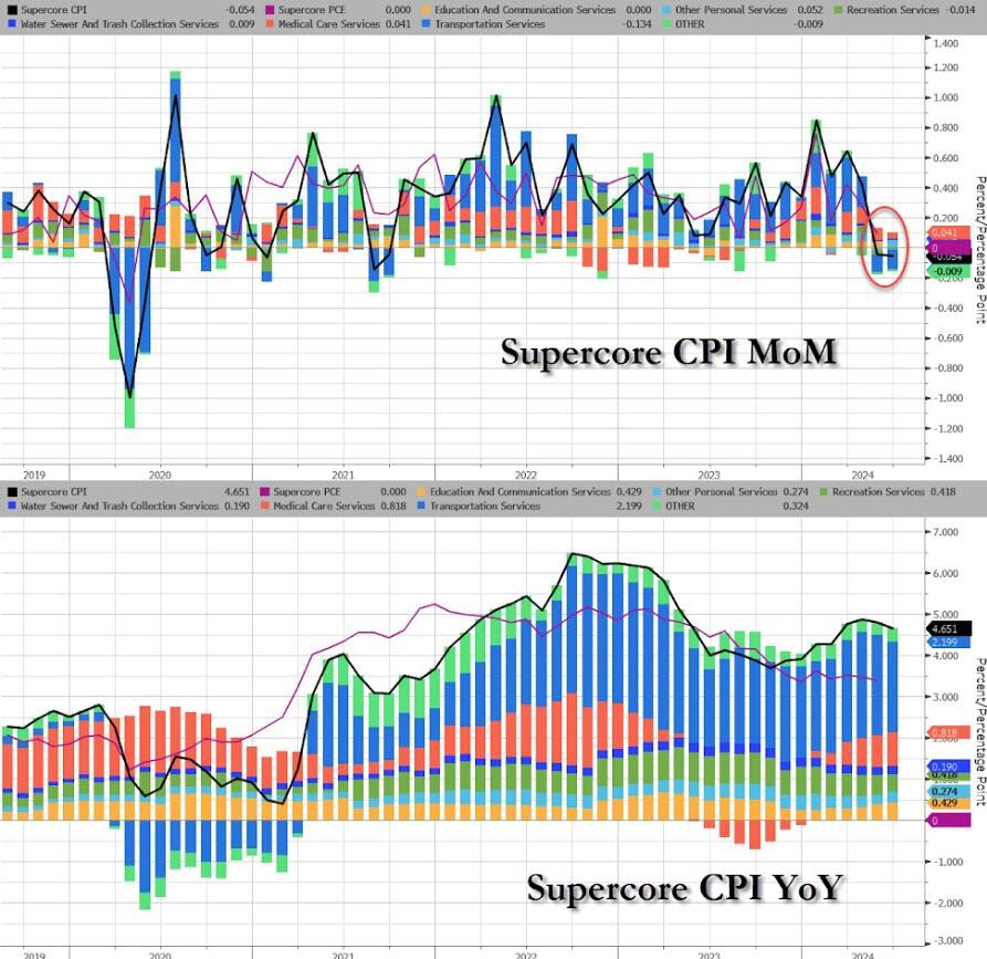
Last, but not least, and perhaps most ominous of all, is that while inflation refuses to be “killed” even as the Fed is about to start cutting rates, Supercore CPI rose 0.33% MoM, the biggest monthly increase since April, driven by continued acceleration in transportation services, which jumped the most in 5 months.
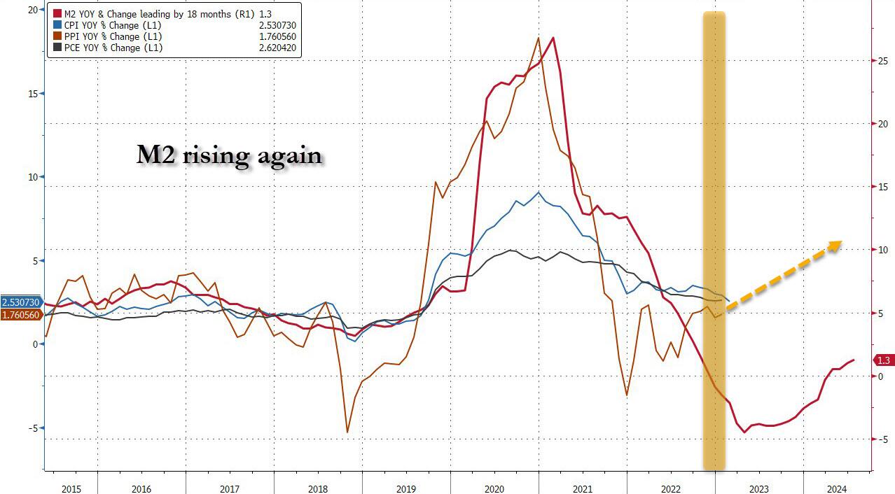
Finally, money supply growth is reaccelerating…
Which begs the question: how long until the Fed’s next easing cycle unleashes the Arthur Burns fed:
Putting it all together:
Underlying inflation unexpectedly picked up, as core CPI increased 0.3% from July, the most in four months, and 3.2% from a year ago
Only five of the 65 forecasts in Bloomberg’s survey called for a 0.3% increase in the core CPI. Almost everyone else was at 0.2%, and four had it at 0.1%. The five were right.
Shelter prices, the largest category within services, climbed 0.5%, the most since the start of the year and the second month of acceleration, defying widespread expectations for a downshift. Owners’ equivalent rent — a subset of shelter and the biggest individual component of the CPI — rose at a similar pace.
Airfares rose a hefty 3.9% in August after falling for the previous five months while costs for energy and used vehicles fell
Risk assets pumped and dumped and bond yields rose. S&P 500 futures dropped steeply immediately after the report came out, before paring losses. The yield on 10-year Treasuries advanced two basis points to 3.66%. The dollar wavered.
And while one can stick a fork in the market’s hopes for a 50bps rate cut (odds slumped from 30% to 20%… and from 50% last Friday)…
… the question remains: will the Fed really cut rates as shelter inflation inflects higher for the first time since 2023.
After last night’s ABC Presidential debate. Where Kamala acted like she was auditioning for part in the movie “Mean Girls” and the ABS moderators acted like pure Soviet-era Russian journalists.
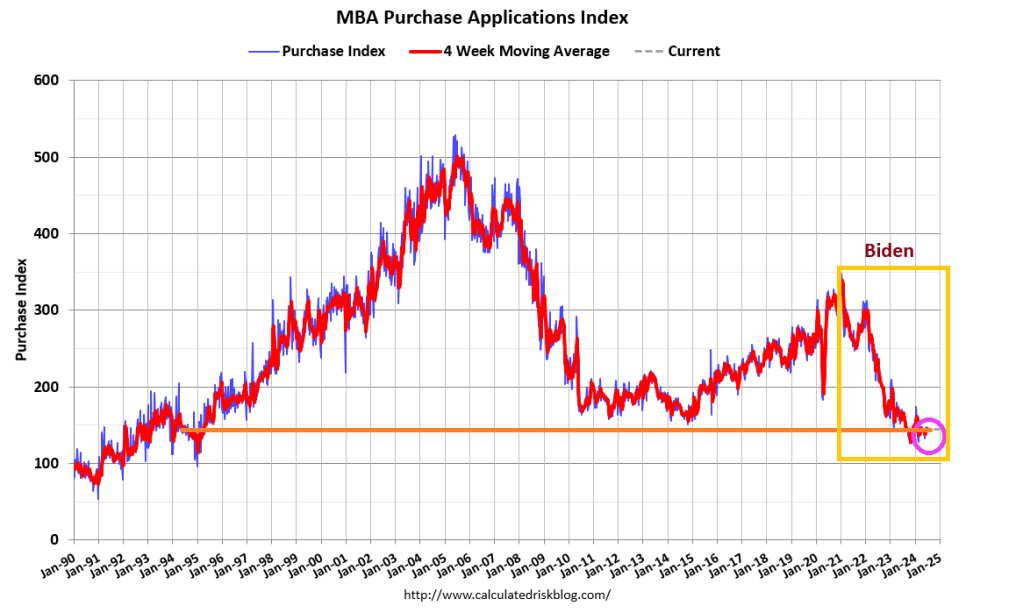
Mortgage applications decreased 3.9 percent from one week earlier, according to data from the Mortgage Bankers Association’s (MBA) Weekly Applications Survey for the week ending July 26, 2024.
The Market Composite Index, a measure of mortgage loan application volume, decreased 3.9 percent on a seasonally adjusted basis from one week earlier. On an unadjusted basis, the Index decreased 4 percent compared with the previous week. The seasonally adjusted Purchase Index decreased 2 percent from one week earlier. The unadjusted Purchase Index decreased 1 percent compared with the previous week and was 14 percent lower than the same week one year ago.
Note the decline in mortgage purchase demand after Biden/Harris were sworn into office in Janaury 2021.
The Refinance Index decreased 7 percent from the previous week and was 32 percent higher than the same week one year ago. The average contract interest rate for 30-year fixed-rate mortgages with conforming loan balances ($766,550 or less) remained unchanged at 6.82 percent, with points increasing to 0.62 from 0.59 (including the origination fee) for 80 percent loan-to-value ratio (LTV) loans.
Because of rising rates under Biden/Harris economic policies, mortgage refinancing demand has gotten crushed.
We are in the latter half of the year, so seasonalility will kill off purchase mortgage demand compared to the Spring and early Summer.
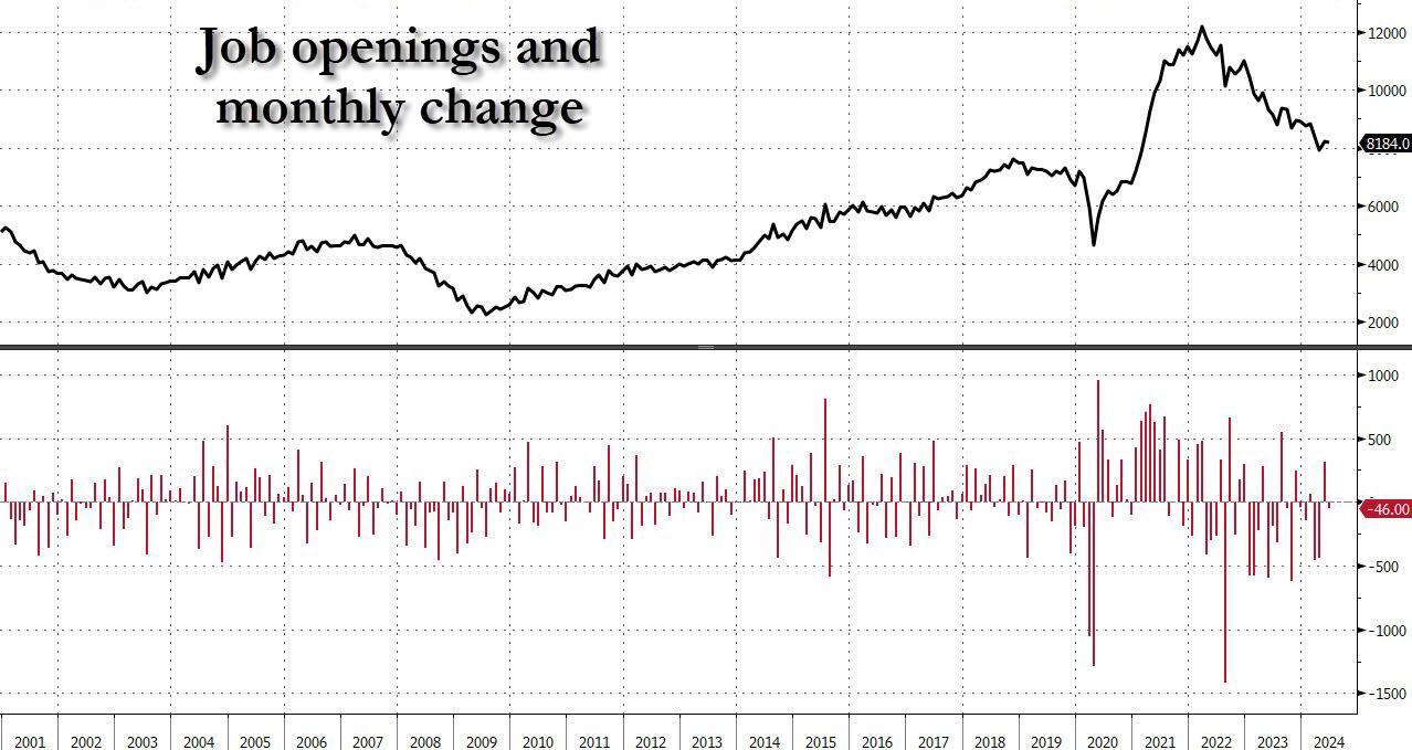
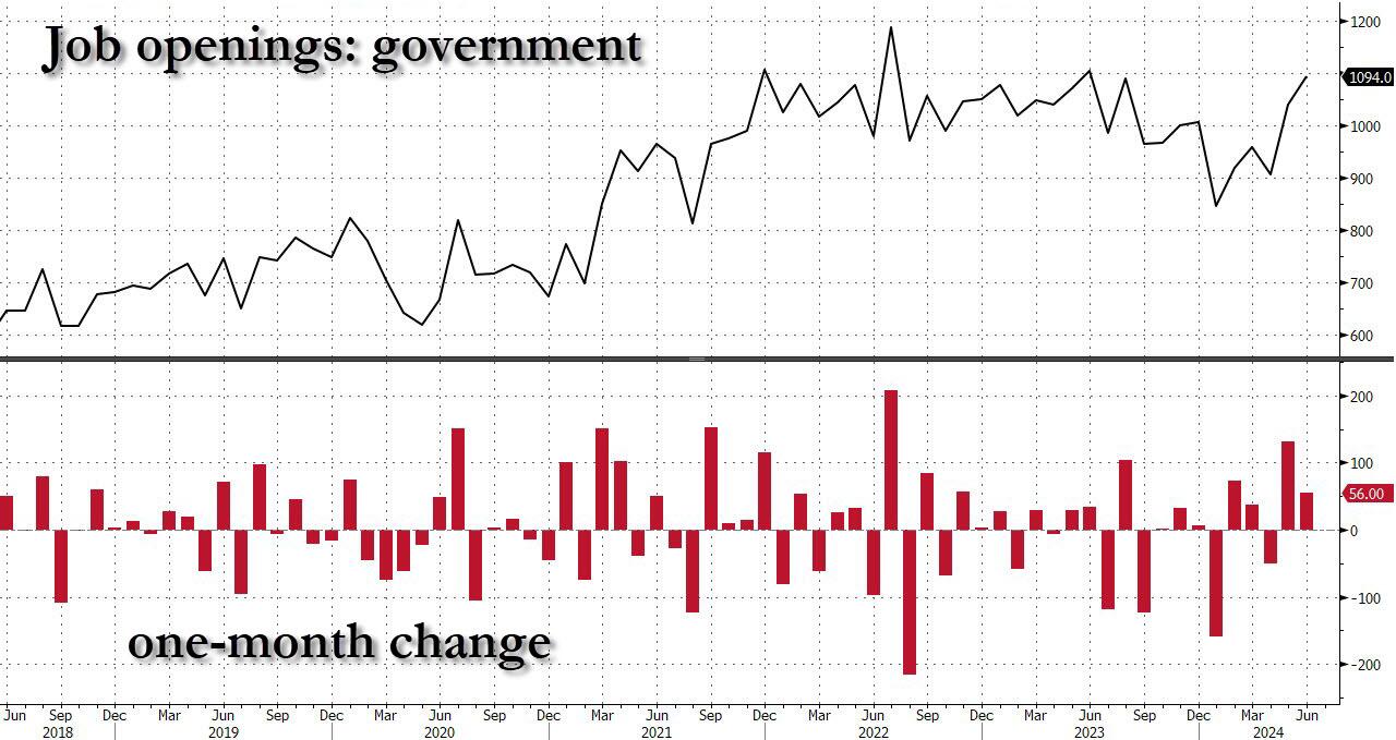
And yet, the same data rigging observed last month took place once again, because a quick look at the breakdown shows that while private jobs saw another broad drop in openings across private sectors…
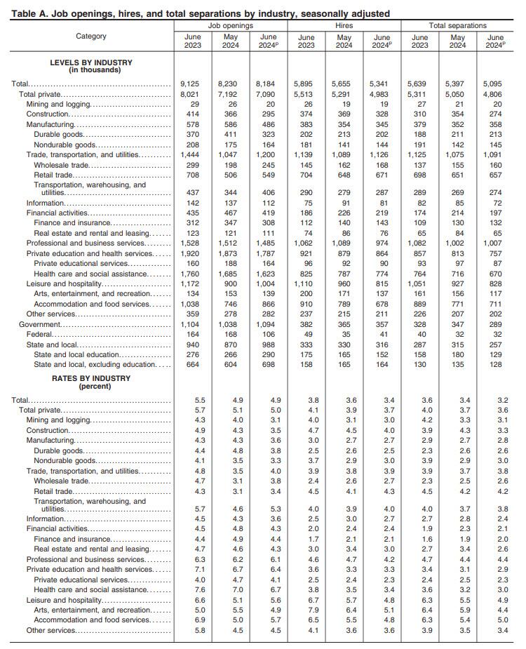
… this was almost fully offset by the relentless surge in government job openings.
Yes, while May was indeed revised lower, June saw another bizarre jump in government job openings, surging to a near record 1.094 million, driven by a 118K spike in State and Local job openings.
Putting it all together, while private sector job openings plunged to a level seen back in late 2018, government job openings are just shy of a record high!
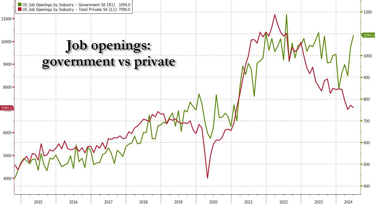
Ignoring the data manipulation, in the context of the broader jobs report, in June the number of job openings was 1.373 million more than the number of unemployed workers (which the BLS reported was 6.811 million), down from last month’s 1.581 million and the lowest since the summer of 2021.
Said otherwise, in April the number of job openings to unemployed dropped to just 1.24, a sharp slide from the March print of 1.30, the lowest level since June 2021 and now officially back to pre-covid levels.
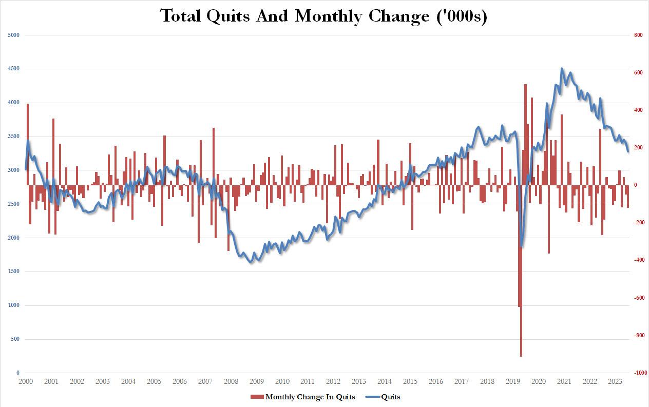
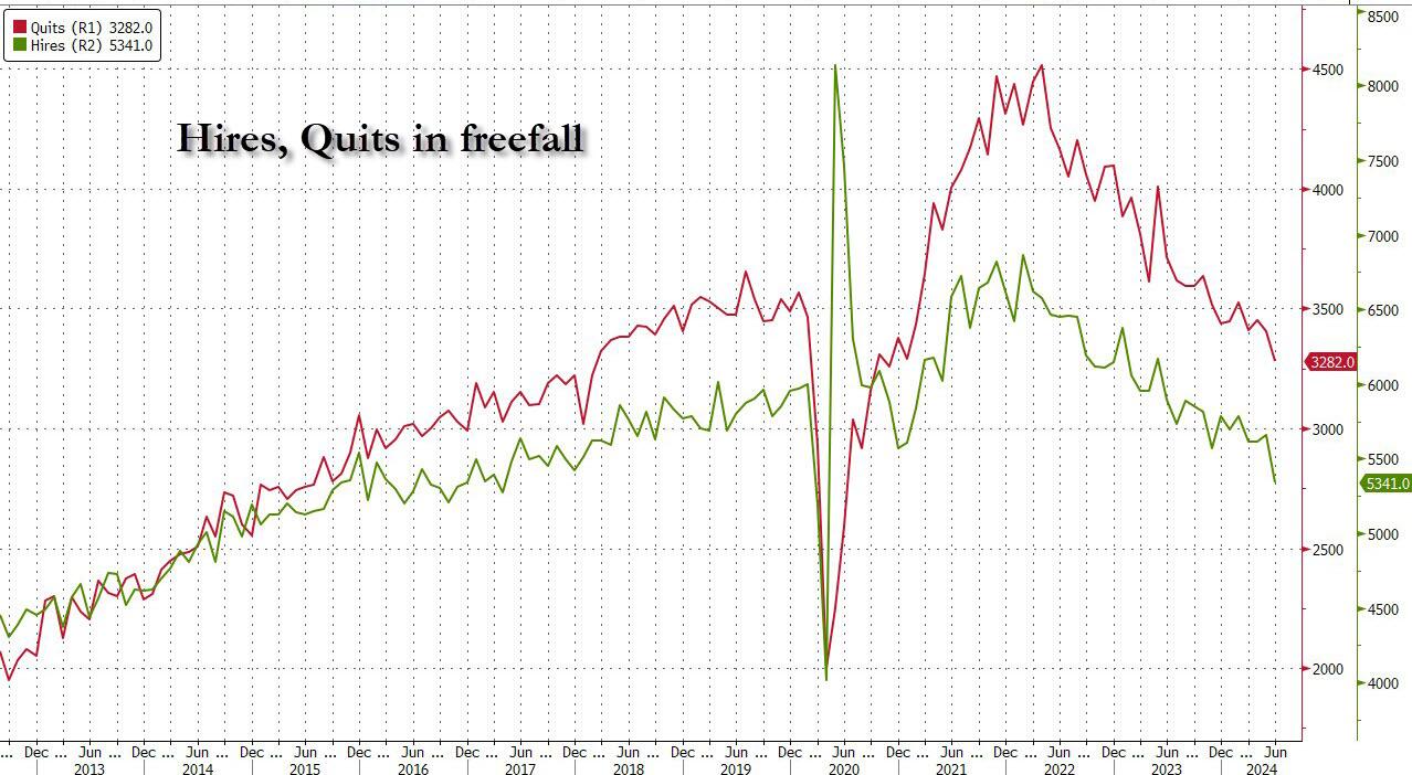
But wait there’s more: confirming that if one ignores the clearly manipulated jump in government job openings (“quick, let’s hire a ton more TSA agents and deep state apparatchiks to make it seems that Kamalanomics is working”), a quick look at the number of quits – an indicator closely associated with labor market strength as it shows workers are confident they can find a better wage elsewhere – showed a plunge in June, dropping by 121K, the most since July 2023, to just 3.282 million, the lowest since August 2020!
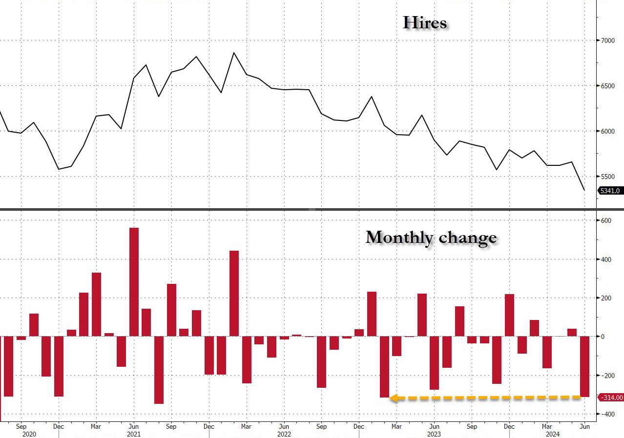
Finally, the piece de resistance was the number of actual hires, which in June also tumbled to just 5341, down a massive 314K in one month, the biggest monthly drop since February 2023…
… dragging the total to just 5.3 million, the lowest level since the depts of the covid lockdowns.
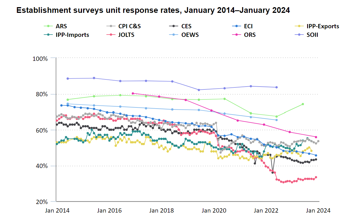
Finally, no matter what the “data” shows, let’s not forget that it is all just estimated, and it is safe to say that the real number of job openings remains still far lower since half of it – or some 70% to be specific – is guesswork. As the BLS itself admits, while the response rate to most of its various labor (and other) surveys has collapsed in recent years, nothing is as bad as the JOLTS report where the actual response rate remains near a record low 33%
In other words, more than two thirds, or 70% of the final number of job openings, is estimated!
And at a time when it is critical for Biden, pardon Kamala, to still maintain the illusion that at least the labor market remains strong when everything else in the economy is crashing and burning, we’ll let readers decide if the near record number of government job openings at a time when hiring and quitting are both crashing, is an accurate reflection of a strong labor market, or is merely a reflection of a debt-funded deep state gone full tilt. We’ll know the answer on Friday.
This scene from the film “McCabe and Mrs. Miller” sums up our political plight quite nicley. Politicians spend like crazy to stay in power (Biden/Harris) are excellent examples). Politicians promises endless money, then shoot the economy. The US is broke and relies on printing money and boowed funds to stay afloat. Harris wants to raise taxes on everyone to fund her plans like even MORE emphasis of failed green energy schemes and endless foreign wars. I doubt if Harris could defend her spending plans in light of the US already $35 TRILLION in debt.
Even more worrisome if thev fact that DC politicians have promised entitlements (Social Security, Medicare, etc. totalling $217.63 Trillion. Or 623% higher than the rapidly increasing national debt.
Biden/Harris raised thr national debt by 25% in less than 4 years. And Harris wants to increase spending! Harris wants illegal immigrants put on Social Security and Medicare, further bankrupting those entitlement programs.
Let’s see Harris explain her indefensible budget (like raising taxes and not hurting economic growth).
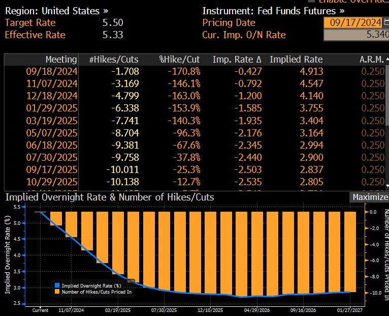
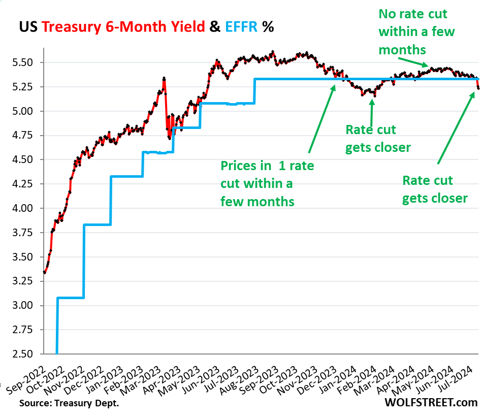
It brought the 6-month yield just a tad below the lower end of the Fed’s target range for the federal funds rate (5.25-5.50%), and below the effective federal funds rate (EFFR), currently 5.33% (blue in the chart below):
So the 6-month yield is now pricing in one rate cut within its 6-month window, more heavily weighted toward the first two-thirds or so of that window, after having already wrongly done so at the beginning of this year.
Back in late November through January, the 6-month yield had also priced in a rate cut within its 6-month window. By February 1, the yield had dropped to 5.15%, a sign the market was certain that there would be a rate cut at the March FOMC meeting.
But the market was wrong. Instead, we got a series of ugly inflation readings for January, February, March, and April, and there still hasn’t been a rate cut.
By March and April, with ugly inflation readings accumulating, rate cuts within the 6-month window of the 6-month yield were taken off the table.
May had provided a much softer inflation reading. And with Thursday’s CPI report of June, a rate cut within the 6-month window of the 6-month yield, weighted toward the first two-thirds of the window, was back on the table.
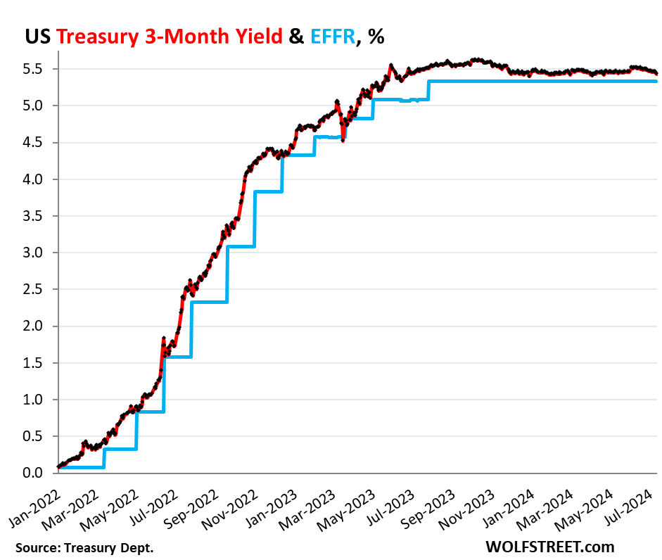
But the shorter-term Treasury yields are not pricing in a rate cut within their shorter windows. The shorter yields didn’t move much since the CPI report, and all were near the upper end of the Fed’s policy rates (5.5%), and all were above the EFFR (5.33%):
1-month yield: +1 basis point to 5.47%
2-month yield: +2 basis points 5.52%
3-month yield: -3 basis points to 5.43%
4-month yield: -5 basis points to 5.41%
In other words, the Treasury market is not expecting a rate cut in July at all, but sees a good chance of a rate cut in September, not as strong a chance as they saw in late January, when they saw a rate cut with near certainty by March that never came.
The three-month yield is not seeing any rate cuts within the first two-thirds of its window. No rate cut in July, and the September 18 FOMC meeting statement is beyond the first two-thirds of the window and has less impact on the current three-month yield:
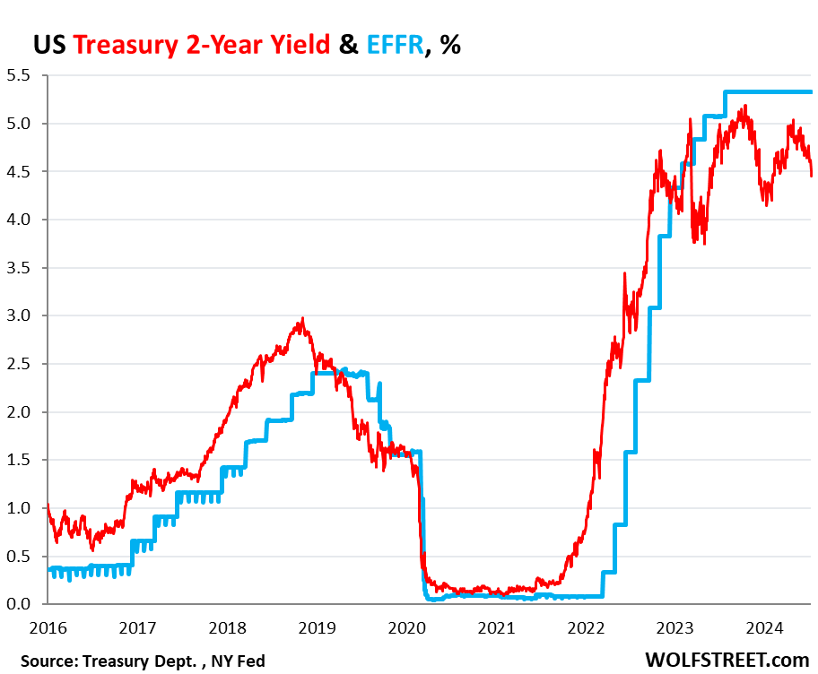
The market for the 2-year yield has been wrong all along.
The 2-year Treasury yield demonstrates how wrong the Treasury market has been all along about the Fed’s rate hikes and rate cuts: it expected far fewer and smaller rate hikes than what the Fed eventually did. And then without ever rising to the level that would price in the actual rates that the Fed has held for nearly a year, it started pricing in rate cuts before the Fed even stopped hiking rates.
So back in April 2022, the two-year yield was about 2.5%. Now, today, 2.5% sounds like a lousy yield, but back then – after 15 years of near-0% interrupted by a few years of higher yields that maxed out at around 2.4% in 2019 – 2.5% sounded pretty good, and the market thought that was getting pretty close to the Fed’s terminal rate.
In February 2022, before the Fed’s rate hikes started, Goldman Sachs predicted that the Fed would hike seven times in 2022, each by 25 basis points, and then in 2023 three times by 25 basis points each, one hike per quarter, to reach a terminal target range for the federal funds rate of 2.5-2.75% by Q3 2023.
The Fed ended up doing more double that, and by July 2023.
So the 2-year Treasury note that sold at auction in April 2022 with a coupon of 2.5% and with a yield close to that sounded like a good deal, and we, being part of the Treasury market, nibbled on some too. Two years was as long as we went. The rest of our Treasuries are T-bills.
Those 2-year notes matured in April 2024, and we got paid face value, and we earned about 2.5% in interest each year over those two years. The entire market was wrong – and so were we. The Fed would raise to 5.25-5.5% by July 2023, more than double the yield we received, and its rate is still there, and the yields of our two- three- and four-month T-bills have by far outrun our 2-year note.
The 2-year yield closed at 4.45% on Friday. The market never once came even close to betting that the Fed would hold rates above 5% for long, and they’ve been above 5% for over 14 months. And the 2-year yield has been below the EFFR for almost the entire time since January 2023, having turned into the Doubting Thomas.
The market was wrong about the Fed’s rates, and all 2-year notes that were bought at auction and that matured in 2024 or will mature in 2024 were a lousy deal. Buyers would have been better off with a series of short-term T-bills that stick closely to Fed’s actual policy rate — rather than follow market projections.
Someday, the market is going to get the rate-cut bets right. But it will only take a few more lousy inflation readings for the rate cuts to get moved further into the future. On Friday, the PPI showed up with red-hot services inflation, now delineating a clear U-Turn in December. Producers that pay those higher prices for services will try to pass them on, and so they may ultimately filter into consumer prices and higher inflation readings over the next few months. Or if producers cannot pass on the higher costs of services, their margins will get squeezed.
Inflation is unpredictable. Once inflation has broken out in a big way, as history shows us, it tends to come in waves and tends to dish up nasty surprises. And it already has dished up nasty surprises multiple times so far, including each of the first four months of this year.
Are you ready? You can tell an election is on the radar since inflation numbers are settling down for the most part. According to the BLS, overall inflation fell slightly in June to 3.0%.
Shelter CPI is up 5.14% YoY as M2 Money growth has been rising slowly … again.
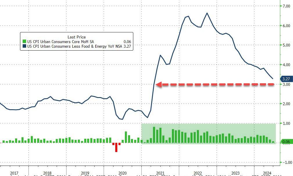
Core CPI also ‘missed’, rising just 0.1% MoM (vs +0.2% exp), dragging the YoY Core CPI down to +3.27% – its lowest since April 2021…
Source: Bloomberg
Goods deflation also dominates core prices disinflationary trend…
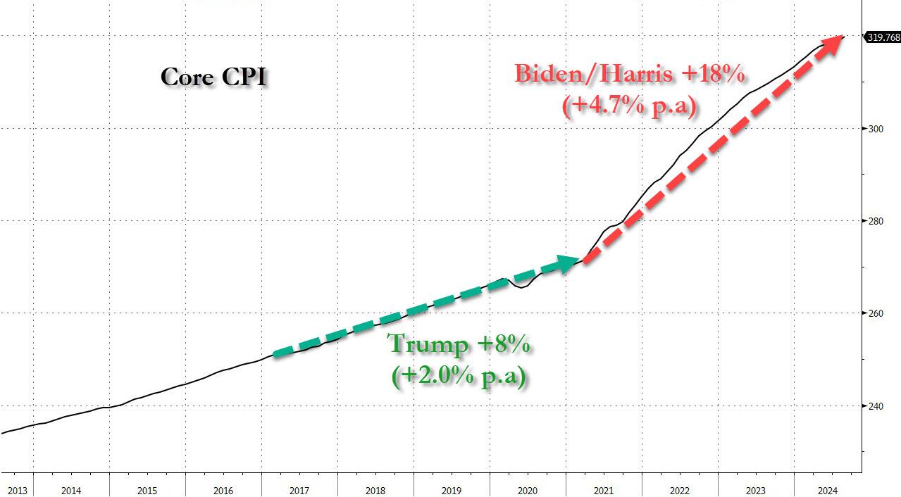
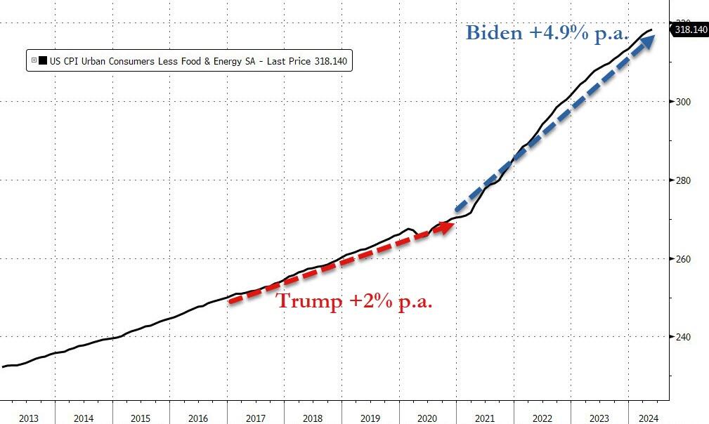
We do note that Core consumer prices have still not seen a single monthly decline since Bidenomics began.
Core consumer prices are up just under 18% since Bidenomics began (+4.9% per annum) – that is dramatically higher than the 2.0% per annum Americans experienced under Trump…
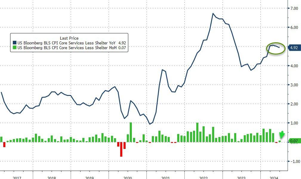
The much-watched SuperCore CPI rose on a MoM basis but declined (back below 5.0%) on a YoY basis (but obviously remains extremely elevated)…
Source: Bloomberg
Transportation Services are seeing prices fall…
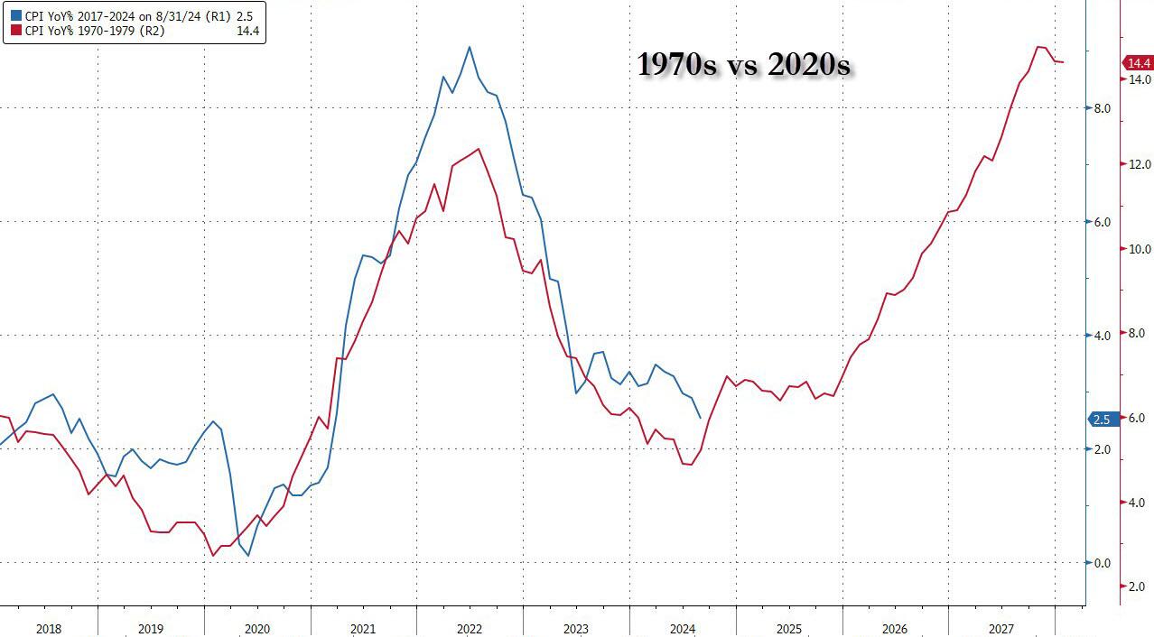
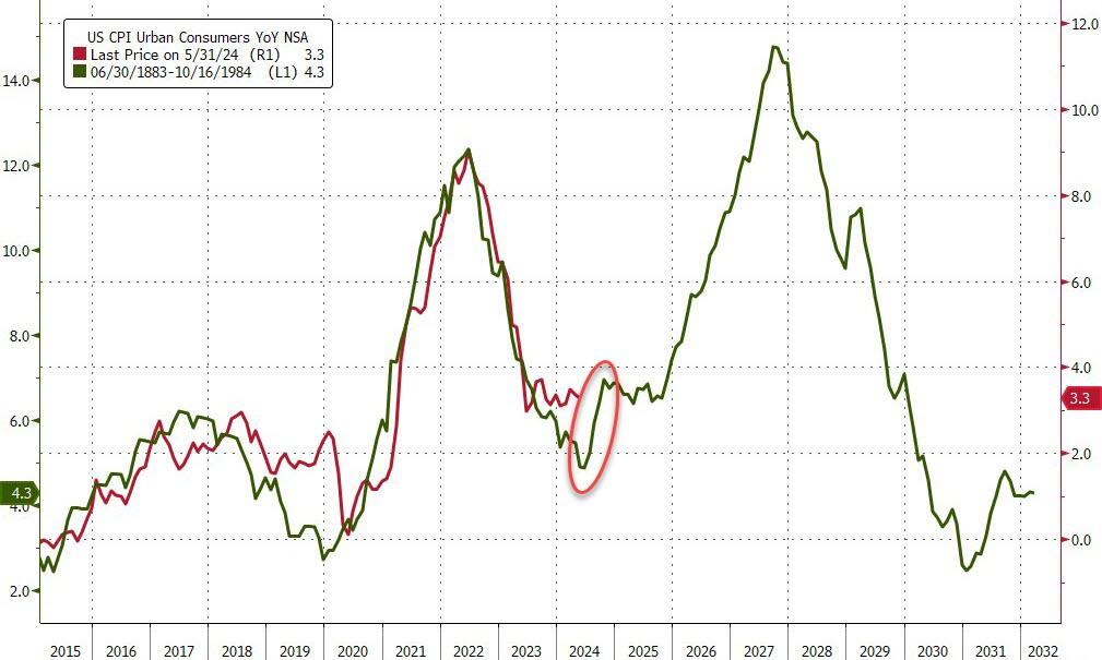
Finally, we can’t help but get a sense of deja vu all over again here. What if… The Fed cuts (because bad – recession – data), Biden loses (because dementia), and inflation re-accelerates (just like in the 80s)…
Source: Bloomberg
Challenger job cuts in construction we the highest since 2008 putting downward pressure on wages.
Mortgage applications decreased 0.2 percent from one week earlier, according to data from the Mortgage Bankers Association’s (MBA) Weekly Applications Survey for the week ending July 5, 2024. Last week’s results included an adjustment for the July 4th holiday.
The Market Composite Index, a measure of mortgage loan application volume, decreased 0.2 percent on a seasonally adjusted basis from one week earlier. On an unadjusted basis, the Index decreased 20 percent compared with the previous week. The seasonally adjusted Purchase Index increased 1 percent from one week earlier. The unadjusted Purchase Index decreased 19 percent compared with the previous week and was 13 percent lower than the same week one year ago.
The Refinance Index decreased 2 percent from the previous week and was 28 percent higher than the same week one year ago.
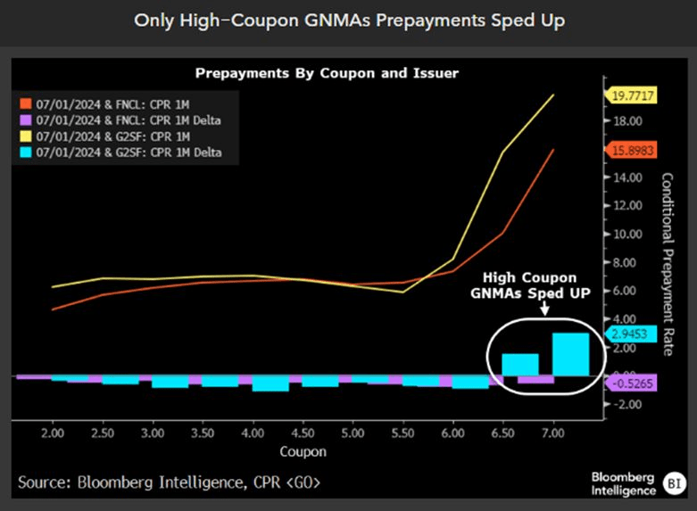
Mprtgage prepays fell less than daycoiunt.
But on;y high-coupn GNMAs prepayments sped up.
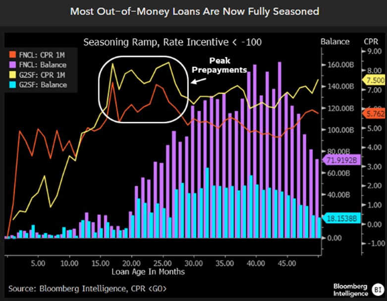
Finally, most out-of-the-money loans are now fully seasoned.
Stated differently, virtually everything the Fed does for the alleged benefit of the American economy is both unnecessary and a ruse. The Fed has actually become a captive of the Wall Street traders, gamblers and high rollers, and functions mainly at their behest.
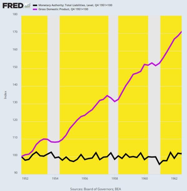
The proof of this proposition starts with the startling historical fact that the post-war US economy did just fine without any interest rate targeting, heavy-duty bond-buying or general macroeconomic management help from the Fed at all. For all practical purposes today’s omnipresent Fed domination of the financial and economic system was non-existent at that point in time.
We are referring to the full decade between Q4 1951 and Q3 1962 when the balance sheet of the Fed remained flat as a board at just $51 billion (black line). Yet the US economy did not gasp for lack of monetary oxygen. GDP grew from $356 billion to $609 billion or by 71% (purple line) during the period. That’s nominal growth of 5.1% per annum, and the majority of it represented real output gains, not inflation.
Change in Federal Reserve Balance Sheet Versus GDP, Q4 1951 to Q3 1962.
As it happened, this halcyon span encompassed the immediate period after the so-called Treasury-Fed Accord of March 1951, which finally ended the WWII expedient that had pegged Treasury bills at 0.375% and the long-bond at 2.5o% in order to finance the massive flow of war debt.
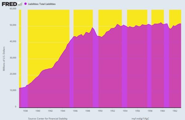
The effect of the WWII pegs, of course, was that the Fed had been obliged to absorb any and all US Treasury supply that did not clear the market at the target yields. Not surprisingly, the Fed’s 1937 balance sheet of $12 billion had risen by 4.3X to $51 billion by the time of the Accord, thereby reflecting what amounted to the original version of backdoor monetization of the public debt, which was justified at the time by the exigencies of war.
By contrast, in the post-peg period shown below interest rates were allowed by a newly liberated Fed to find their own market clearing levels. So there was no continuous guessing game on Wall Street about where the next monthly Fed meeting would peg short-term interest rates. Back then, it was understood that the forces of supply and demand down in the bond pits of Wall Street were fully capable of discovering the right interest rates, given the financial and economic facts then extant.
The combination of high growth, robust investment, strong wages and smartly rising real family income, on the one hand, and rock-bottom inflation on the other, surely constitutes the gold standard of performance for a modern capitalist economy.
And yet, and yet. It was all accomplished under a regime of persistent “light touch” central banking that assumed free market capitalism would find its own way to optimum economic growth, employment, housing, investment and main street prosperity. No monetary Sherpa at the Eccles Building was necessary.
Even more crucially, no money printing was necessary, either. The sterling economic results depicted below happened during a 11-year period when the Fed did not purchase one net dime of U.S. Treasury debt!
Per Annum Change, Q4 1951 to Q3 1962
Real Final Sales: +3.8%.
Real Domestic Investment: +4.1%.
Nonfarm productivity growth: +2.5%.
Real hourly wages: +3%.
Real Median Family Income: +2.3%.
CPI Increase: +1.3%
Federal Reserve Liabilities, 1937 to 1962
There is absolutely nothing about this period that makes the superior macroeconomic performance summarized above aberrational, flukish or unreplicable. In fact, President Eisenhower cut defense spending sharply and eliminated the fiscal deficit entirely during his second term. So, the cumulative increase in the public debt during this 11-year period was just $30 billion or a tiny 0.6% of GDP owing to Korean War borrowing early in the period.
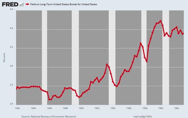
But even this modest debt increase wasn’t monetized by Fed bond-buying. Instead, it was effectively financed out of private savings in the bond pits. Long-term bond yields, therefore, actually rose from the 2.5% pegged level shown below for 1942 to 1951 to upwards of 4% by the end of the period, as dictated by supply and demand. Still, the CPI averaged just 1.2% during 1959-1962, meaning that real yields bordered on +3.o% during the early 1960s.
That is to say, at the time, the Fed had seen no need to push real rates to zero and even into negative territory as has been the case for much of the last two decades. The fact is, the main street economy prospered mightily even when inflation-adjusted rates were providing a solid return to savers and investors.
Long-Term US Treasury Bond Yield, 1942 to 1962
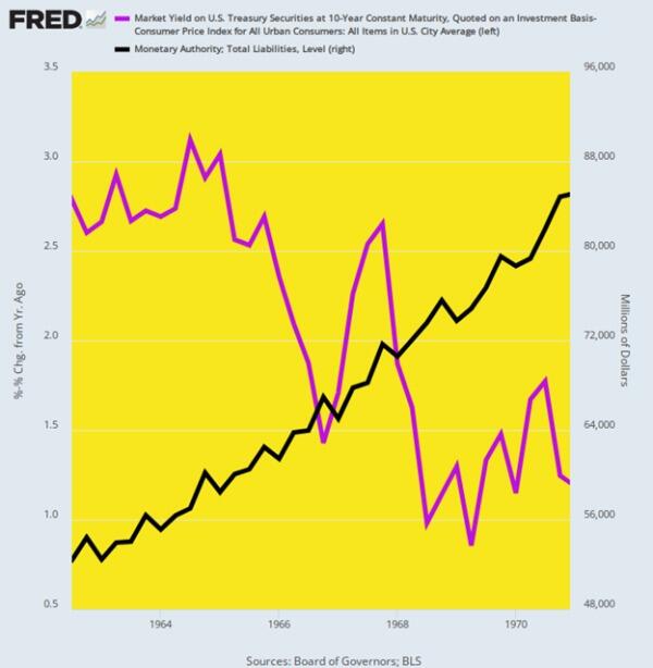
What ended the benign economics of 1951 to 1962, of course, was the scourge of War Finance. LBJ (Lyndon B. Johnson) escalated the Vietnam War dramatically after 1963, causing the debt to soar and the 10-year UST to climb to nearly 6% by early 1968. But Johnson was not about to allow market clearing interest rates to fund his misbegotten venture in bringing the blessings of the Great Society to southeast Asia.
So he gave “the treatment” to the Fed Chairman at his Texas ranch and ordered to cut the Federal funds rate to accommodate LBJ’s surging Federal deficit. The latter had grown from $4.8 billion and -0.8% of GDP in 1963 to $25.2 billion and -2.8% of GDP by 1968.
Unfortunately, after steadily and appropriately raising the Fed funds rate from 2.9% in December 1962 to 5.75% by November 1966 as Johnson’s inflationary deficits grew, the funds rate was brought down rapidly to 3.8% by July 1967. In turn, that unleashed a red-hot wave of speculation and inflation, with the CPI rising from a 1% Y/Y (year-on-year) gain in August 1964 to a +6.4% peak in February 1970.
There is no mystery as to why the inflationary genie was now out of the bottle. Between Q3 1962 and Q4 1970, the Fed’s heretofore flat balance sheet (black line) soared skyward, rising from $52 billion to $85 billion over the eight-year period. That amounted to a 6% per year gain, meaning that the precedent for aggressive balance sheet expansion had now been firmly established.
Inflation-Adjusted Yield on 10-Year UST Versus Fed Balance Sheet Growth, 1962 to 1970
The first victim, of course, was inflation-adjusted bond yields (purple line above). As shown above, the healthy +3% real yield of 1962 fell to barely +1% by the end of 1970.
Yet the crucial essence of this “guns and butter” breakdown cannot be gainsaid. To wit, the Fed was not driven to this first round of post-war money-printing and debt monetization because the private economy had gone into a mysterious swoon or failure mode and therefore needed a helping hand from the nation’s central bank.
To the contrary, this was a Washington driven departure from sound central banking pure and simple. And as we will amplify below, it was off to the races of Rogue Central Banking from there.
Once the inflation genie was out of the bottle with the CPI clocking in at 6% by the fall of 1970, the Fed struggled for more than a decade to put it back. Consequently, any focus on stimulating growth, jobs, housing and investment was infrequent and definitely secondary to inflation-fighting.
We amplify the 1970s flood of central bank money and the resulting inflationary mess below, but it is important to note at the onset that despite four recessions (1970, 1975, 1980 and 1981) and very little pro-growth help from what was now an inflation-preoccupied Fed, the US economy did expand at a decent clip during the interval between Q4 1969 and Q2 1987.
The economic growth rate (real final sales basis) averaged a solid +3.1% per annum, but that occurred due to the inherent growth propensities of private capitalism and despite the roadblocks thrown up by periodic bouts of monetary stringency. In fact, three Fed chairman served during that 17.5-year interval—Burns, Miller and Volcker—and with varying degrees of success their focus was overwhelmingly on suppressing inflation, not goosing growth.
As it happened, the growth rates of jobs, productivity and real median family income during this period were not especially outstanding, but these metrics didn’t plunge into an economic black hole, either.
Self-evidently, these outcomes on main street were the work of market capitalism, not the central bank. The latter was leaning hard against inflation during most of the period—so this absence of central bank “help” is just further proof that easy money stimulus is not necessary for solid growth and main street prosperity.
Per Annum Change, Q4 1969 to Q2 1987
Real Final Sales of Domestic Product: +3.1%.
Labor hours employed: +1.5%.
Nonfarm productivity: +1.8%.
Real Median Family Income: +1.2%.
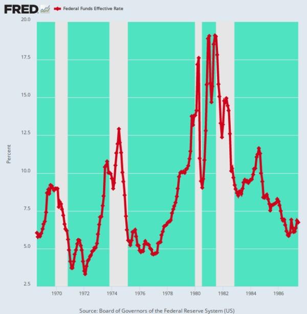
For avoidance of doubt, here is the path of the Federal funds rate as the above macroeconomic performance was unfolding. To wit, the Fed’s recurrent anti-inflation initiatives caused the funds rate to gyrate wildly like some kind of monetary jumping bean. In the run-up to each of the four recessions designated by the shaded areas of the graph, the increase in the Fed funds rate was as follows:
1970: +340 basis points.
1974: +960 basis points.
1980: +1,290 basis points.
1981: +440 basis points.
Needless to say, these successive rate-raising campaigns amounted to hammer blows to the main street economy. There is no way that these violent interest rate swings and the consequent start and stop economic cycles—four recessions in only 17 years— were a tonic for growth during this era of high and volatile inflation.
In effect, the reasonably solid macroeconomic performance quantified above represents a kind of free market minimum. It reflects the relentless drive of workers, consumers, entrepreneurs, businessmen, investors, savers and speculators to better their own economic circumstances—even in the face of inflationary roadblocks and anti-inflation financial manipulation by the central bank.
Federal Funds Rate, August 1968 to June 1987
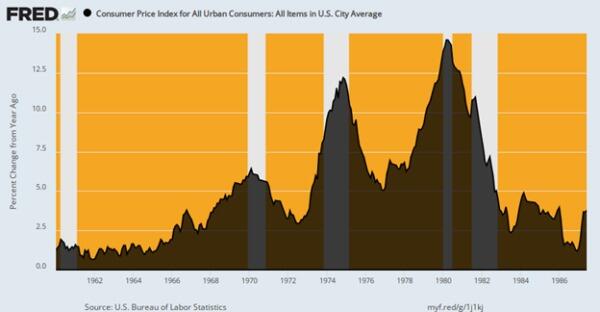
Of course, the inflationary roadblocks were enormous, and far beyond any prior peacetime experience. Compared to the 1.3% inflation average during 1951 to 1962, the CPI rose at a 5.6% rate over 1969:4 to 1987:2.
And that included the benefit of the sharp drop in inflation engineered by Paul Volcker during the final four years of the period. Thus, during the decade of the 1970s through the Y/Y inflation peak at 14.6% in April 1980, the CPI rose by an average of 7.7% per annum.
In turn, this introduced the wage-earning classes for the first time to the treadmill of robustly rising nominal wage rates, which become almost entirely consumed by sharply rising consumer prices. Thus, during the decade ending in the inflationary peak of Q2 1980, average hourly earnings in nominal terms rose by 7.6% per annum. But, alas, what stuck to the walls of workers’ bank accounts was a gain of only 1.1% per annum during the same period. All the rest was eaten up by inflation.
Y/Y Change in the CPI, 1960 to 1987
If the wage/price treadmill effect introduced after 1969 was the whole story, the impact might be considered minimally tolerable. The resilience of market capitalism was shown to be sufficiently strong so as to overcome much of the inflationary headwinds, along with the Fed’s punishing cycles of anti-inflation tightening.
Unfortunately, however, what also materialized out of the 1970s inflation era were two exceedingly harmful corollaries.
The first was the notion that the job of the central bank was to manage the rate of change in the general price level, rather than the far more modest original remit. The latter presumed the presence of noninflationary gold-backed money—so inflation-management would have been an oxymoron.Consequently, the Fed’s actual statutory mandate was simply to provide liquidity and reserves to the banking system based on market rates of interest. The Fed heads didn’t need to know from the CPI, PCE deflator or any other modern inflation measuring stick that had not yet been invented.
As it happened, however, management of the short run pace by which the general price level is rising was a fateful portal into statist central banking and the plenary management of the macro-economy in which the inflation indices are inextricably embedded. Eventually the bastard son of this strategic opening to vastly expanded state power materialized as the holy grail of 2% inflation.
Yet, here’s the thing. Until the gold-backed dollar was deep-sixed by Nixon in August 1971 and the possibility of rising, persistent and eventually double-digit peacetime inflation materialized in the 1970s, the idea of central bank management of the inflation rate didn’t even exist. That’s because peacetime price stability was the default condition of the gold standard world. Indeed, from the Napoleonic Wars forward, “inflation” and wartime were pretty much synonymous because fiat money was almost invariably a temporary wartime expedient.
The other legacy of the inflationary 1970s was the breakout of high and ever rising unit labor costs in the US economy. This unnecessary but pervasive economic deformation eventually resulted in the massive offshoring of the US industrial economy.
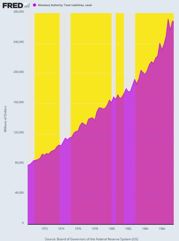
The implication, of course, is that it would have been far better to stick with William McChesney Martin’s golden era of high growth, low inflation, a flat Federal Reserve balance sheet and interest rates driven overwhelmingly by supply and demand forces in the private financial markets. But as it happened, the Fed’s balance sheet during the decade of high inflation was the very opposite of flat.
Under the three successive Chairmen, the Fed’s balance sheet grew at the following compound annual rates:
Arthur Burns (Feb. 1970 to March 1978): +6.9%.
William Miller (March 1978 to August 1979): +9.5%.
Paul Volcker (August 1979 to August 1987): +6.8%.
Growth Lift-off of Federal Reserve Balance Sheet, Q1 1970 to Q2 1987
In a word, Volcker sharply slowed the runaway growth of the Fed’s balance sheet which had occurred under the regime of William Miller – the hapless former CEO of a conglomerate which made golf carts, snowmobiles and Cessna aircraft. But when all was said and done, the Volcker Fed still pumped new money into the economy at a rate barely below that of Arthur Burns. And Burns, of course, was the villain central banker who had ignominiously succumbed to Nixon’s entreaties to “give me money, Arthur” in support of his re-election campaign in 1972.
The amount of money the US government spends on foreign aid, wars, the so-called intelligence community, and other aspects of foreign policy is enormous and ever-growing. It’s an established trend in motion that is accelerating, and now approaching a breaking point. It could cause the most significant disaster since the 1930s. Most people won’t be prepared for what’s coming. That’s precisely why bestselling author Doug Casey and his team just released an urgent video with all the details.
Lest we forget, M2 Money printing exploded with Covid and kept increasing under Biden’s Reign of (Economic) Error.


You must be logged in to post a comment.