The Comeback Kid? US Personal Savings Rate Is -51.5% YoY To Cope With Bidenflation Raging At 8.5% YoY (Meanwhile The Fed Is “Slothing” Its Balance Sheet Reduction)

It is amazing that Biden is rising in the polls, simply because he got several inflation-generating, crony pay-off bills passed through a Democrat-controlled Congress. Even more amazing is that Americans aren’t more furious with Biden given that inflation is still raging at 8.5% YoY and the US Personal Savings Rate to cope with raging prices is at -51.5% YoY.

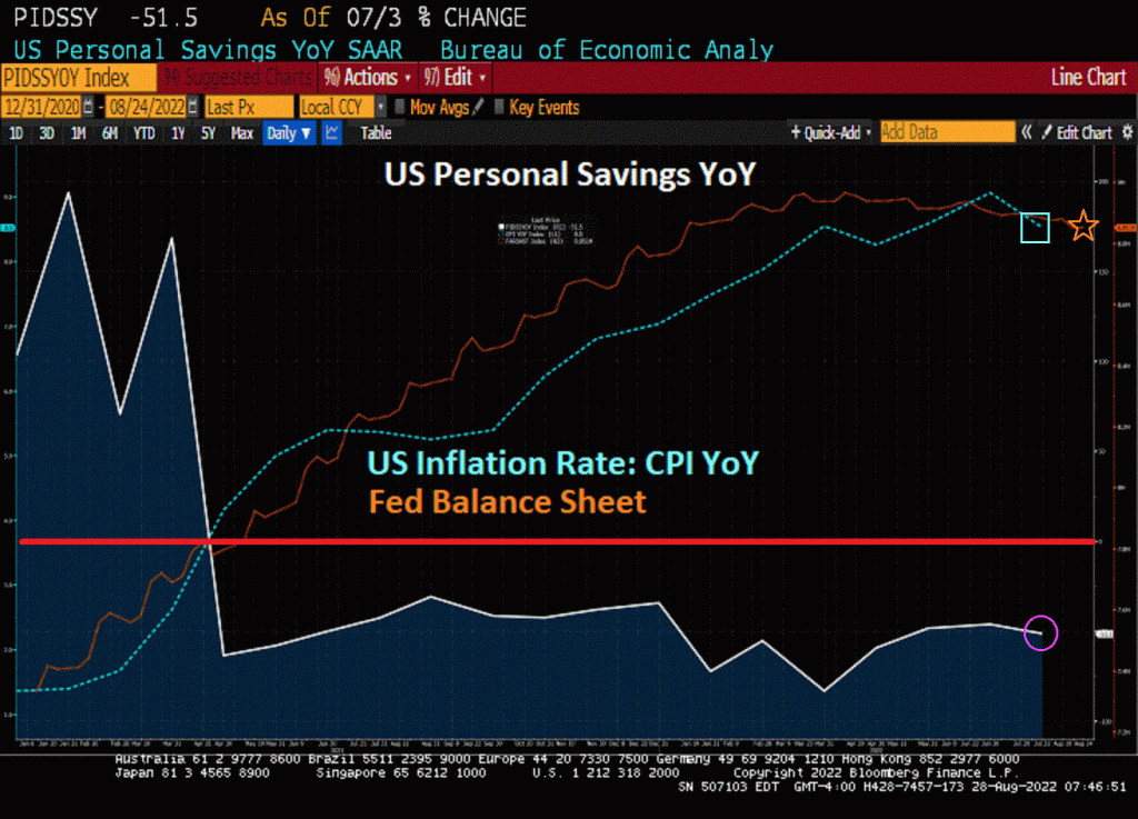
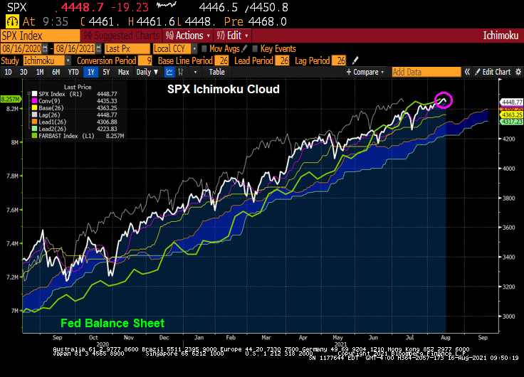
It looks like one quick fix to the inflation problem is for The Federal Reserve to shrink its balance sheet. But they are taking their own sweet time doing it.

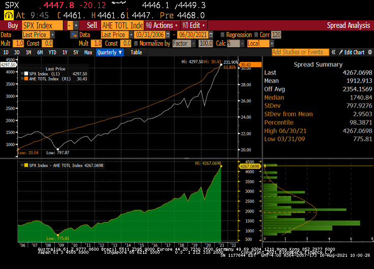
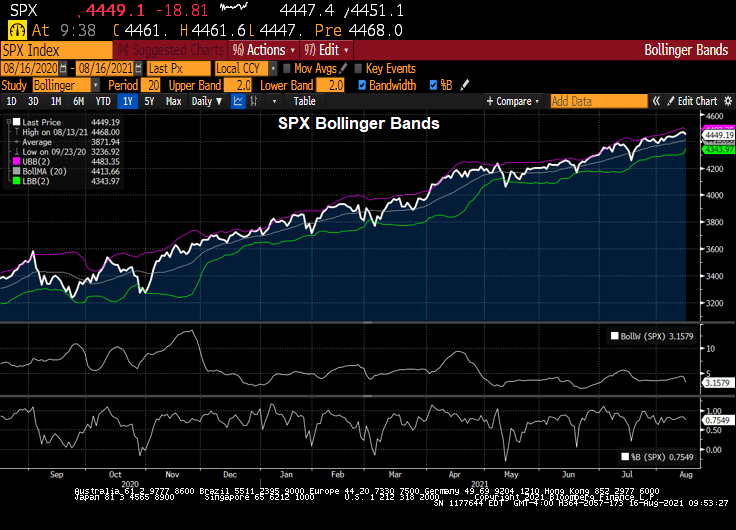
And then we have the S&P 500 index which has done poorly since Powell and The Fed have undertaken their “fight inflation” mantra caused by their own folly and Biden’s green, anti-fossil fuel policies. Not to mention Congress spending like drunken sailors in port.

But the same is going on in Europe where inflation is even higher than in the USA and the EUR/USD is plunging like a paralyzed falcon.

And then we have Biden shrinking the Strategic Petroleum Reserve (orange line).

And in Europe, we have Germany suffering through a horrible energy price spike.

Finally, here is a baseball card of former Dodger pitcher Billy Loes. He almost reminds me of Biden trying to think through a complex problem like student loan debt forgiveness that may cost taxpayers an average of $2,000 yet buy votes for Democrats at the midyear elections.

S&P 500 Bubble Views: Buffett Indicator, Shiller CAPE, Ichimoku, Bollinger, Gold To SPX, SPX Versus Average Hourly Earnings (All Roads Point To Bubble)

There are a variety of measures of an asset bubble. And each one points to an unsustainable bubble in the stock market.

Let’s start with the Buffett Indicator. The ratio of Total Market Capitalization of all US stocks (WCAUUS ) to total nominal GDP of the United States (GDP CUR$ ).

There is also the GLOBAL Buffett ratio produced by Holger Zschäpitz. Global market cap now equal to 139% of global GDP, way above Buffett’s 100% bubble threshold.

Shiller’s Cyclically-adjusted Price-earnings ratio? Still climbing and resembles the Dot.com bubble of 2000.

How about gold to Average Hourly Earnings (similar to the Bichler and Nitzan “Power” measure. The spread (bottom chart) sees the S&P 500 index soaring away from average hourly earnings.

We also have the Gold to SPX ratio that is now back to pre-financial crisis levels.

How about the Ichimoku cloud, where the SPX is currently ABOVE the cloud?

SPX and Bollinger Bands? The SPX index is close to the upper band.

How about The Hindenburg Omen, a technical indicator that was designed to signal the increased probability of a stock market crash. It compares the percentage of new 52-week highs and new 52-week lows in stock prices to a predetermined reference percentage that is supposed to predict the increasing likelihood of a market crash.

So it looks like a have a bubble in the stock market.

Fed Chair Jerome Powell sees the ghost of the Dot.com bubble.