The University of Michigan consumer survery is out and the results are startling.
Under Biden/Harris, buying conditions are far worse than under Trump/Pence.
In fact, buying conditions were extremely favorable (above 100) under Trump and dismal under Harris. Particularly for housing (where higher than normal mortgage rates and high housing prices made the “American Dream” the American Scream.
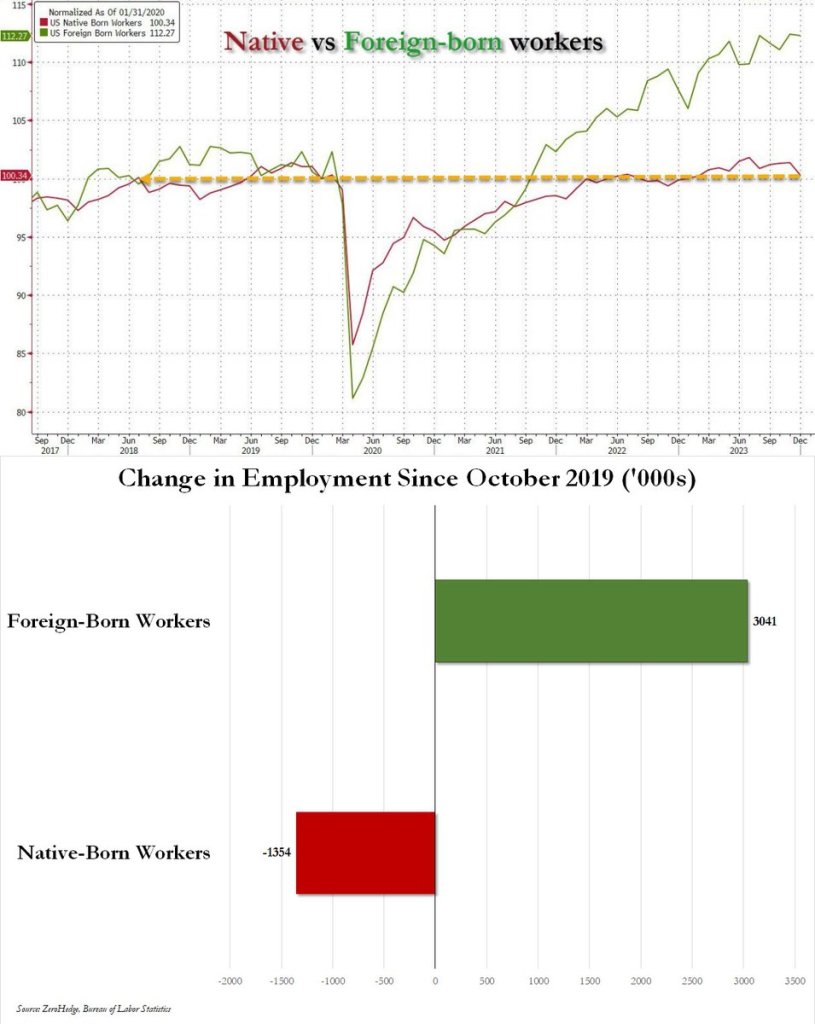
Since October 2019, native-born US workers have lost 1.4 million jobs; over the same period foreign-born workers have gained 3 million jobs.
Ay ay ay ay, ay ay ay ay!
The last three monthly jobs reports show aggregate job gains of 340K. Of that total 172K are accounted for by Health Care and Social Assistance and 60K by Government. Manufacturing jobs have shrunk by 34K; Professional and Business services, a 16k decline.
Biden/Harris have alliowed the US to be invaded. Under Harris, the new US national anthem will be Jesusita en Chihuahua.
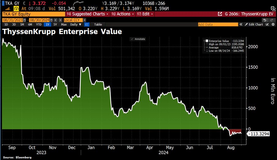
I read “The Arms of Krupp” by William Manchester. A great book about the rise of ThyssenKrupp during World War II. It is one of the world’s largest steel producers, but it now has NEGATIVE ENTERPRISE VALUE.
The cause? Germany is up the creek without an economic paddle after years of gross mismanagement by Angela Merkel and her party. Mass immigration in Germany and a slowdown in the global economy aren’t helping.
These are the essential pillars of “21st century socialism” and the radical left Peronism that obliterated Argentina. These are also the main elements of the economic plan presented by Kamala Harris and the Democratic Party. Undoubtedly, this is the most radical socialist economic plan ever announced by the Democrats.
According to the Committee for a Responsible Federal Budget (CRFB), Harris’s proposals will cost $1.95 trillion over 10 years. However, it emphasizes that if certain measures become permanent, this figure could increase to $2.25 trillion.
The Harris campaign has stated that these costs will be offset by a classic excuse of socialism in any election: “higher taxes on corporations and high earners.” This is, obviously, ludicrous, because there is no revenue measure that will cover the already bloated $2 trillion annual deficit and an added $2 trillion. The mantra of “higher taxes for the rich” always means higher taxes and more inflation, a hidden tax, for you.
The Congressional Budget Office (CBO) has already warned of the fiscal disaster of the United States, with an annual deficit of 6% of GDP. Despite not accounting for a recession and projecting record tax revenues from 2024 to 2034, the CBO predicts an explosion in the budget deficit from $1.9 trillion to $2.8 trillion by 2034, even before factoring in Harris’s new spending plan. This means that the adjusted deficit will rise above 6.9 percent of GDP by 2034, almost twice the average of 3.7 percent over the previous 50 years.
Following the Harris plan, the United States public debt will likely increase by $24 trillion in a decade. As I have explained, there is no set of revenue measures that can bring $2 trillion per year in additional tax receipts, and tax hikes will harm both investment and growth.
An economy that generates an annual deficit of 6 percent of GDP to achieve a mere 2 percent annual growth is already on a dangerous path, and Harris’ plan would make it even worse.
Kamala Harris promises to cut inflation by spending and printing more money, reducing competition, and attacking businesses. It has never worked and never will because it is upside-down economics. Welcome to the US “Peronism.”.
Imagine all those United States citizens who have escaped Latin American or European economies impoverished by interventionism to find a better opportunity in the United States only to find that the same policies will be implemented by Harris.
The narrative of price gouging and greedflation is simply false. In 2023, profit margins in the grocery industry hit the lowest level since 2019, at 1.6%, according to the IMF. Corporations, even if they were stupid and reckless, cannot make all prices rise constantly. Competition would eat away at their market share; newcomers would eliminate them, and aggregate prices would fall. Furthermore, stores and businesses cannot make aggregate prices soar, maintain the increase, and consolidate it, which is the measure of inflation (CPI) we read every month. The only thing that can make all prices rise and continue increasing at a slower pace is printing money and eroding the purchasing power of the currency.
The only thing that can make aggregate prices rise constantly is the destruction of the purchasing power of the currency, which comes from massive government spending and printing currency to disguise fiscal imbalances.
Kamala Harris and her team know that their spending plan will make the national debt soar and that price controls do not reduce prices. In fact, these should not be called “price controls” but “limits to competition.” If corporations were the cause of inflation and price controls were the solution, Peronist Argentina would have enjoyed the lowest inflation in the world in the past decades.
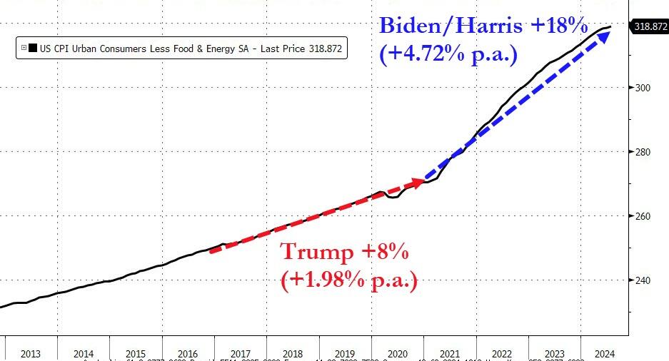
Harris’ proposals to forgive debt are profoundly anti-social. They do not forgive any debt; they just add it to the national debt and make you pay for it. This enormous increase in public debt will be a burden for every American, particularly the poorest, with persistent inflation and lower real wages. US citizens have already endured negative real wage growth since January 2021, when Biden took office, according to the Federal reserve of St Louis. Expect worse.
Why does Harris promote the same policies that have failed everywhere? Promising free stuff and blaming others for the negative consequences is the defining strategy of socialist politicians.
Are you surprised to see how Germany, France, and other historically rich nations slump into stagnation, high debt, persistent inflation, enormous taxes, and the destruction of the middle class? Those policies are what Harris is promising. Who benefits? The vast government and its surrounding corporations reap the benefits.
Many people hold the belief that a nation cannot be considered socialist if it contains private companies. It makes no sense. State control does not limit itself to capital ownership but also to the imposition of increasingly restrictive laws, regulations, and confiscatory taxes. In fact, the government likes to absorb most of the wealth created by the private sector without the inconvenience of managing the businesses. Huerta de Soto defines socialism as “any system of institutional, methodical aggression against the free exercise of entrepreneurship” and that is precisely what Harris promises.
Higher taxes and more debt.
The government will print money to provide subsidies in a currency that is constantly losing value. It will blame stores and businesses for inflation. Interventionist policies will continue to erode the private sector. And they will repeat.
The makers of these policies are aware that they will negatively impact the economy, yet they will also engender a substantial number of enslaved citizens who rely on the government and must abide by its decisions. Voters see an alleged tsunami of free money but ignore the fact that they will pay for it through higher inflation, lower real wages, and diminishing opportunities for small businesses and families.
Yes, under Obama/Biden, then Biden/Harris,
The Harris team believes deficits do not matter and that the Federal Reserve can always disguise any budget imbalance. However, cracks have already appeared. Persistent inflation is the consequence of years of excessive spending and monetization. The next step is the risk of losing the US dollar as the world reserve currency when the world stops accepting the ever-increasing debt.
Under Obama/Biden and Biden/Harris, we have seen massive money printing and devaluation of the US Dollar. Trump/Pence too, but they were nailed with Covid. And the Democrat shut down off schools and local economies.
But all Harris (America’s Eva Peron) wants to do is dance. And not answer serious questions.
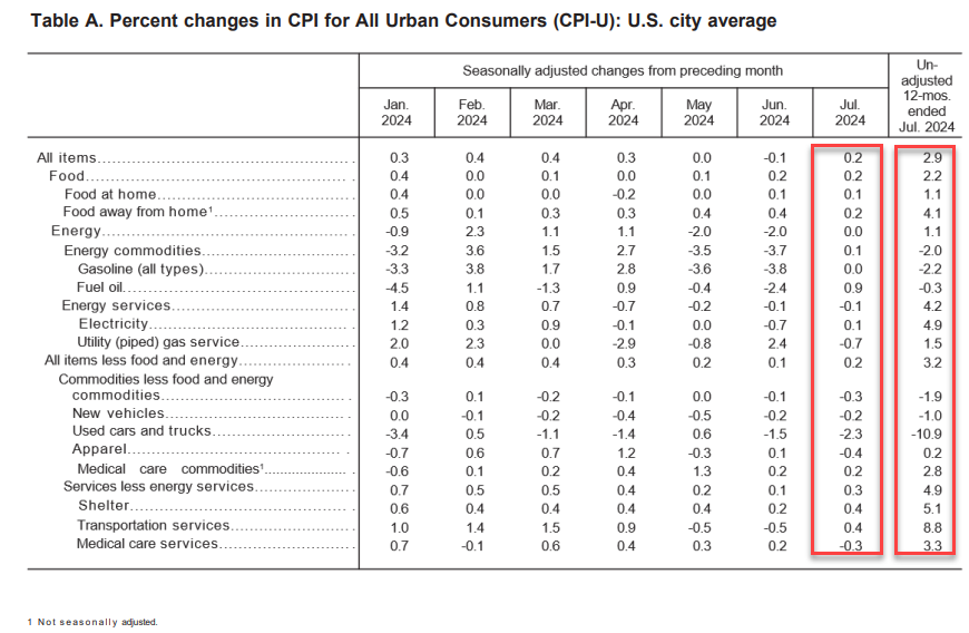
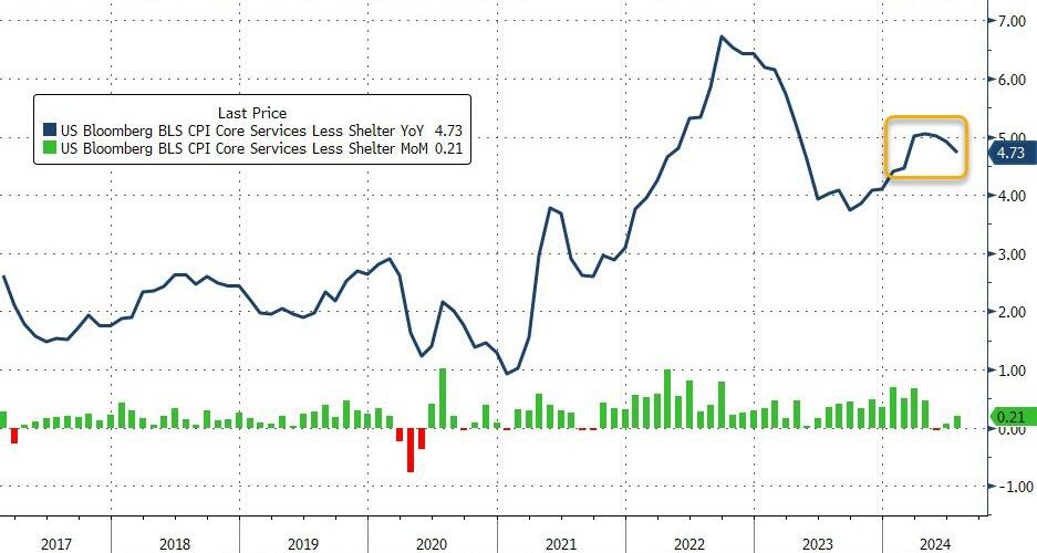
Combined Biden/Harris’ spending spree with The Fed’s monetary goonery and we got inflation (gasoline, food, shelter). With spiraling inflation in mortgage rates and shelter prices we saw a correponding decline in existing home sales under Biden/Harris.
Harris claims to lower prices on her first day in office (she has been in office as VP since 2021 and actually voted in the US Senate as tie breaker to enact policies that INCREASED Inflation). But her suggestion of $25,000 for ALL first time homebuyers is of course INFLATIONARY. And her anti-price gouging policies willl of course reduce supply of groceries avaiable, driving up INFLATION.
After watching the Democrat hate fest last night (Aka, the Democrat National Convention), I was not shocked that the DNC platform looked like a playbook to destroy the US economy. High taxes, endless spending, more regulations, etc. Not a word about the staggering side of the US debt load … with Harris’ economic plan projected to add a whopping $25 trillon in debt to the already massive $35+ trillion debt load.
And not a mention that US interest payments on the national debt already exceeds defense spending. And is booming!
Of course, Harris’s economic vision is a continutation of Biden’s disastrous visions (which are Obama’s vision of US obliteration). Most politicians in Congress are millionaires (including Bernie Sanders) and won’t suffer from their insane “progressive” policies. Watching last night’s DNC hatefest was like watching nasty 2nd graders having a party.
Of course, the drove of anti-American, anti-properity speakers spewing venom (I hate Hillary’s flat-tone speaking style) like Hillary, Jaime Raskin (aka, Rasputin), AOC, etc. all failed to acknowledge to acknowledge the already monstrous size of the US debt ($35+ trillion) or the massive size of the unfunded promises ($218+ TRILLION). Of course not.
The handle the staggering interest payments that will crowd out other spending, The Federal Reserve will be forced to lower rates.
Of course, Democrats will wheel out “economists” like Robert Reich who say that the debt doesn’t matter.
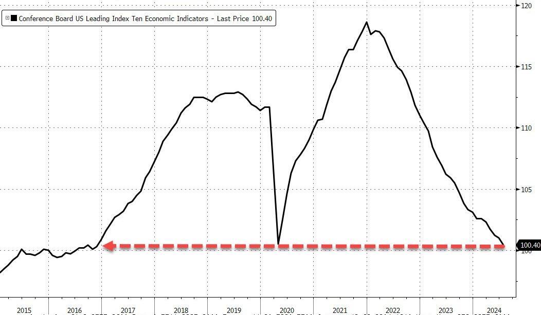
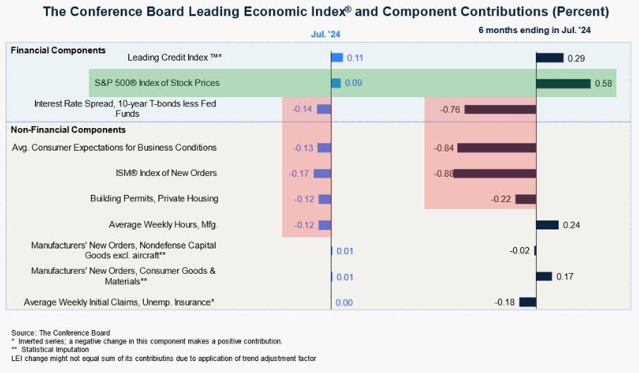
…and the head of The Conference Board says ‘nothing to see here’…
“The LEI continues to fall on a month-over-month basis, but the six-month annual growth rate no longer signals recession ahead,” said Justyna Zabinska-La Monica, Senior Manager, Business Cycle Indicators, at The Conference Board.
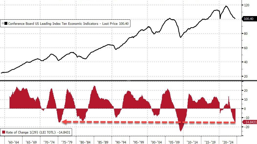
For context, outside of the great financial crisis, this is the worst decline in LEI since the mid ’70s!!!
And what is behind the ‘no recession’ call… US equity strength!!
Thank The Feral Reserve for the equity spike!
So, to summarize – almost all the macro data signals weakening growth for years… but because stocks are up (and credit spreads down), there’s no recession anywhere on the horizon!!??
Here is a breakdown of the annual cost of regulations:
And “China” Kamala (ChiKam) plans even MORE regulations!
Federal regulation’s total compliance costs and economic effects are at least $2.117 trillion annually in Ten Thousand Commandments’ estimate, and almost certainly higher.
An October 2023 National Association of Manufacturers (NAM) report models regulatory compliance at $3.079 trillion annually.
US households pay on average $15,788 annually in a hidden regulatory tax, which consumes 17 percent of income and 22 percent of household expenses.
These outlays exceed expenditures on health care, food, transportation, entertainment, apparel, services, and savings. Only the costs of housing, which stand at $24,298 annually, exceed regulation.
The higher NAM figure implies $22,962 per household, or 31 percent of the household expense budget.
The regulatory tax of $2.117 trillion rivals individual income tax costs estimated at $2.328 trillion for 2023 and stands at nearly four times the corporate income tax of $546 billion.
The NAM cost figure of $3.1 trillion annually would exceed the sum of both ($2.9 trillion).
If it were a country, US regulation would be the world’s 10th-largest economy, ranking behind Canada and ahead of Italy.
If we exclude the US economy from the list, the US regulation economy would be the ninth largest, still behind Canada and ahead of Italy.
The 10.34 billion hours Washington says it took to complete federal paperwork in 2022, according to the Information Collection Budget, translate to the equivalent of 14,883 human lifetimes.
The tally of final rules for 2023 stood at 3,018, which is the second-lowest count since at least 1976.
On the other hand, the Federal Register containing those rules surged to 89,368 pages, the second-highest tally on record and a 12 percent rise over 2022.
Although we have fewer new rules, they appear to be broader in scope.
During calendar year 2023, agencies issued 3,018 rules, whereas Congress enacted 68 laws. Thus, agencies issued 44 rules for every law enacted by Congress.
This Unconstitutionality Index—the ratio of regulations issued by agencies to laws passed by Congress and signed by the president—underlines how much agency lawmaking has replaced that of elected officials. The average ratio over the past 10 years is 23 rules for every law.
Since the Federal Register first began itemizing final rules in 1976, 217,565 have been issued. Since 1993, when the first edition of Ten Thousand Commandments appeared, agencies have issued 120,475 final rules.
A 2023 draft consolidated version of the White House Report to Congress on the Benefits and Costs of Federal Regulations caught up on fiscal years 2020–2022. The report for 2023 has still not been released.
A total of only 31 “major” rules had both benefits and costs quantified, and these add $13 billion to the annual regulatory cost bill; another 56 rules with costs but not benefits quantified add another $46 billion to annual costs.
Employing our lower estimate, regulatory burdens of $2.1 trillion amount to nearly 8 percent of US gross domestic product (GDP), reported by the Commerce Department at $27.36 trillion in 2023.
The NAM regulatory figure implies 11 percent of GDP.
Regulatory costs stand at over 60 percent of the level of corporate pretax profits of $3.523 trillion.
The NAM figure would take that to over 80 percent.
When regulatory costs of $2.1 trillion are combined with federal outlays of $6.135 trillion, the federal government’s share of the $27.36 trillion economy reaches at least 30 percent. State and local spending and regulation add to these costs.
Until April 2023, a subset of each year’s 3,000-plus rules was deemed economically significant, referring to annual economic effects of $100 million or more. Biden’s Executive Order 14094 (“Modernizing Regulatory Review”) eliminated that category and initiated a higher $200 million Section 3(f)(1) Significant category.
In the year-end 2023 edition of the twice-yearly Unified Agenda of Federal Regulatory and Deregulatory Actions, 69 federal departments, agencies, and commissions present 3,599 regulatory actions flowing through the pipeline as follows:
2,524 rules in the active (prerule, proposed, final) phase
431 recently completed rules
644 long-term rules
Of the 3,599 regulations in the fall 2023 Unified Agenda’s pipeline, 304 are Section 3(f)(1) Significant category rules (which implies at least $60 billion in economic impact), as follows:
233 rules in the active (prerule, proposed, final) phase
41 completed rules
30 long-term rules
Despite his own higher $200 million threshold, high-significance rules in the Biden pipeline outnumber the Bush, Obama, and Trump years when the lower $100 million threshold applied.
Major rules as defined in the Congressional Review Act leave a $100 million threshold intact despite Biden’s executive order. The Government Accountability Office database contains 76 finalized major rules for 2023. The Biden average exceeds those of Bush, Obama, and Trump.
Final rules affecting small business appear to be mounting and could generate calls for reform. Biden’s three years have averaged 870 rules annually in the Federal Register affecting small business, compared with 694 and 701 for Obama and Trump, respectively.
Of the 3,599 rules and regulations in the fall 2023 Unified Agenda pipeline, 690 affect small businesses; of those, 370 required an official “regulatory flexibility analysis.”
Biden-era mandates affect state and local governments at heights not seen in over a decade. Rules in the Unified Agenda pipeline affecting state governments stand at 507, while rules affecting local governments stand at 349.
The five most active rule-producing executive branch entities in the Unified Agenda—the departments of the Interior, the Treasury, Transportation, Commerce, and Health and Human Services—account for 1,497 rules, or 42 percent of all rules in the pipeline. The five most active independent agencies account for another 318 rules.
From the nation’s founding through 2022, more than 15,635 executive orders have been issued. Biden issued 24 executive orders in 2023, well below his peak 77 of 2021. Biden’s presidential memoranda continue to outstrip the average of recent predecessors.
Public notices in the Federal Register always exceed 22,000 annually, with uncounted guidance documents and other proclamations that hold potential regulatory effect among them, whereas other guidance documents issued do not appear in the Federal Register at all. In 2023, 23,197 notices were issued. There have been 714,563 public notices since 1994 and over a million since the 1970s.
DC bureaucrats are out of control. Treasury Secretary Yellen calls for $78 TRILLION to tackle climate change. So to quote The Carpenters, they’ve only just begun to regulate.


You must be logged in to post a comment.