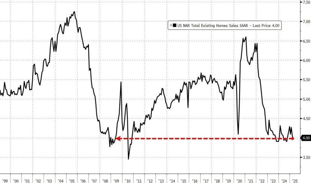
US existing home sales dropped 0.5% MoM in April (considerably worse than the +2.0% MoM rise expected), dropping to just 4.00MM sales SAAR, with sales down 3.1% from a year earlier on an unadjusted basis.
This is the weakest April sales pace since April 2009.
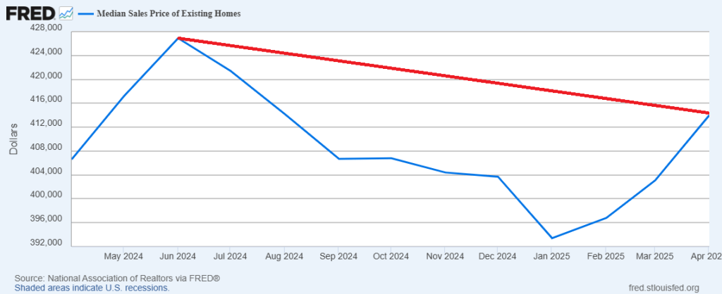
And median price of EHS is rising and is on pace to top 2024’s high.
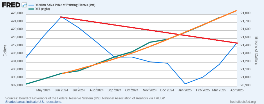
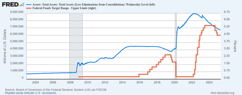
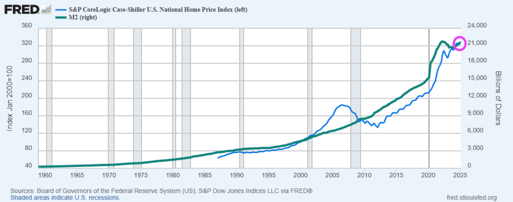
And with M2 Money printing like a bat out of hell.
Republicans are trying to lock in Trump’s tax cuts and Democrats are resisting. We now know that DOGE is trying to end the wasteful spending in DC. But I would really like to see tax rates on the middle class fall.
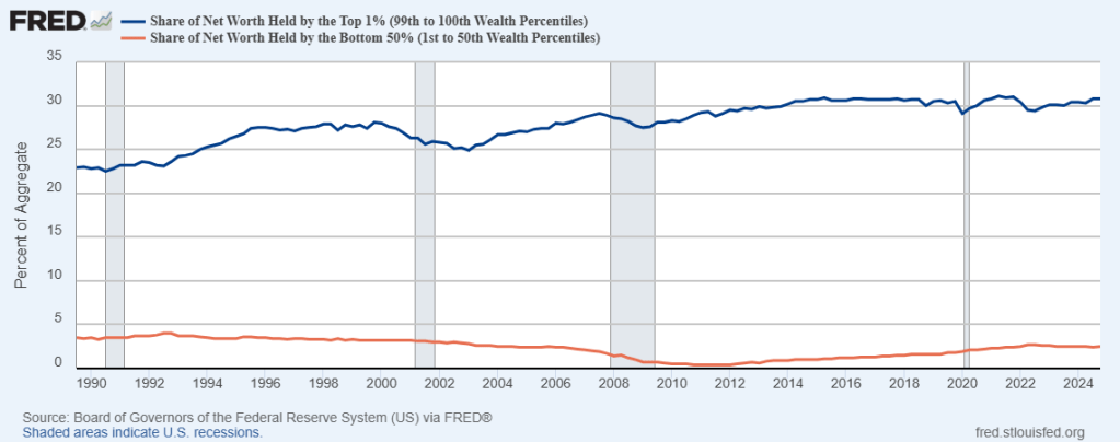
The wealth gap between the top 1% of taxpayers and the bottom 50% of taxpayers is enormous. And has gotten worse since 1990.
Meanwhile. to fight off the temporary effects of the tariff war, Trump is urging Fed Chair Powell to cut rates.
Powell will likely NOT cut rates. But what does “Lunatic Liz” Warren say about rate cuts??
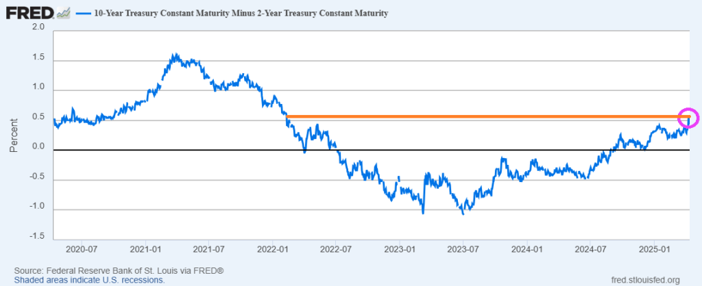
The good news? The US Treasury 10Y-2Y yield curve is normalizing to January 2022 levels.
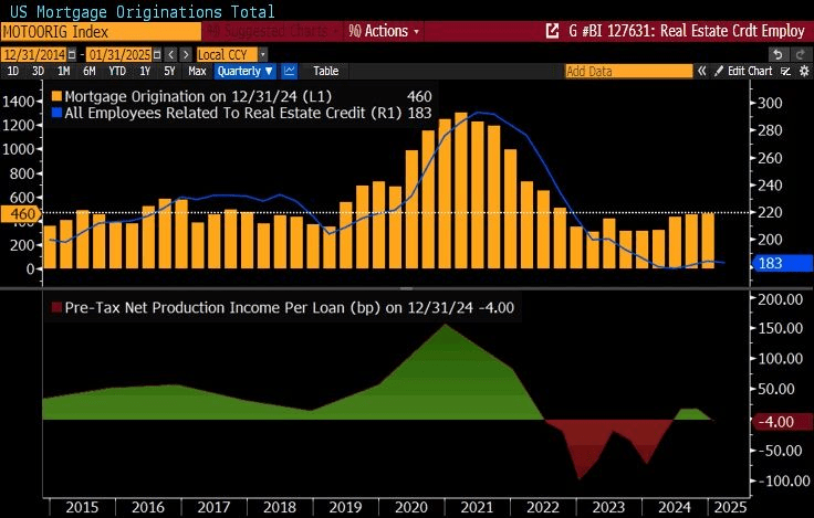
One the mortgage side, adjustable rate mortgage (ARM) share is the highest since the financial crisis (2008).
As Trump continues to stand up for Americans and China (and Democrats) continues to fight, the S&P 500 index lags MSCI World index by most since 1993 (The Clintons).
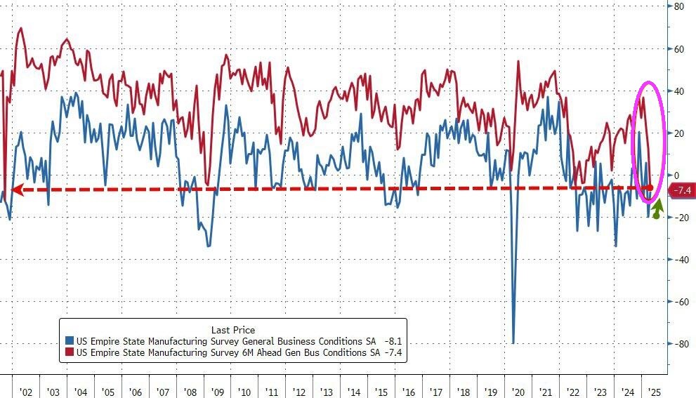
Despite the slump in ‘soft’ survey data, analysts expected Empire Fed Manufacturing to bounce back from March’s tumble to one year lows and they were right with the headline index rising from -20.0 to -8.1 (considerably better than the -13.5), but still negative. However, while current conditions jumped, expectations plunged to the lowest since 9/11/.
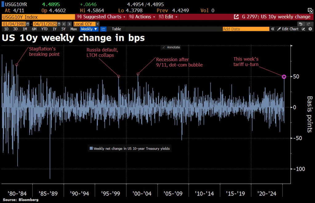
Thunderstruck! The tariff kerfuffle between the Trump Administration and China is causing turbulence in the Treasury market. The 10-year Treasury rate is soaring with China’s counterpunching.
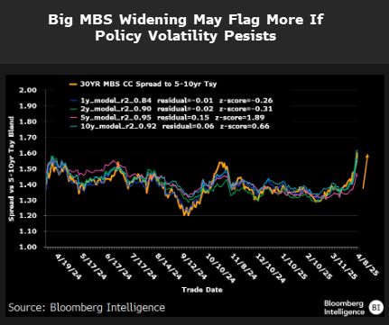
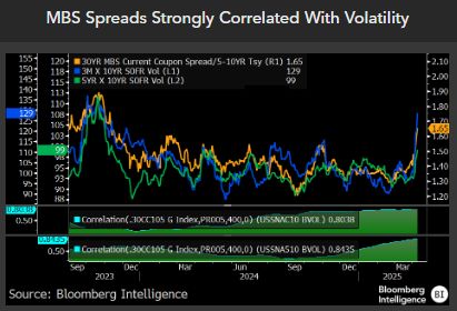
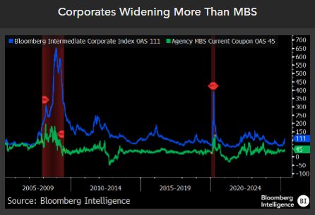
MBS spreads are widening.
Along with volatility.
But corporate spreads are widening more than MBS spreads.
The 10Y-2Y yield curve has risen to the highest level since the early days of “China Joe” Biden.
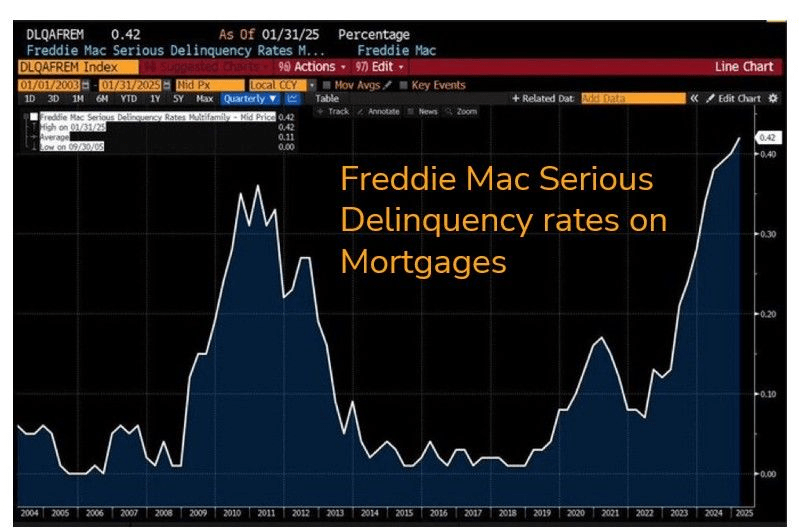
On a related note, Freddie Mac serious delinquency rates on mortgages is now the highest since the financial crisis.
Freddie Mac Serious Delinquency Rate on Multifamily (Apartment) loans soared to highest rate since 2000. Since it is as of January 31, 2025, you can’t blame this on Donald Trump (although I am sure they will try).
Of course, home prices and rents soared under Biden. Home prices rose 37% under Biden and rents rose 25%. Simply unaffordable.
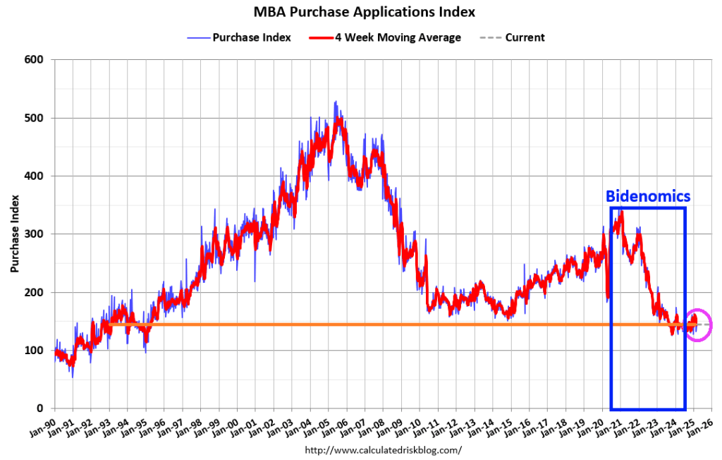
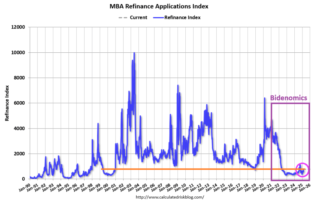
Mortgage applications increased 20.4 percent from one week earlier, according to data from the Mortgage Bankers Association’s (MBA) Weekly Mortgage Applications Survey for the week ending February 28, 2025.
The Market Composite Index, a measure of mortgage loan application volume, increased 20.4 percent on a seasonally adjusted basis from one week earlier. On an unadjusted basis, the Index increased 22 percent compared with the previous week. The seasonally adjusted Purchase Index increased 9 percent from one week earlier. The unadjusted Purchase Index increased 12 percent compared with the previous week and was 2 percent higher than the same week one year ago.
The Refinance Index increased 37 percent from the previous week and was 83 percent higher than the same week one year ago.
Thank God the adults are in charge in DC instead of the children we saw at Trump’s speech last night.
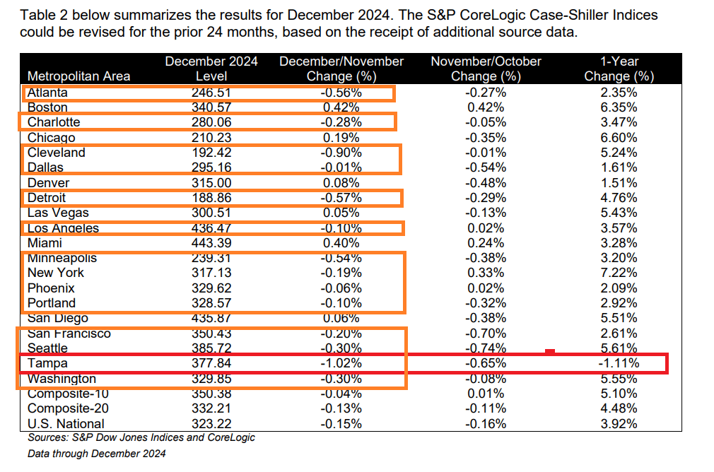
For the second straight month, US home prices accelerated YoY in December (according to the latest data from S&P Global’s Case-Shiller Index). The 20-City Composite saw prices jump 0.5% MoM (faster than expected and the biggest jump since June) and accelerating MoM for the 3rd straight month.
Only Tampa FLA of the top 20 metro areas had a negative YoY price change, but 14 of the top 20 metro areas experienced price declines from November to December: Atlanta, Charlotte, Cleveland, Dallas, Detroit, Los Angeles, Minneapolis, New York, Phoenix, Portland, San Francisco, Seattle, Tampa and Washington DC.
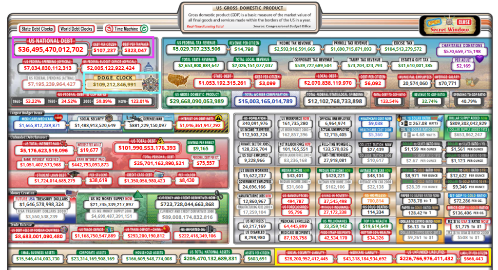
Janet Yelllen, the former Federal Reserve Chair and Treasury Secretary under clueless Joe Biden was a disaster in every respect. As Fed Chair, she was noteworthy for her clinging to low rates for too long. And as Treasury Secretary, she is noteworthy for her gross fiscal mismanagement (look at the deficit and debt crisis!). Now Zero Hedge has this disastrous report of $4.7 TRILLION in virtuallly untraceable Treasury payments.
The Elon Musk-led Department of Government Efficiency (DOGE) on Monday revealed its finding that $4.7 trillion in disbursements by the US Treasury are “almost impossible” to trace, thanks to a rampant disregard for the basic accounting practice of using of tracking codes when dishing out money.
With a debt load of $36.5 trillion and D.O.G.E. clock at $109 million and growing. Not to mention the $227 trillion in unfunded liabilities.
Mind you, it’s not as if such a federal tracking system wasn’t already in place— it simply went casually unused for all sorts of payouts adding up to an almost unfathomable $4.7 trillion. Without Treasury Access Symbol (TAS) identification codes associated with those payouts, there’s little hope in figuring out where all that money went.
“In the Federal Government, the TAS field was optional for ~$4.7 Trillion in payments and was often left blank, making traceability almost impossible,” DOGE announced via its X account. Thanks to DOGE, those “optional” days are over. “As of Saturday, this is now a required field, increasing insight into where money is actually going,” DOGE added.
DOGE’s scrutiny of various government agencies is eliciting high-pitched shrieks from nearly every leftist in America, from establishment politicians who don’t want the curtain that hides their hijinks and grifting torn down, to your liberal sister-in-law who thinks the government has an endless supply of money and that it spends it all virtuously.
Earlier this month, Treasury Secretary Scott Bessent pushed back on portrayals of DOGE employees as reckless rogues. “These are highly trained professionals,” he told Bloomberg. “This is not some roving band going around doing things. This is methodical and it is going to yield big savings.”
In the wake of the latest revelation that makes normal people glad that DOGE teams are scouring the federal government, Democrats desperately tried to find a way to make it sound bad that DOGE exposed trillions in untraceable payouts and promptly instituted tighter accounting discipline.
Meanwhile, leftists have also been foaming at the mouth over news that DOGE staffers are looking into the Social Security Administration’s (SSA) books, as if they were going to start rerouting funds to Tesla. Considering Social Security is careening toward mandatory benefit cuts as soon as 2033, everyone should welcome a team of financial professionals making sure the system isn’t being drained by improper payments.
Of course, that appears to be exactly what’s been happening. On Sunday night, Musk said DOGE might be on the trail of “the biggest fraud in history,” as SSA data appears to show that 20.789 million Americans over the age of 100 are collecting Social Security retirement benefits. That includes 12 million who are purportedly over 120 years old.
Bent on derailing DOGE, Democrats have sued to prevent the organization from accessing federal data associated with the Office of Personnel Management, and the Health and Human Services, Education, Energy, Transportation, Labor and Commerce departments. On Monday, the federal judge handling the request for a restraining order expressed skepticism over Democrats’ challenge, noting that their “evidence” was largely media speculation about potential harms springing from DOGE’s activities: “The courts can’t act based on media reports. We can’t do that.“
A ruling is expected Tuesday. Here’s looking forward to DOGE proceeding to uncover a relentless string of scandals for months and months to come.


You must be logged in to post a comment.