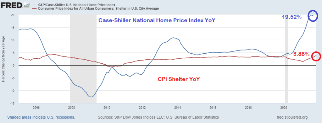
But that 6.9% YoY is very misleading because of the strange way the Bureau of Labor Statistics measures the largest asset in most households’ expenditures: housing.
The BLS measures inflation in housing using the Shelter measurement. Which was only 3.88% YoY. The problem is that the Case-Shiller National Home Price Index was 19.52% in its last reading. That is quite a discrepancy.
So, if we substitute the Case-Shiller National home price index for the CPI Shelter, we get an inflation rate of greater than 11%.
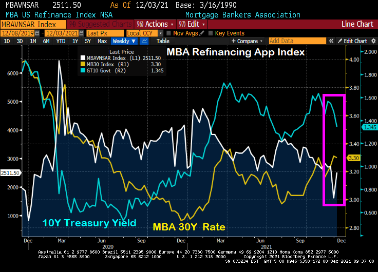
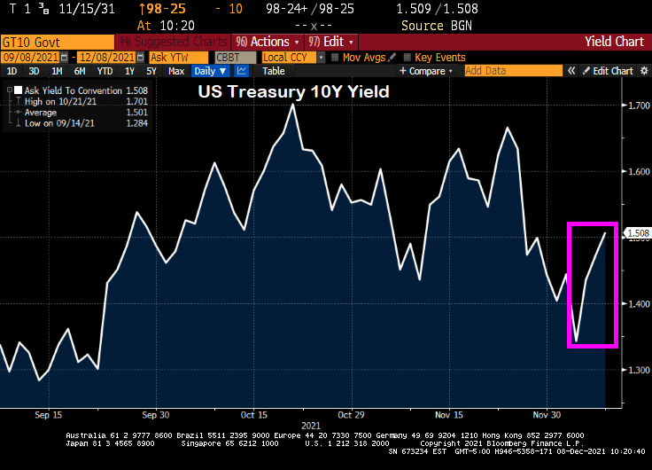
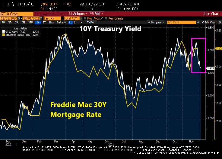
Despite the “Talk, Talk” from The Federal Reserve about balance sheet taper and rate “normalization,” we actually saw the 10-year Treasury yield fall from 1.6651% on 11/23/2021 to 1.343 on 12/3/2021. While the 30-year mortgage rate only fell from 3.31% to 3.3%, it is the SIGNAL that The Fed is sending that people should refinance their mortgages ASAP.
You can see the rise in mortgage refinancing applications of 56% week-over-week (WoW) (white line) with the drop in the 10-year Treasury yield (blue line) despite the relatively small drop in the Mortgage Bankers Association (MBA) tiny drop in their 30-year mortgage rate index.
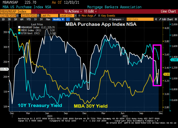
Ditto for the MBA mortgage purchase application index. The drop in the US Treasury yield (blue line) resulted in a 28% WoW increase in mortgage purchase applications.
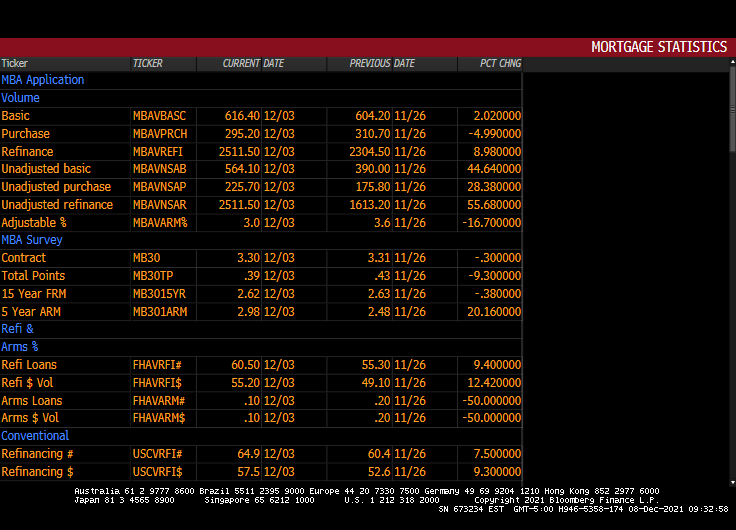
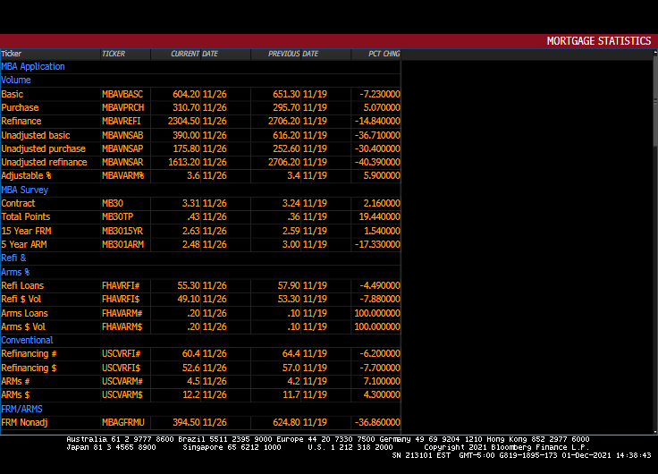
Here is the table of MBA data for the week of 12/03.
Please note that the 10-year Treasury yield have jumped since 12/03 indicating that mortgage application activity for the week of 12/10 will be lower.
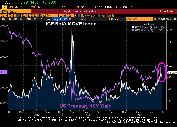
Here is the MOVE bond volatility index and the US Treasury 10-yield chart. Can you spot the COVID outbreak??
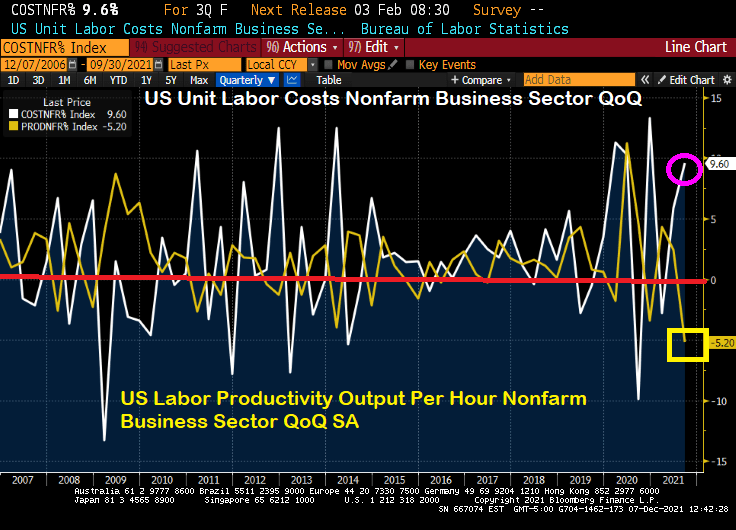
If this what the Biden Administration had in mind? Soaring labor costs at the same time that labor productivity is falling to its lowest level since 1960?
Powell and the Gang’s monetary approach doesn’t seem to be working for the labor market …
Its that time of year for mortgage purchases applications! Purchase applications usually decline during December and start to rise after the beginning of the year.
Mortgage purchase applications (white line) dropped -30.4% from the previous week, not usual for December. But what is surprising is the drop in REFINANCING applications: down -40.3% from the previous week.
30-year mortgage rates rose 2.16% from the previous week.
But between Omicron (or as the French say, “Oh! Macron!”) and The Federal Reserve, there is a good chance that mortgage rates will fall this week putting a quick end to refi application plunge.
Purchase applications? Nope, it is that time of the season when purchase applications drop like a rock.
Renters in the US are getting clobbered by inflation.
The US Zillow Rent Index All Homes YoY + CPI YoY is one measure of renter misery.
The classic misery index (CPI YoY + U-3 unemployment rate) is 10.80%.
Then there is inflation in food prices, gasoline, heating oil, natural gas, etc.
While Biden is releasing the Strategic Petroleum Reserves (SPR) in order to mitigate the problem that he created by terminating the energy pipelines and oil/natural gas drilling permits in the name of “Going Green!” But on the announcement of tapping the SPR, crude oil futures actually rose.
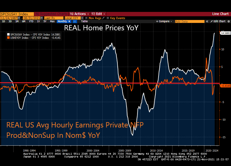
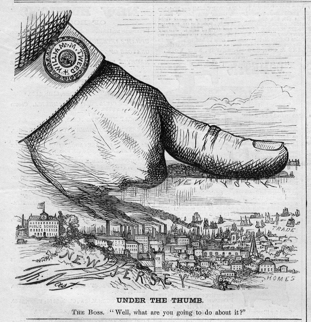
Welcome to The Fed’s Gilded Age … for housing! The gilded age refers to the thin-veneer of gold covering up problems in the late 1800s.
Today’s gilded age is largely fueled by The Federal Reserve’s uber-easy monetary policies combined with absurd Federal government policies. The result? Thanks to inflation, REAL home prices are growing at 14.6% YoY while REAL hourly earnings are declining (-0.41% YoY).
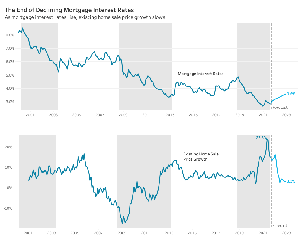
Redfin predicts a more balanced housing market in 2022. Part of their rationale is that they predict mortgage rates will rise to 3.6%. This growth in the mortgage rate is predicted to slow home price growth to 3.2% from double digit growth currently.
While this scenario is plausible, it will require a change in direction of the 10-year Treasury yield which has been declining since 1981. 5.39% YoY inflation may encourage The Fed to raise rates.
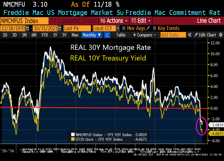
Today’s REAL 30-year mortgage rate is -3.08% while the REAL 10-year Treasury yield is -4.67%. It will require a reduction in inflation AND an increase in the nominal rate to get to 3.6%.
With the Freddie Mac 30-year survey rate at 3.10, will a 50 basis point increase in mortgage rates send the market crashing? Not likely.
After all, the US economy is under the thumb of The Federal Reserve.
The Marty Stuart/Travis Tritt song “This One’s Gonna Hurt You (For A Long, Long Time)” seems appropriate for the plight of the middle and lower income classes in the face of high inflation. How do you spell the combination of President Biden’s policies and The Fed’s inaction on inflation? T-R-O-U-B-L-E … for the middle and lower income classes.
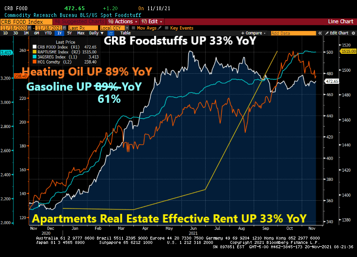
Over the past year, since the election of Joe Biden, the household consumption bundle (food, rent, heating, gasoline) have all risen dramatically in terms of prices. Food is up 33%, heating oil is up 89%, regular gasoline is up 61%, and effective apartment rents are up 33%.
Meanwhile, the 1% are sitting high on a mountain top obvious to the pain caused by The Federal Reserve and Biden Administration. Here is the growth in wealth by the 1% since the housing bubble burst and financial crisis compared with the bottom 50%.
A problem facing renters is the rapid growth of home prices particularly since the COVID epidemic. At least M2 Money has “slowed” to 12.80% YoY while home prices are raging at almost 20% YoY. But hopefully home price growth will slow with declining M2 growth.
Compendium of Fed Chair Jerome Powell and President Biden on vacation.
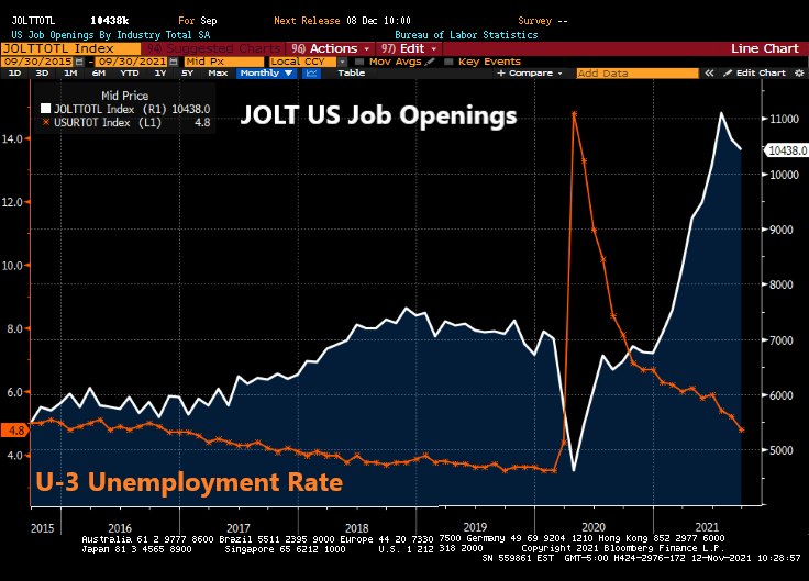
The Federal Reserve continues to JOLT markets with excessive monetary stimulus despite numerous reasons why they should back off.
For example, today’s JOLT report (US job openings) revealed that 10.4 million jobs were open in September. This is the fourth consecutive month of 1 million plus job openings, yet The Fed refuses to raise their target rate.
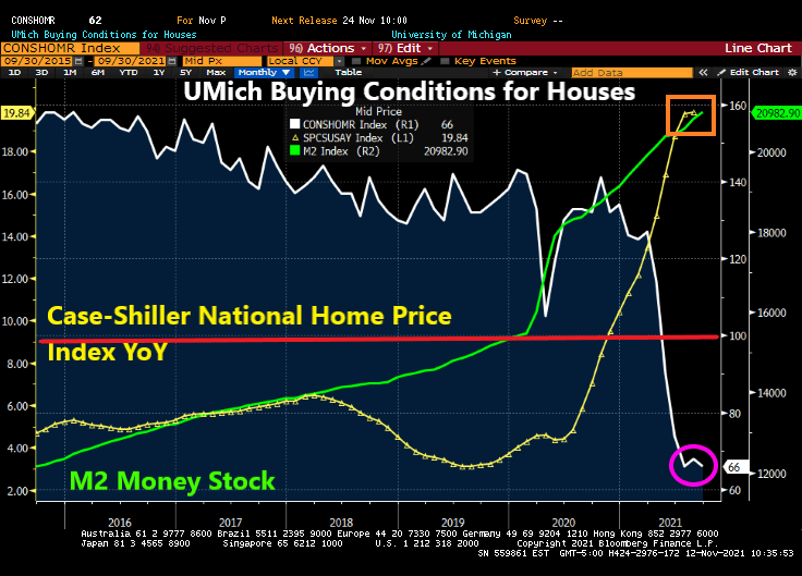
At the same time, the University of Michigan survey revealed that buying conditions for houses dropped to 66 (baseline of 100). To show how bad this is, buying conditions for houses was at 144 this time last year.
UPDATE: UMich revised their number downward to 62, the lowest since 1981.
In The Fed’s mind, they are still chasing at least 3.5% unemployment, the lowest rate under President Trump prior to COVID. But with perpetual million plus job openings GOING UNFILLED, trying to get to pre-COVID unemployment rate of 3.5% is a fool’s errand.
Of course, with The Fed helping to pump up house prices to largely unaffordable levels, it makes sense that enthusiasm for buying expensive homes has crashed.
Meanwhile, The Fed continues to JOLT the economy with excess stimulus.
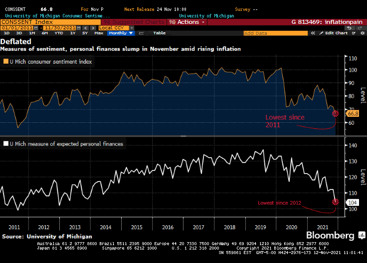
Overall inflation fears are leading to lowest consumer confidence since 2011.
Federal Reserve Chair Jerome Powell sounded a note of heightened concern over persistently high inflation as he made clear that the central bank will begin tapering its bond purchases shortly but remain patient on raising interest rates.
“The risks are clearly now to longer and more persistent bottlenecks, and thus to higher inflation,” Powell said Friday during a virtual panel discussion hosted by the South African Reserve Bank and moderated by Bloomberg’s Francine Lacqua.
“I would say our policy is well-positioned to manage a range of plausible outcomes,” he said. “I do think it’s time to taper and I don’t think it’s time to raise rates.”
Good luck with that, Jay! You are going to raise the short-end of the yield that will lead to a flattening of the Treasury yield curve. But you are going to continue to buy Treasuries and Agency MBS in order to monetize the rampant spending by Congress and the Biden Administration? C’mon man!
You can see where Powell spoke today. It is when gold tanked along with the 10-year Treasury yield. Both rebounded a bit, but the 10-year Treasury yield continue its fall to 1.6324%.
The US dollar (green) fell when Powell opened his pie-hole. But Bitcoin (blue) fell in advance as if they knew what Powell was going to say.
I remember my academic colleague at The Ohio State University (now at Notre Dame), Paul Schultz saying “Why do you find fixed-income and the yield curve interesting?” I have always found the yield curve to be interesting … at least until The Federal Reserve hammered down the short-end with it zero-interest rate policy (ZIRP) and tried manipulating the 10-year Treasury Note yield through Quantitative Easing (QE) meaning The Fed’s purchase of Treasuries and Agency Mortgage-backed Securities (MBS). No, I still think the manipulated yield curve is interesting.
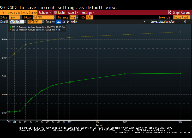
Here is today’s Treasury actives curve (green) versus the yield curve at the peak of the previous housing bubble in 2005 yellow). That is a 300 basis point shift as the short-end. And a 243 basis point shift for the 10-year Treasury Note.
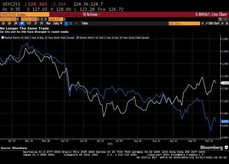
(Bloomberg) — The yield curve is one of the most-powerful forces in the observable financial universe. While much of the price action that we see on a day-to-day basis may be driven by some sort of dark energy, the curve provides a highly visible lodestone indicating the state of policy settings and the likely trajectory of the economy. That being said, the curve is often misunderstood — a bear flattening often produces plenty of hand-wringing, when it’s the bull steepening that you should really worry about. In fact, referring to “the curve” itself is something of a misnomer — while different iterations of the yield curve often travel in tandem, sometimes their paths diverge. That has been the case recently, though perhaps not for much longer. The recent rise in two-year yields looks more than justified, as various fixed income models demonstrate in a roundabout way.
For the past year and a half or so, most of the focus on the yield curve in this column has been on the 5s-30s iteration. The rationale for this has been relatively straightforward: With the Fed funds rate locked in near zero for the foreseeable future, the two-year note has been moribund. As such, 2s-10s has really just been another articulation of the 10-year yield. And much like recent price action vis-a-vis my 10-year model, the curve briefly traded where it “ought” to in March before once again becoming too flat in recent months.
At least 5s-30s has had the benefit of containing a useful forward-looking component on both legs of the spread. Yet even as I type that, it is interesting to note that 2s-10s and 5s-30s exhibited virtually identical price action at virtually identical levels earlier this year. While they remain positively correlated, of course, a clear wedge has emerged between the two curves as five-year yields have broken decisively through 1%, pricing greater conviction that a monetary tightening cycle will fully emerge over the next half-decade.
Yet I am left to wonder about the two-year note. The eurodollar strip is pricing that the bulk of monetary tightening will come by the end of 2023, a period that’s now largely captured by the shortest-maturity coupon security. To be sure, the appropriate level for 2s is a function not only of the ultimate magnitude of monetary tightening, but when it begins. After all, a 150 bp hike in Q4 of 2023 carries very different implications for the current two-year note than a 25 bp rate rise every three months from Q3 of next year onwards.
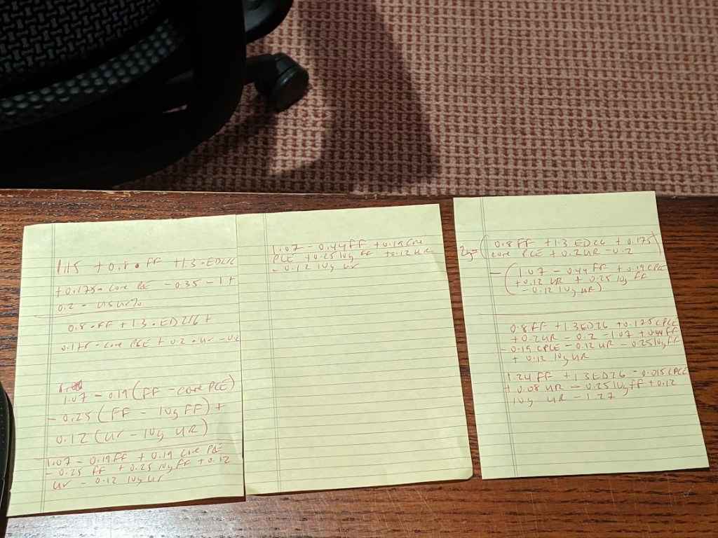
It occurred to me that I could back out a model for two-year yields by simply subtracting the output of my yield curve model from that of the 10-year model. I had no real idea of what to expect from this exercise, but even with the proviso that short-end yields rarely stray too far from the policy rate, I was pleasantly surprised at how close the fit is from this “derivative” model for the two-year.
The question then arose, naturally, of what actually went into the calculation of this “model.” After all, knowing the formulae of the two constituent models — for the 10-year and the yield curve– should allow for the distillation of a separate equation for the two-year note. Because that sort of thing is more fun than unpacking more boxes, that’s how I spent a few minutes on Wednesday night. The outcome isn’t necessarily an optimal model for the two-year, but more of an accidental one.
A bit of high school algebra
For what it’s worth, the resultant formula is 2y = 1.24 * FDTR + 1.3 * (ED2 – ED6) -0.015 PCE CYOY + 0.08 * USURTOT – 0.25 * (10y average of FDTR) + 0.12 * (10y average of USURTOT) – 1.27. I am pretty sure that one could get similar results with a simpler framework; the notion that a 2% rise in core inflation is worth just 3 bps on the two-year yield, all else being equal, leaves me simultaneously amused and bemused.
What does seem evident, however, is that henceforth there is going to be considerably more signal generated from two-year yields than has been the case in recent quarters. As such, 2s-10s are going to be worth following again, just as much if not more than 5s-30s. Both nominal yields and the curves are clearly constrained by the notion that all of this inflation kerfuffle really is transitory at its heart, and that, with r* remaining in the gutter, the long-run lid on nominal policy rates is going to be extraordinarily low.
That’s probably as good a null hypothesis as any, and possibly better than most. That being said, if we’re still having a lot of the same inflation conversations a year from now, we’re gonna need a long hard think about whether some of the post-GFC lessons need to be unlearned. In the meantime, at least fixed income is interesting again. I wonder where the yield curve and the model will eventually meet up to shake hands again… -Cameron Crise
The yield curve will become more interesting if Powell and The Gang take their foot off the monetary accelerator pedal.


You must be logged in to post a comment.