US pending home sales declined -2.3% MoM and -7.19% YoY as US GDP sinks like a paralyzed falcon,
(Bloomberg) — The National Association of Realtors’ index of pending home sales decreased 2.3% in September from a month earlier to 116.7, largest drop since April, according to data released Thursday.
The median estimate ina Bloomberg survey of economists called for a 0.5% advance.
Compared with a year earlier, contract signings were down 7.2% onan unadjusted basis”
Forecast range from -4.6% to 4.5% from 30 economists surveyed
Signings declined in all four U.S. regions from the prior month, led by a 3.5% drop in the Midwest Unlike existing-home sales, which are calculated when a contract closes, the index of pending home sales is based on contract signings
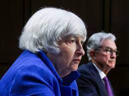
Treasury Secretary Janet Yellen: “What, me worry?”
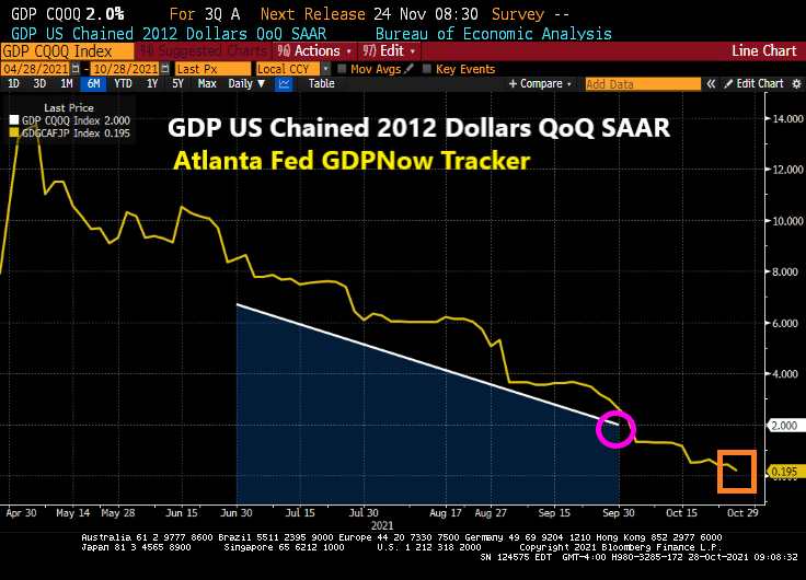
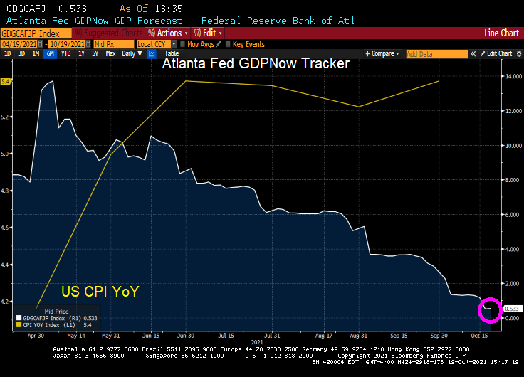
Despite the staggering and unorthodox monetary stimulus from The Federal Reserve, US real GDP continues to fall. The Q3 real GDP report is out and real GDP QoQ fell to 2%. Not surprising given that the Atlanta Fed’s GDPNow tracker is at a dismal 0.195% and falling.
The culprit? Personal consumption fell to 1.6% in Q3 after hitting 12% in Q2.
The GDP price index actually declined slightly from 6.1% to 5.7%.
Of course, Bloomberg blames the decline in GDP on supply constraints … which were created by The Fed and Federal government dumping trillions of dollars of stimulus. While the monetary stimulus is still raging, Federal government stimulus has worn out. To paraphrase BB King, “The fiscal stimulus is gone.”
Yes, The Federal Reserve and the Federal government reacted insanely to the Covid crisis and created a total mess (including ill-advised government lockdowns of the economy, stimulus to households who already were employed, etc.)
Bloomberg News headline of “U.S. Posts Weakest Growth of Pandemic Recovery on Supply Woes” misses the point that The Fed and Federal Reserve CAUSED the supply woes. It reminds me of an episode from the British comedy series “Blackadder” with Rowan Atkinson, Hugh Laurie and Stephen Fry.
General Melchett: [explaining why they can’t rescue Captain Blackadder] Now George, you remember when I came down to visit you when you were a nipper, for your sixth birthday? You used to have a lovely little rabbit, beautiful little thing, do you remember?
Lieutenant George: Flossie.
General Melchett: That’s right, Flossie! Do you remember what happened to Flossie?
Lieutenant George: You shot him.
General Melchett: That’s right! It was the kindest thing to do after he’d been run over by that car.
Lieutenant George: By *your* car, sir.
General Melchett: Yes, by my car. But that, too, was an act of mercy when you remember that that dog had been set on him.
Lieutenant George: *Your* dog, sir.
General Melchett: Yes, yes, my dog. But what I’m trying to say, George, is that the state young Flossie was in after we’d scraped him off my front tyre, is very much the state that young Blackadder will be in now: if not very nearly dead, then very actually dead!
US new home sales rose a whopping 14% in September as the median price of new home sales rose 20.1%.
Existing home sales still remain low allowing median prices to soar with Fed money printing.
New home sales surged as The Fed turns a blind eye to out-of-control inflation in prices.
Thanks to The Fed, new homes under $150,000 have disappeared and new homes over $500,000 have grown to 31% of all new homes. Where have all the starter homes gone?
Between Fed stimulypto and massive over-spending by Congress and the Biden Administration, the economic system is clogged like an interstate toilet, driving construction prices soaring.
Apparently Fed Chair Jerome Powell and Treasury Secretary Janet Yellen have never experienced clogged plumbing in their homes. And President Joe Biden has probably forgotten.
I can’t wait to hear if Biden’s press secretary Jen Psnarki attempts to put a positive spin on this debacle.
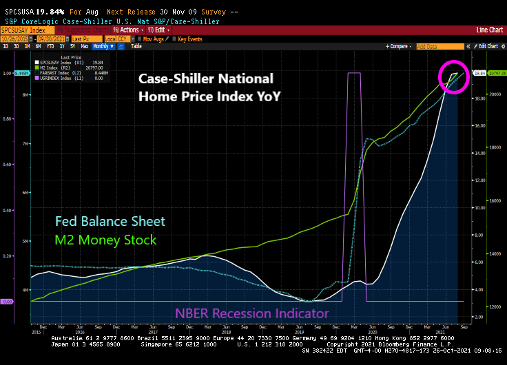
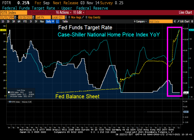
Between The Federal Reserve’s unorthodox monetary policy and insane spending from Congress and Biden Administration, we are seeing a near 20% rise in home prices for August.
Please note that pre-COVID the Case-Shiller home price index (national) was growing at 4%. Thanks to Fed Stimulypto, home prices are roaring at near 20% YoY.
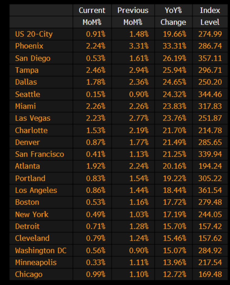
Phoenix AZ home prices are growing at a 33.31% pace. The slowest growing? The US “shoot ’em up” capital, Chicago, is growing at 12.72% and is the slowest growing Case-Shiller 20 city.
I feel like I am living in the movie “Cloverfield” with The Federal Reserve as the uncontrollable monster.
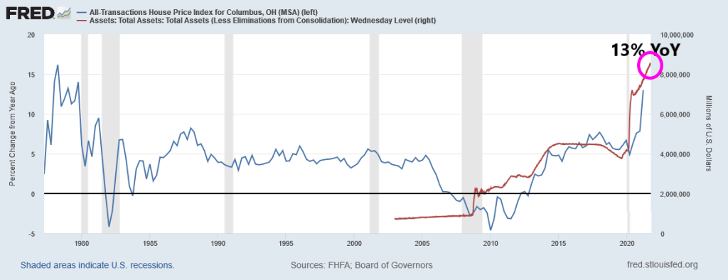
UPDATE: Columbus Ohio as of Q2 2021 is growing at a 13% YoY pace.
https://www.redfin.com/news/housing-market-update-pending-sales-up-47pct-from-2019/According to Redfin, forty-four percent more homes are pending sale than at this time in 2019, but only 3% more homes recently hit the market—down from 12% growth over 2019 just 7 weeks prior. As a result of the severe imbalance between the number of homes for sale and the number of buyers, the pace of the market is picking up at a time when it typically slows. A third of homes are finding buyers within a week of hitting the market, up from 30.8% at the end of the summer. This week, we’re comparing today’s market with the pre-pandemic fall market of 2019 to highlight how hot the market remains, even as most measures are settling into typical seasonal patterns.
“Comparing today’s sales and new listings numbers to the 2019 levels helps to reveal the stark shortage of supply we are facing,” said Redfin Deputy Chief Economist Taylor Marr. “The boost of housing supply that came on the market during the summer has already faded away, even as demand tapers off as we expected it to in the fall. Relative to the last ‘typical’ fall of 2019, demand remains steady and strong thanks to the increased urgency many buyers have as mortgage rates inch up. Rising rates also make buyers more price sensitive, so homes that are priced right are increasingly likely to receive offers right away.”
Shortage of supply, indeed. It is a mystery to me why the supply of homes for sale is not matching the demand.
But what happened after 2019? COVID and the entrance of massive Federal Reserve and Federal government stimulus. With limited supply hitting the market, home prices soared with the government stimulus.
We are likely to see rising prices until Federal Stimulypto stops or at least slows.
I remember my academic colleague at The Ohio State University (now at Notre Dame), Paul Schultz saying “Why do you find fixed-income and the yield curve interesting?” I have always found the yield curve to be interesting … at least until The Federal Reserve hammered down the short-end with it zero-interest rate policy (ZIRP) and tried manipulating the 10-year Treasury Note yield through Quantitative Easing (QE) meaning The Fed’s purchase of Treasuries and Agency Mortgage-backed Securities (MBS). No, I still think the manipulated yield curve is interesting.
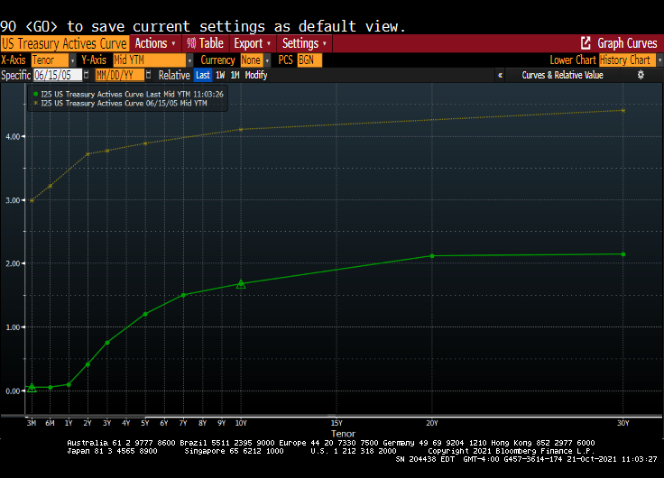
Here is today’s Treasury actives curve (green) versus the yield curve at the peak of the previous housing bubble in 2005 yellow). That is a 300 basis point shift as the short-end. And a 243 basis point shift for the 10-year Treasury Note.
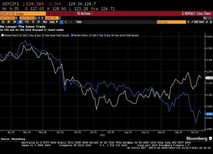
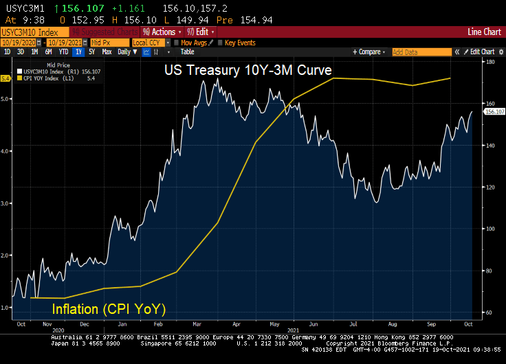
(Bloomberg) — The yield curve is one of the most-powerful forces in the observable financial universe. While much of the price action that we see on a day-to-day basis may be driven by some sort of dark energy, the curve provides a highly visible lodestone indicating the state of policy settings and the likely trajectory of the economy. That being said, the curve is often misunderstood — a bear flattening often produces plenty of hand-wringing, when it’s the bull steepening that you should really worry about. In fact, referring to “the curve” itself is something of a misnomer — while different iterations of the yield curve often travel in tandem, sometimes their paths diverge. That has been the case recently, though perhaps not for much longer. The recent rise in two-year yields looks more than justified, as various fixed income models demonstrate in a roundabout way.
For the past year and a half or so, most of the focus on the yield curve in this column has been on the 5s-30s iteration. The rationale for this has been relatively straightforward: With the Fed funds rate locked in near zero for the foreseeable future, the two-year note has been moribund. As such, 2s-10s has really just been another articulation of the 10-year yield. And much like recent price action vis-a-vis my 10-year model, the curve briefly traded where it “ought” to in March before once again becoming too flat in recent months.
At least 5s-30s has had the benefit of containing a useful forward-looking component on both legs of the spread. Yet even as I type that, it is interesting to note that 2s-10s and 5s-30s exhibited virtually identical price action at virtually identical levels earlier this year. While they remain positively correlated, of course, a clear wedge has emerged between the two curves as five-year yields have broken decisively through 1%, pricing greater conviction that a monetary tightening cycle will fully emerge over the next half-decade.
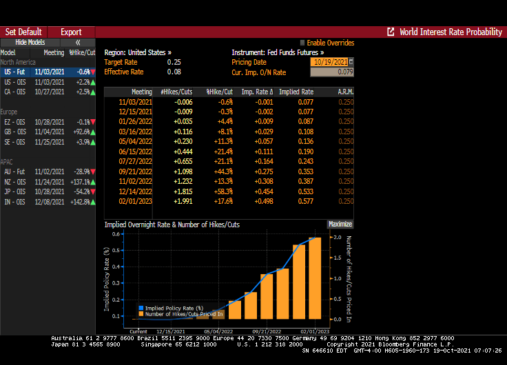
Yet I am left to wonder about the two-year note. The eurodollar strip is pricing that the bulk of monetary tightening will come by the end of 2023, a period that’s now largely captured by the shortest-maturity coupon security. To be sure, the appropriate level for 2s is a function not only of the ultimate magnitude of monetary tightening, but when it begins. After all, a 150 bp hike in Q4 of 2023 carries very different implications for the current two-year note than a 25 bp rate rise every three months from Q3 of next year onwards.
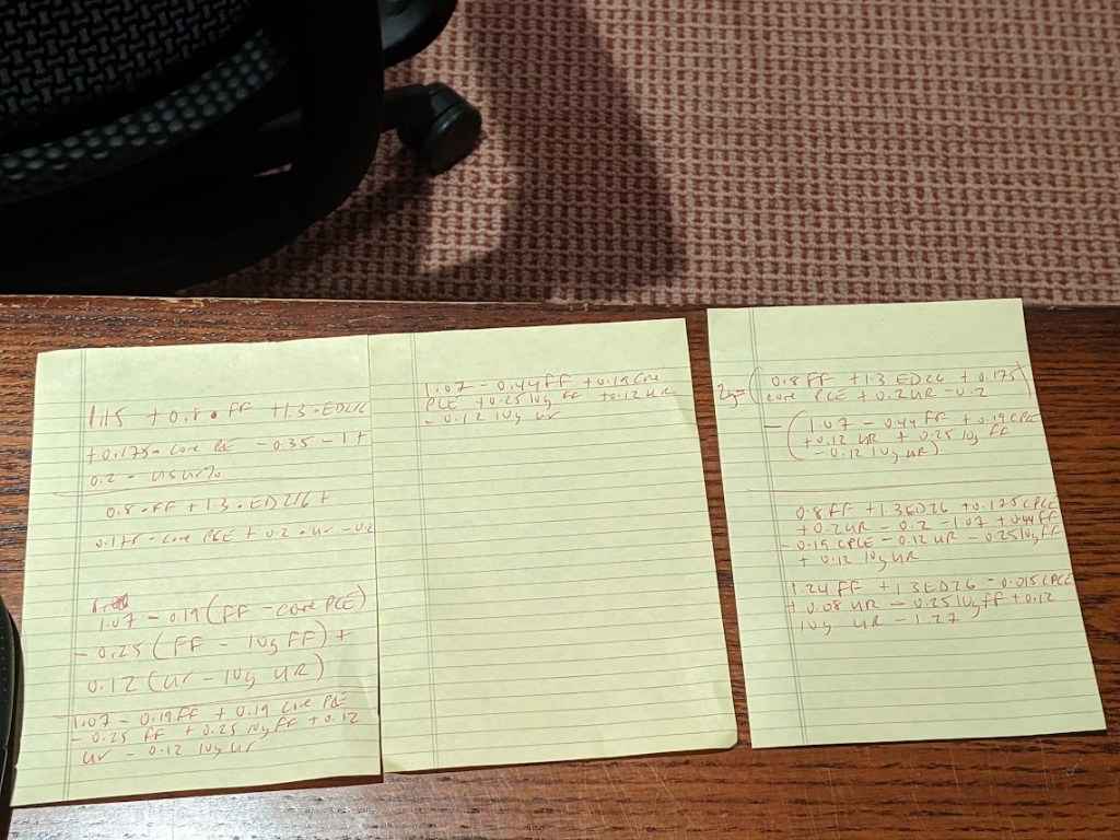
It occurred to me that I could back out a model for two-year yields by simply subtracting the output of my yield curve model from that of the 10-year model. I had no real idea of what to expect from this exercise, but even with the proviso that short-end yields rarely stray too far from the policy rate, I was pleasantly surprised at how close the fit is from this “derivative” model for the two-year.
The question then arose, naturally, of what actually went into the calculation of this “model.” After all, knowing the formulae of the two constituent models — for the 10-year and the yield curve– should allow for the distillation of a separate equation for the two-year note. Because that sort of thing is more fun than unpacking more boxes, that’s how I spent a few minutes on Wednesday night. The outcome isn’t necessarily an optimal model for the two-year, but more of an accidental one.
A bit of high school algebra
For what it’s worth, the resultant formula is 2y = 1.24 * FDTR + 1.3 * (ED2 – ED6) -0.015 PCE CYOY + 0.08 * USURTOT – 0.25 * (10y average of FDTR) + 0.12 * (10y average of USURTOT) – 1.27. I am pretty sure that one could get similar results with a simpler framework; the notion that a 2% rise in core inflation is worth just 3 bps on the two-year yield, all else being equal, leaves me simultaneously amused and bemused.
What does seem evident, however, is that henceforth there is going to be considerably more signal generated from two-year yields than has been the case in recent quarters. As such, 2s-10s are going to be worth following again, just as much if not more than 5s-30s. Both nominal yields and the curves are clearly constrained by the notion that all of this inflation kerfuffle really is transitory at its heart, and that, with r* remaining in the gutter, the long-run lid on nominal policy rates is going to be extraordinarily low.
That’s probably as good a null hypothesis as any, and possibly better than most. That being said, if we’re still having a lot of the same inflation conversations a year from now, we’re gonna need a long hard think about whether some of the post-GFC lessons need to be unlearned. In the meantime, at least fixed income is interesting again. I wonder where the yield curve and the model will eventually meet up to shake hands again… -Cameron Crise
The yield curve will become more interesting if Powell and The Gang take their foot off the monetary accelerator pedal.
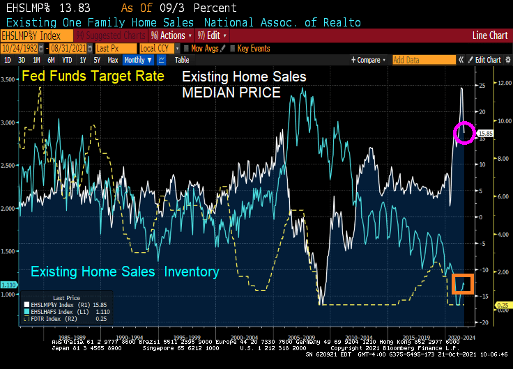
It was a surprise to see 6.29 million home sold SAAR in September. That is a 7% MoM growth rate.
The median price of existing home sales GROWTH slowed to 15.85% YoY (it was over 24% for the last two months).
And INVENTORY of existing homes for sale remains MIA.
Perhaps President Biden can issue an executive order forcing households to place their homes up for sale if they refuse to get vaccinated for Covid. /sarc
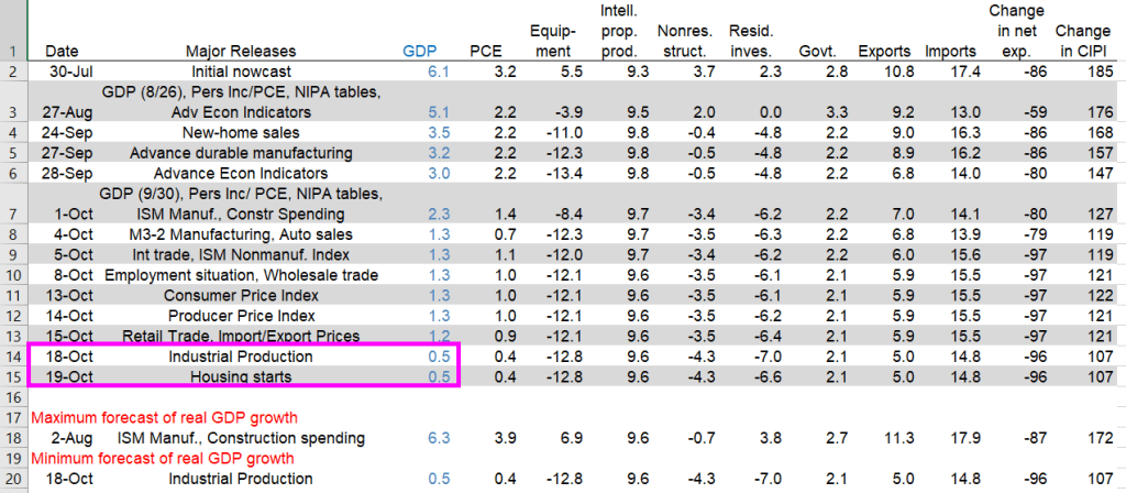
The Atlanta Fed’s GDPNow model estimate for real GDP growth (seasonally adjusted annual rate) in the third quarter of 2021 is 0.5percent on October 19, down from 1.2 percent on October 15. After recent releases from the US Census Bureau and the Federal Reserve Board of Governors, the nowcasts of third-quarter real personal consumption expenditures growth and third-quarter real gross private domestic investment growth decreased from 0.9 percent and 10.6 percent, respectively, to 0.4 percent and 8.4 percent, respectively.
US real GDP nosedived to 0.5% according to the Atlanta Fed GDPNow real-time tracker.
Again, The Fed and Federal government pumped trillions of stimulus into an unprepared economy resulting in massive bottlenecks. So, we are getting declining GDP and rising inflation.
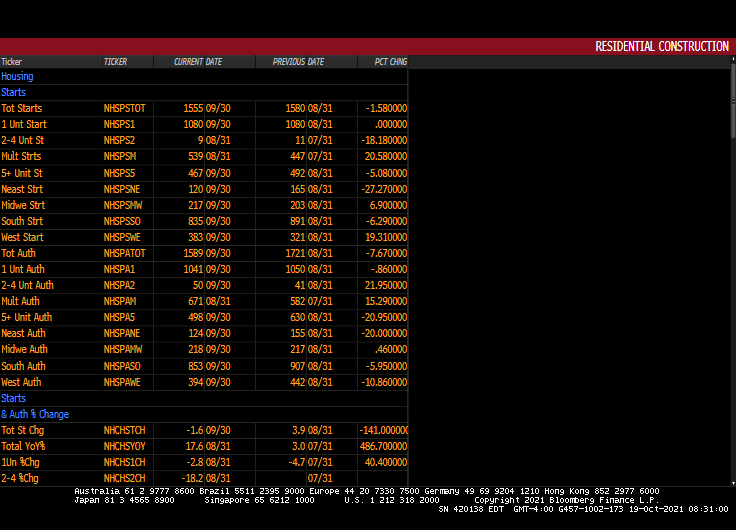
Yesterday’s industrial production dove leading to the 0.5% GDP figure. Today’s housing starts didn’t impact GDP in a meaningful way.



















You must be logged in to post a comment.