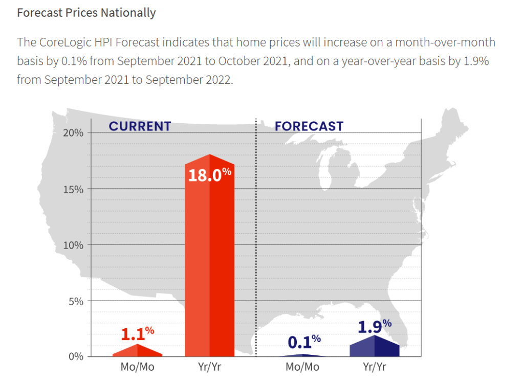
But the forecast for home price growth is for 1.9% YoY in 2022.
As home price growth crashes back to earth as wages don’t keep pace with home prices.
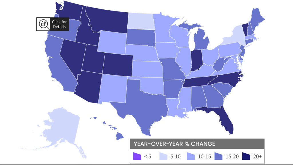
Home prices have been growing in most states out west where The Fed’s money pump has resulted in a boom in second homes and people escaping high tax California and Oregon for Nevada, Idaho, Arizona (again), Utah and Montana. The east coast is seeing the Carolinas booming along with Florida and Indiana. Escape from New York?
Escape from LA … to Arizona, Nevada, Idaho and Utah?
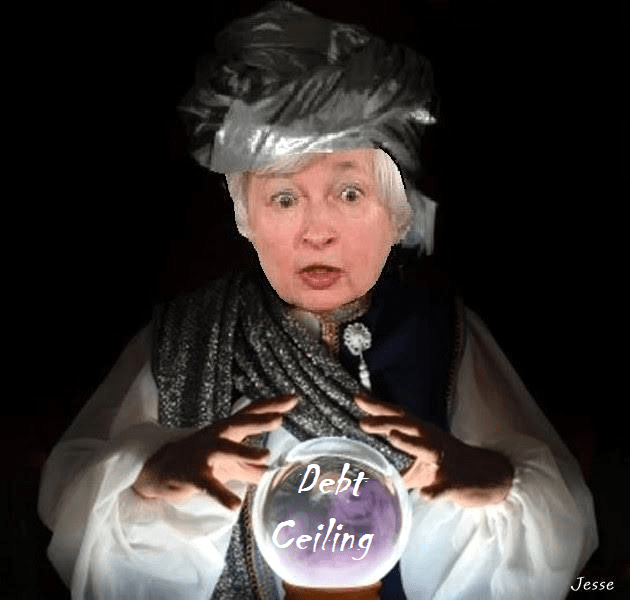
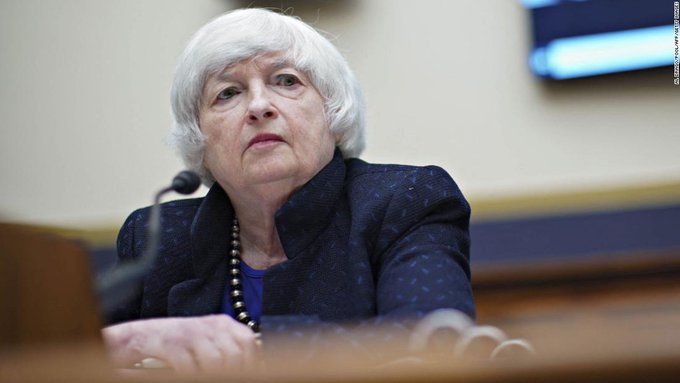
Somewhere over the Alps, T-Sec Janet Yellen is fearmongering over a possible US debt default if Republicans don’t kowtow to Democrat’s desires to raise the debt ceiling.
(Washington ComPost) — SOMEWHERE OVER THE ALPS — Treasury Secretary Janet Yellen on Sunday said Democrats should be willing to approve a fix to the nation’s debt ceiling without GOP support if necessary, an approach senior Democrats ruled out during arecent standoff over the issue.
In an interview aboard a government airplane between Rome and Dublin, Yellen castigated Republicans for refusing to help raise the debt limit but acknowledged Democrats may be able to address the issue without GOP support through the Senate budget procedure known as reconciliation.
Senior Democratic leaders were adamant that the debt ceiling be resolved on a bipartisan basis last month. Senate Republicans have uniformly insisted that Democrats should alone be responsible for raising the nation’s debt limit. Congress probably will face a deadline of Dec. 3 to act, though the exact date is uncertain.
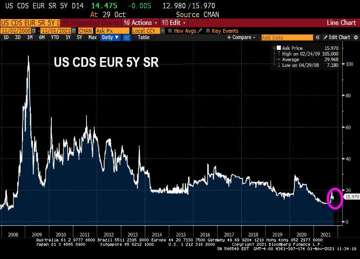
Well, Janet, the market (Credit Default Swaps for US) doesn’t seem to be worried about raising the debt ceiling.
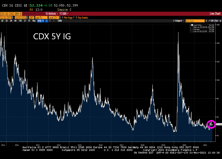
Likewise, the CDX 5Y IG for the US investment grade corporate bonds is near historic lows. Even Yellen can’t make that rise.
Only a career academic and politico Bambina like Janet Yellen would try to drum up agita about a US debt default when Democrats can cram down most anything through “budget reconciliation.”
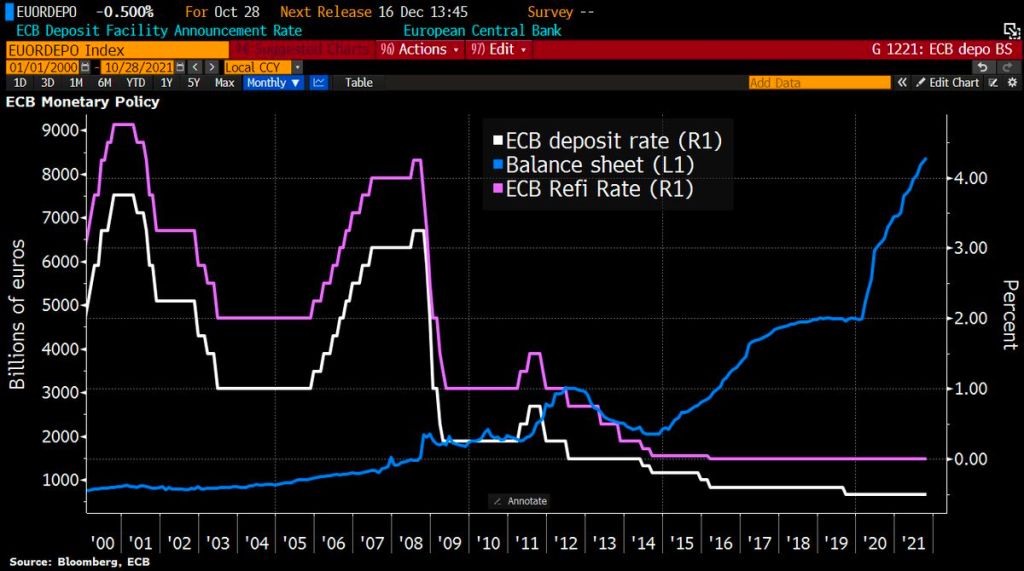
With central banks around the world signalling tighter policy amid rising prices, Lagarde said the ECB had done much “soul-searching” over its stance but concluded that inflation was still temporary, so a policy response would be premature.
Soul-searching? The ECB is just doing what Powell and the Fed (aka, Jerome Jett and the Blackhearts) are doing. Keeping the foot on the monetary gas pedal in the face of inflation.
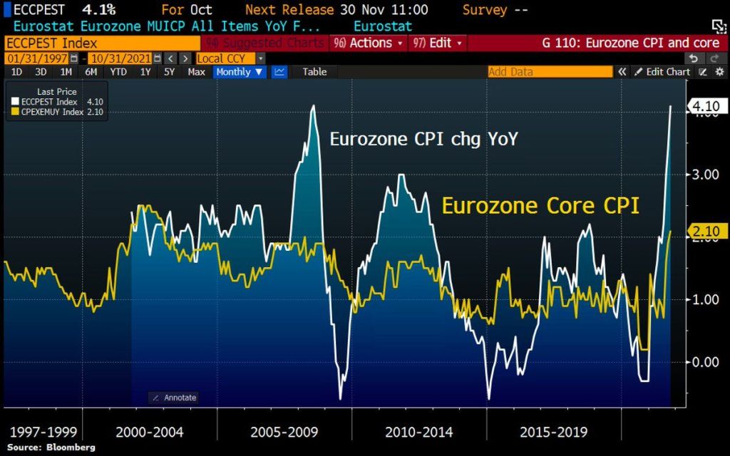
Let’s start Eurozone inflation. It is now sitting a 4.10% YoY. And core inflation is sitting at 2.10% YoY. Inflation is now the highest since 2009 while core inflation is at the highest since 2001.
Like the Federal Reserve, the ECB still has its foot on the monetary accelerator pedal despite booming inflation.
So, Christine, 19 nations in “Europe” having negative 2-year sovereign yields isn’t low enough for you?
The ECB’s platform in Frankfurt reminds me of a bad TV quiz show where participants try to guess prices next year. Call it “The Price Is Wrong.”
Unless, of course, the ECB sees a massive depression ahead.
US pending home sales declined -2.3% MoM and -7.19% YoY as US GDP sinks like a paralyzed falcon,
(Bloomberg) — The National Association of Realtors’ index of pending home sales decreased 2.3% in September from a month earlier to 116.7, largest drop since April, according to data released Thursday.
The median estimate ina Bloomberg survey of economists called for a 0.5% advance.
Compared with a year earlier, contract signings were down 7.2% onan unadjusted basis”
Forecast range from -4.6% to 4.5% from 30 economists surveyed
Signings declined in all four U.S. regions from the prior month, led by a 3.5% drop in the Midwest Unlike existing-home sales, which are calculated when a contract closes, the index of pending home sales is based on contract signings
Treasury Secretary Janet Yellen: “What, me worry?”
Federal Reserve Chair Jerome Powell sounded a note of heightened concern over persistently high inflation as he made clear that the central bank will begin tapering its bond purchases shortly but remain patient on raising interest rates.
“The risks are clearly now to longer and more persistent bottlenecks, and thus to higher inflation,” Powell said Friday during a virtual panel discussion hosted by the South African Reserve Bank and moderated by Bloomberg’s Francine Lacqua.
“I would say our policy is well-positioned to manage a range of plausible outcomes,” he said. “I do think it’s time to taper and I don’t think it’s time to raise rates.”
Good luck with that, Jay! You are going to raise the short-end of the yield that will lead to a flattening of the Treasury yield curve. But you are going to continue to buy Treasuries and Agency MBS in order to monetize the rampant spending by Congress and the Biden Administration? C’mon man!
You can see where Powell spoke today. It is when gold tanked along with the 10-year Treasury yield. Both rebounded a bit, but the 10-year Treasury yield continue its fall to 1.6324%.
The US dollar (green) fell when Powell opened his pie-hole. But Bitcoin (blue) fell in advance as if they knew what Powell was going to say.
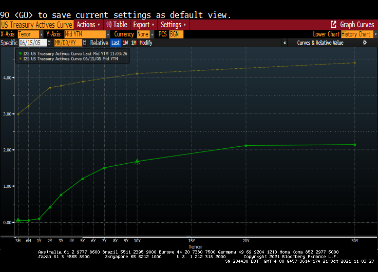
I remember my academic colleague at The Ohio State University (now at Notre Dame), Paul Schultz saying “Why do you find fixed-income and the yield curve interesting?” I have always found the yield curve to be interesting … at least until The Federal Reserve hammered down the short-end with it zero-interest rate policy (ZIRP) and tried manipulating the 10-year Treasury Note yield through Quantitative Easing (QE) meaning The Fed’s purchase of Treasuries and Agency Mortgage-backed Securities (MBS). No, I still think the manipulated yield curve is interesting.
Here is today’s Treasury actives curve (green) versus the yield curve at the peak of the previous housing bubble in 2005 yellow). That is a 300 basis point shift as the short-end. And a 243 basis point shift for the 10-year Treasury Note.
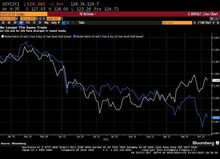
(Bloomberg) — The yield curve is one of the most-powerful forces in the observable financial universe. While much of the price action that we see on a day-to-day basis may be driven by some sort of dark energy, the curve provides a highly visible lodestone indicating the state of policy settings and the likely trajectory of the economy. That being said, the curve is often misunderstood — a bear flattening often produces plenty of hand-wringing, when it’s the bull steepening that you should really worry about. In fact, referring to “the curve” itself is something of a misnomer — while different iterations of the yield curve often travel in tandem, sometimes their paths diverge. That has been the case recently, though perhaps not for much longer. The recent rise in two-year yields looks more than justified, as various fixed income models demonstrate in a roundabout way.
For the past year and a half or so, most of the focus on the yield curve in this column has been on the 5s-30s iteration. The rationale for this has been relatively straightforward: With the Fed funds rate locked in near zero for the foreseeable future, the two-year note has been moribund. As such, 2s-10s has really just been another articulation of the 10-year yield. And much like recent price action vis-a-vis my 10-year model, the curve briefly traded where it “ought” to in March before once again becoming too flat in recent months.
At least 5s-30s has had the benefit of containing a useful forward-looking component on both legs of the spread. Yet even as I type that, it is interesting to note that 2s-10s and 5s-30s exhibited virtually identical price action at virtually identical levels earlier this year. While they remain positively correlated, of course, a clear wedge has emerged between the two curves as five-year yields have broken decisively through 1%, pricing greater conviction that a monetary tightening cycle will fully emerge over the next half-decade.
Yet I am left to wonder about the two-year note. The eurodollar strip is pricing that the bulk of monetary tightening will come by the end of 2023, a period that’s now largely captured by the shortest-maturity coupon security. To be sure, the appropriate level for 2s is a function not only of the ultimate magnitude of monetary tightening, but when it begins. After all, a 150 bp hike in Q4 of 2023 carries very different implications for the current two-year note than a 25 bp rate rise every three months from Q3 of next year onwards.
It occurred to me that I could back out a model for two-year yields by simply subtracting the output of my yield curve model from that of the 10-year model. I had no real idea of what to expect from this exercise, but even with the proviso that short-end yields rarely stray too far from the policy rate, I was pleasantly surprised at how close the fit is from this “derivative” model for the two-year.
The question then arose, naturally, of what actually went into the calculation of this “model.” After all, knowing the formulae of the two constituent models — for the 10-year and the yield curve– should allow for the distillation of a separate equation for the two-year note. Because that sort of thing is more fun than unpacking more boxes, that’s how I spent a few minutes on Wednesday night. The outcome isn’t necessarily an optimal model for the two-year, but more of an accidental one.
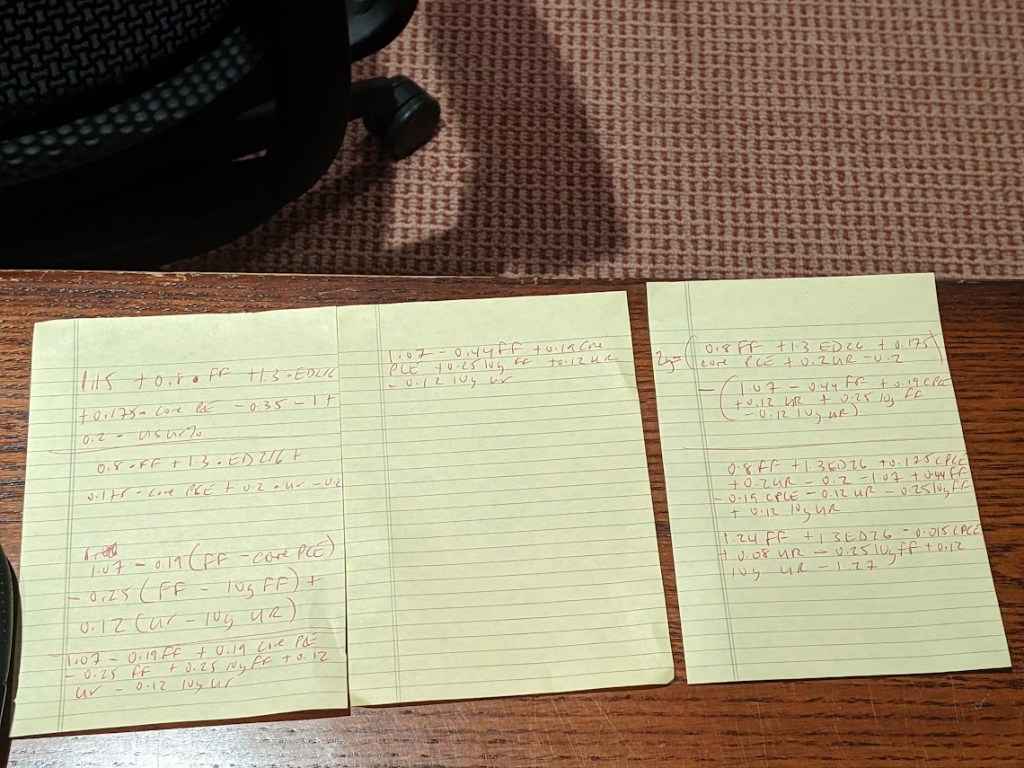
A bit of high school algebra
For what it’s worth, the resultant formula is 2y = 1.24 * FDTR + 1.3 * (ED2 – ED6) -0.015 PCE CYOY + 0.08 * USURTOT – 0.25 * (10y average of FDTR) + 0.12 * (10y average of USURTOT) – 1.27. I am pretty sure that one could get similar results with a simpler framework; the notion that a 2% rise in core inflation is worth just 3 bps on the two-year yield, all else being equal, leaves me simultaneously amused and bemused.
What does seem evident, however, is that henceforth there is going to be considerably more signal generated from two-year yields than has been the case in recent quarters. As such, 2s-10s are going to be worth following again, just as much if not more than 5s-30s. Both nominal yields and the curves are clearly constrained by the notion that all of this inflation kerfuffle really is transitory at its heart, and that, with r* remaining in the gutter, the long-run lid on nominal policy rates is going to be extraordinarily low.
That’s probably as good a null hypothesis as any, and possibly better than most. That being said, if we’re still having a lot of the same inflation conversations a year from now, we’re gonna need a long hard think about whether some of the post-GFC lessons need to be unlearned. In the meantime, at least fixed income is interesting again. I wonder where the yield curve and the model will eventually meet up to shake hands again… -Cameron Crise
The yield curve will become more interesting if Powell and The Gang take their foot off the monetary accelerator pedal.
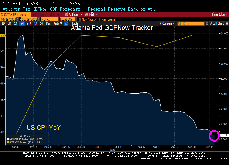
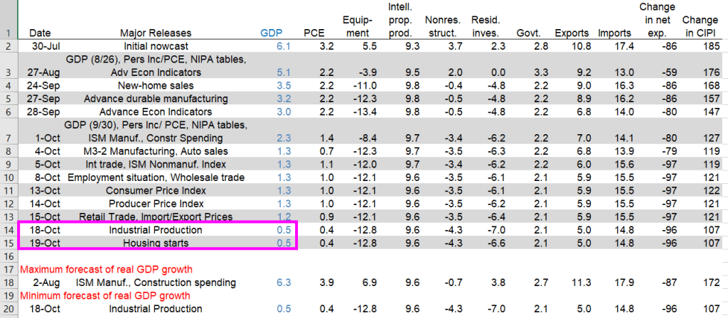
The Atlanta Fed’s GDPNow model estimate for real GDP growth (seasonally adjusted annual rate) in the third quarter of 2021 is 0.5percent on October 19, down from 1.2 percent on October 15. After recent releases from the US Census Bureau and the Federal Reserve Board of Governors, the nowcasts of third-quarter real personal consumption expenditures growth and third-quarter real gross private domestic investment growth decreased from 0.9 percent and 10.6 percent, respectively, to 0.4 percent and 8.4 percent, respectively.
US real GDP nosedived to 0.5% according to the Atlanta Fed GDPNow real-time tracker.
Again, The Fed and Federal government pumped trillions of stimulus into an unprepared economy resulting in massive bottlenecks. So, we are getting declining GDP and rising inflation.
Yesterday’s industrial production dove leading to the 0.5% GDP figure. Today’s housing starts didn’t impact GDP in a meaningful way.
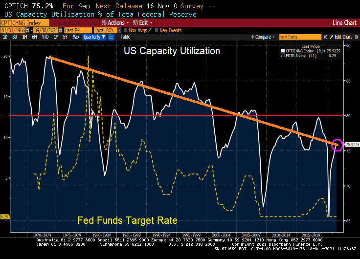
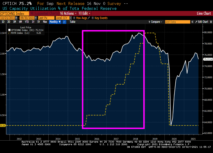
It used to be that capacity utilization was a signal for The Federal Reserve to raise or lower their key target rate. When capacity utilization rose above 80%, the economy was deemed to getting “hot” and The Fed would raise rates. And vice-versa.
But then mass outsourcing occurred, primarily to China and southeast Asia. Since the 1970s, the general trend in US capacity utilization has been downward. But the last time the US saw capacity utilization of above 80% in Q4 2007. Capacity utilization almost hit 80% in August 2018
Oddly, The Fed started raising their target rate in 2015 under Fed Chair Janet Yellen AS CAPACITY UTILIZATION WAS FALLING. Capacity utilization hit almost 80% as The Fed put the brakes on rate hikes before Covid struck.
So, capacity utilization was obviously not on the mind of Yellen and the FOMC. Call it the new abnormal.
With capacity utilization falling, the path of Fed policy rate has shifted sharply over the past couple of weeks, to currently pricing first hike into the September 2022 FOMC meeting and second hike by February 2023 — there are now 100bp of rate hikes priced by the end of 2023, in line with the Fed’s dot-plot forecast.
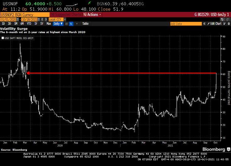
Short-dated volatility on front-end U.S. rates — known as the upper left corner of the volatility surface — continues to catch a bid over the U.S. morning session, spurred by a sharp hawkish re-pricing of the Fed’s policy stance.
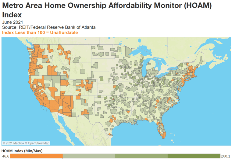
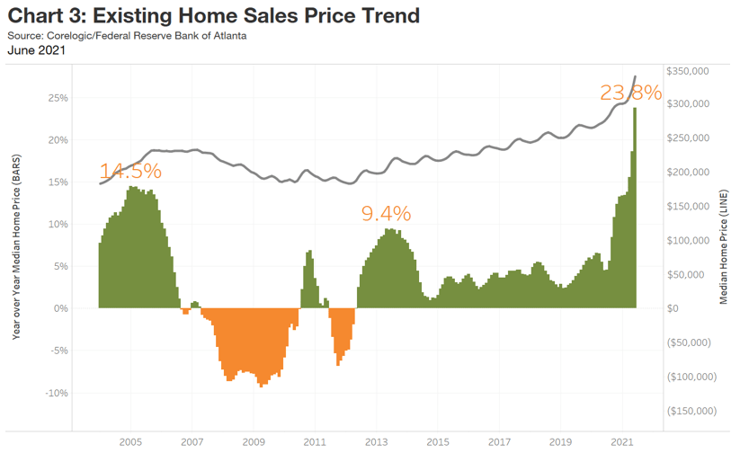
The national HOAM index stood at 92.2 in June, its lowest level since 2008.
National housing affordability fell 11.9 percent in June, the sharpest drop since 2014.
Home sale prices were up 23.8 percent over the past year.
On average, a median-income household would need to spend 32.6 percent of its annual earnings to own a median-priced home.
Although demand for housing remains strong, steadily declining affordability is beginning to affect buying decisions.
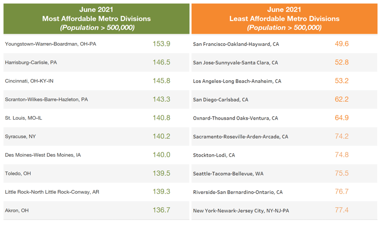
The latest reading of an Atlanta Fed measure and US housing trends show home ownership is becoming out of reach for many buyers and resistance to higher prices is building. More than 80 percent of US metro areas had a drop in affordability.
Where is housing most and least affordable?
ddd
Of course, the one chart that The Fed never includes is home price growth and Fed monetary policy.
So, if The Fed is so concerned with median-income households being priced out of housing markets, why are the still sticking with their unorthodox monetary policies?
Phil Hall of Benzinga wrote a series of excellent articles in four parts for MortgageOrb (although “The Orb” has removed his name). Here are the links to his stories.
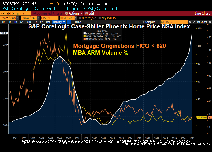
After re-reading these excellent articles on the housing bubble and crash, I thought I would take the opportunity to present a few charts to highlight the housing bubble, pre-crash and post-crash.
Here is a graph of Phoenix AZ home prices. Note the bubble that peaked in mid 2006. The Phoenix bubble correlates with the large volume of sub-620 FICO lending and Adjustable-rate mortgage (ARM) lending. Bear in mind, many of the ARMs prior to 2010 were NINJA (no income, no job) ARM loans.
What happened? Serious delinquenices at the national levels spiked as The Great Recession set in and unemployment spiked.
Since the housing bubble burst and surge in serious mortgage delinquencies, The Federal Reserve entered the economy with a vengeance. And have never left, and increased their drowning of markets with liquidity.
The Fed whip-sawing of interest rates in response to the 2001 recession was certainly a problem. They dropped The Fed Funds Target rate like a rock, then homebuilding went wild nationally and home prices soared thanks to Alt-A (NINJA) and ARM lending. But now The Fed is dominating markets like a gigantic T-Rex.
Oddly, then Fed Chair Ben Bernanke never saw the bubble coming. Or the burst.
Speaking of pizza, Donato’s from Columbus Ohio is my favorite. Founder’s Favorite is my favorite, but they do offer the dreaded Hawaiian pizza (ham, pineapple, almonds and … cinnamon?)


You must be logged in to post a comment.