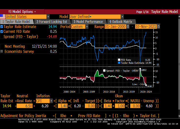
How insanely overstimulated in the US economy by The Federal Reserve? Today’s red-hot inflation report of 6.2% YoY implies a Fed Funds Target rate of … 14.94%!! According to the Taylor Rule model, The Fed Funds Target rate should be almost 15%.
If we use CORE inflation (that is, CPI less food and energy), The Fed’s Target rate should be “only” 11.10%.
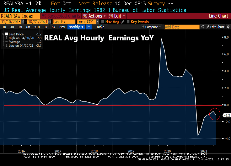
I feel like I am watching re-runs of Gilligan’s Island with Biden as the Skipper and Powell as Gilligan. Thurston Howell III and his wife lovey are the US Congress and Janet Yellen is the Professor. Case in point? REAL average hourly earnings YoY fell to -1.2% under the Gilligan’s Island leadership in DC.
Biden Starts To Freak Out About Soaring Inflation, Orders Economic Council To “Reduce Energy Costs”
Now that President Biden is interviewing Lael Brainard for Federal Reserve Chair, I am really getting a peaceless, uneasy feeling that The Fed will NEVER raise rates and inflation will be perpetual. To whit, …
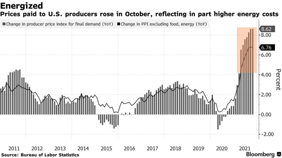
Prices paid to U.S. producers accelerated in October, largely due to higher goods costs, fueling concerns about the persistence of inflationary pressures in the economy.
The producer price index for final demand increased 0.6% from the prior month and 8.6% from a year earlier, matching forecasts, Labor Department data showed Tuesday. The annual advance was the largest in figures back to 2010.
Excluding the volatile food and energy components, the so-called core PPI rose 0.4% and was up 6.8% from a year ago.
More than 60% of the headline increase was due to goods, which jumped 1.2%. Higher energy costs, including that for gasoline, drove the gain. The cost of services rose a more moderate 0.2% for a second month, reflecting a further pullback in the cost of securities brokerages and investment advice.
The report underscores how transportation bottlenecks, materials shortages and increasing labor costs have sent prices soaring across the economy in recent months. Trucking freight costs jumped a record 2.5% from September.
Inflation is a tax created by printing too much money and stupid Federal economic policies (or follicies).
Lael Brainard? Discussing the chairmanship with Brainard could signify that the Biden team is weighing how a break with Powell might help advance their goals for the central bank. Brainard and Powell work closely together on multiple issues and are viewed as holding similar views on monetary policy, but she’s favored a tougher stance on big banks.
Remember, The Federal Reserve is a privately-owned entity independent of The Federal Government. A Brainard appointment would make The Fed the financing arm of the Democrat Party.
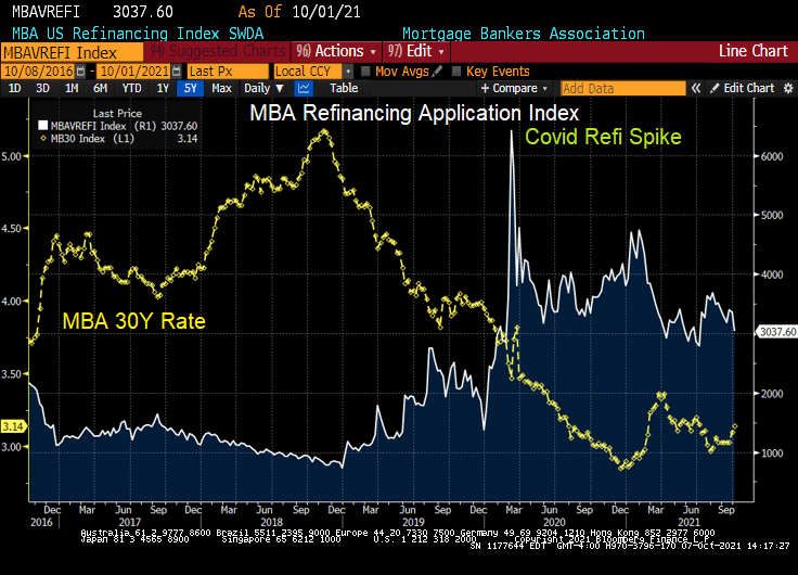
With The Federal Reserve leaving its target rate at 0.25%, but hinting at a tapering (slowdown) of asset purchases, I thought it would be good to present where The Fed sits at the moment.
You can see the rise in the effective Fed Funds rate from 2016 to early 2020, then KABOOM! COVID struck, the effective Fed Funds rate crashed while The Fed dramatically increased their purchases of Treasuries and Agency MBS. Both Treasury and Agency MBS purchases are projected to decline by mid-2022. The Fed’s target rate (purple line) is project to rise to 1% after 2023.
Where SHOULD The Fed Funds Target rate be? How about 8.80% instead of 0.25%.
So we still have over-stimulypto with The Fed projected to raise rates at a snail’s pace.
Face it, Wall Street wants interest rates low, even if inflation burns out of control.
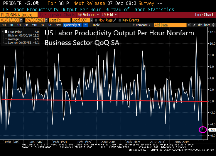
The last time we saw US labor productivity out per hour this low was in 1981 when President Reagan inherited stagflation from President Jimmy Carter.
As unit labor costs soar +8.3%.
Any wonder that the 1% have been doing so well relative to the bottom 50% in terms of wealth since entrance of The Fed in 2008 with zero-interest rate policies (ZIRP) and assets purchases (QE). And also after Covid struck.
“That will be $10,000 for your Big Mac, fries and a soda, please!”
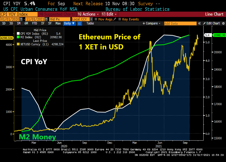
Ethererum, the cryptocurrency, is now at $4,298. It under $200 as the Covid crisis took shape in March 2020. Since Covid, The Federal Reserve went loco and massively increased their money supply and asset purchases. With that response (and economic bottlenecks), inflation has increased to 5.4% YoY.
The Fed’s new moto should be “Policy errors ARE our business!”
No, we don’t look to President Beavis to do much of anything positive about inflation.
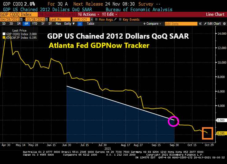
Despite the staggering and unorthodox monetary stimulus from The Federal Reserve, US real GDP continues to fall. The Q3 real GDP report is out and real GDP QoQ fell to 2%. Not surprising given that the Atlanta Fed’s GDPNow tracker is at a dismal 0.195% and falling.
The culprit? Personal consumption fell to 1.6% in Q3 after hitting 12% in Q2.
The GDP price index actually declined slightly from 6.1% to 5.7%.
Of course, Bloomberg blames the decline in GDP on supply constraints … which were created by The Fed and Federal government dumping trillions of dollars of stimulus. While the monetary stimulus is still raging, Federal government stimulus has worn out. To paraphrase BB King, “The fiscal stimulus is gone.”
Yes, The Federal Reserve and the Federal government reacted insanely to the Covid crisis and created a total mess (including ill-advised government lockdowns of the economy, stimulus to households who already were employed, etc.)
Bloomberg News headline of “U.S. Posts Weakest Growth of Pandemic Recovery on Supply Woes” misses the point that The Fed and Federal Reserve CAUSED the supply woes. It reminds me of an episode from the British comedy series “Blackadder” with Rowan Atkinson, Hugh Laurie and Stephen Fry.
General Melchett: [explaining why they can’t rescue Captain Blackadder] Now George, you remember when I came down to visit you when you were a nipper, for your sixth birthday? You used to have a lovely little rabbit, beautiful little thing, do you remember?
Lieutenant George: Flossie.
General Melchett: That’s right, Flossie! Do you remember what happened to Flossie?
Lieutenant George: You shot him.
General Melchett: That’s right! It was the kindest thing to do after he’d been run over by that car.
Lieutenant George: By *your* car, sir.
General Melchett: Yes, by my car. But that, too, was an act of mercy when you remember that that dog had been set on him.
Lieutenant George: *Your* dog, sir.
General Melchett: Yes, yes, my dog. But what I’m trying to say, George, is that the state young Flossie was in after we’d scraped him off my front tyre, is very much the state that young Blackadder will be in now: if not very nearly dead, then very actually dead!
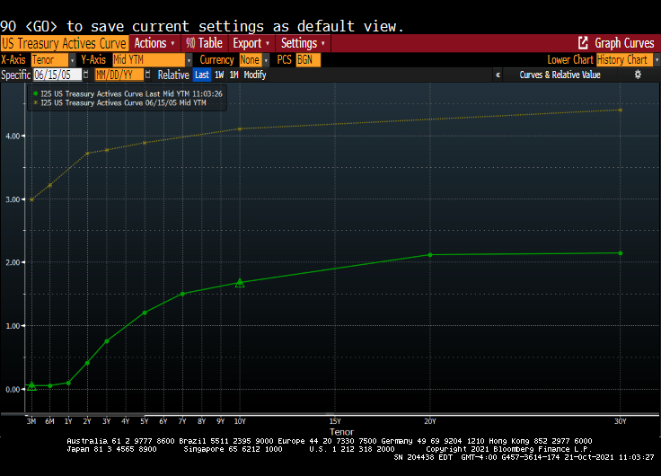
I remember my academic colleague at The Ohio State University (now at Notre Dame), Paul Schultz saying “Why do you find fixed-income and the yield curve interesting?” I have always found the yield curve to be interesting … at least until The Federal Reserve hammered down the short-end with it zero-interest rate policy (ZIRP) and tried manipulating the 10-year Treasury Note yield through Quantitative Easing (QE) meaning The Fed’s purchase of Treasuries and Agency Mortgage-backed Securities (MBS). No, I still think the manipulated yield curve is interesting.
Here is today’s Treasury actives curve (green) versus the yield curve at the peak of the previous housing bubble in 2005 yellow). That is a 300 basis point shift as the short-end. And a 243 basis point shift for the 10-year Treasury Note.
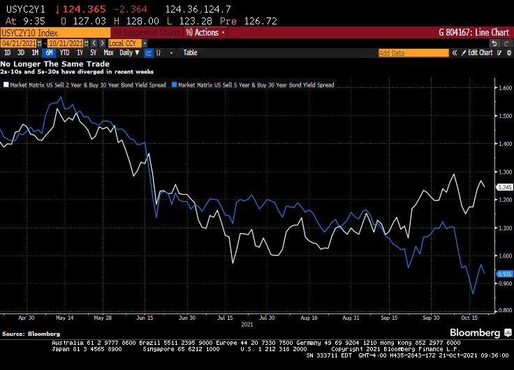
(Bloomberg) — The yield curve is one of the most-powerful forces in the observable financial universe. While much of the price action that we see on a day-to-day basis may be driven by some sort of dark energy, the curve provides a highly visible lodestone indicating the state of policy settings and the likely trajectory of the economy. That being said, the curve is often misunderstood — a bear flattening often produces plenty of hand-wringing, when it’s the bull steepening that you should really worry about. In fact, referring to “the curve” itself is something of a misnomer — while different iterations of the yield curve often travel in tandem, sometimes their paths diverge. That has been the case recently, though perhaps not for much longer. The recent rise in two-year yields looks more than justified, as various fixed income models demonstrate in a roundabout way.
For the past year and a half or so, most of the focus on the yield curve in this column has been on the 5s-30s iteration. The rationale for this has been relatively straightforward: With the Fed funds rate locked in near zero for the foreseeable future, the two-year note has been moribund. As such, 2s-10s has really just been another articulation of the 10-year yield. And much like recent price action vis-a-vis my 10-year model, the curve briefly traded where it “ought” to in March before once again becoming too flat in recent months.
At least 5s-30s has had the benefit of containing a useful forward-looking component on both legs of the spread. Yet even as I type that, it is interesting to note that 2s-10s and 5s-30s exhibited virtually identical price action at virtually identical levels earlier this year. While they remain positively correlated, of course, a clear wedge has emerged between the two curves as five-year yields have broken decisively through 1%, pricing greater conviction that a monetary tightening cycle will fully emerge over the next half-decade.
Yet I am left to wonder about the two-year note. The eurodollar strip is pricing that the bulk of monetary tightening will come by the end of 2023, a period that’s now largely captured by the shortest-maturity coupon security. To be sure, the appropriate level for 2s is a function not only of the ultimate magnitude of monetary tightening, but when it begins. After all, a 150 bp hike in Q4 of 2023 carries very different implications for the current two-year note than a 25 bp rate rise every three months from Q3 of next year onwards.
It occurred to me that I could back out a model for two-year yields by simply subtracting the output of my yield curve model from that of the 10-year model. I had no real idea of what to expect from this exercise, but even with the proviso that short-end yields rarely stray too far from the policy rate, I was pleasantly surprised at how close the fit is from this “derivative” model for the two-year.
The question then arose, naturally, of what actually went into the calculation of this “model.” After all, knowing the formulae of the two constituent models — for the 10-year and the yield curve– should allow for the distillation of a separate equation for the two-year note. Because that sort of thing is more fun than unpacking more boxes, that’s how I spent a few minutes on Wednesday night. The outcome isn’t necessarily an optimal model for the two-year, but more of an accidental one.
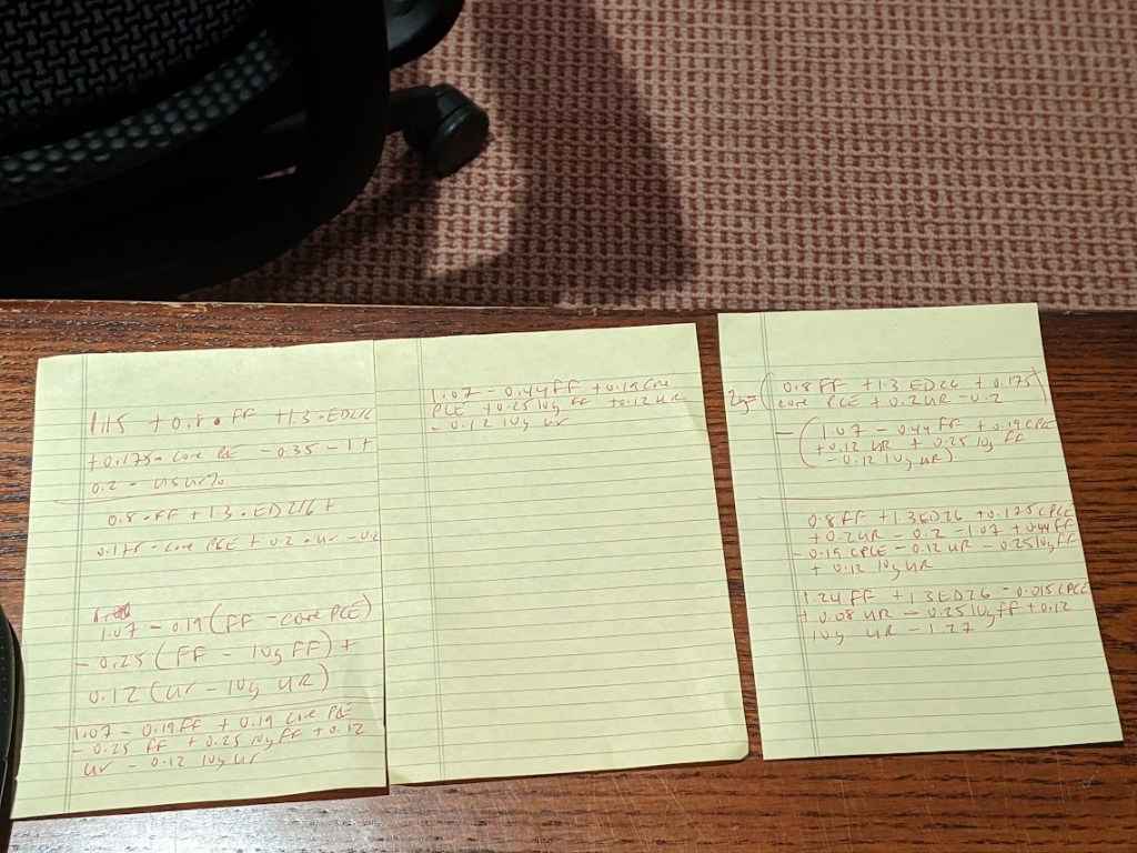
A bit of high school algebra
For what it’s worth, the resultant formula is 2y = 1.24 * FDTR + 1.3 * (ED2 – ED6) -0.015 PCE CYOY + 0.08 * USURTOT – 0.25 * (10y average of FDTR) + 0.12 * (10y average of USURTOT) – 1.27. I am pretty sure that one could get similar results with a simpler framework; the notion that a 2% rise in core inflation is worth just 3 bps on the two-year yield, all else being equal, leaves me simultaneously amused and bemused.
What does seem evident, however, is that henceforth there is going to be considerably more signal generated from two-year yields than has been the case in recent quarters. As such, 2s-10s are going to be worth following again, just as much if not more than 5s-30s. Both nominal yields and the curves are clearly constrained by the notion that all of this inflation kerfuffle really is transitory at its heart, and that, with r* remaining in the gutter, the long-run lid on nominal policy rates is going to be extraordinarily low.
That’s probably as good a null hypothesis as any, and possibly better than most. That being said, if we’re still having a lot of the same inflation conversations a year from now, we’re gonna need a long hard think about whether some of the post-GFC lessons need to be unlearned. In the meantime, at least fixed income is interesting again. I wonder where the yield curve and the model will eventually meet up to shake hands again… -Cameron Crise
The yield curve will become more interesting if Powell and The Gang take their foot off the monetary accelerator pedal.
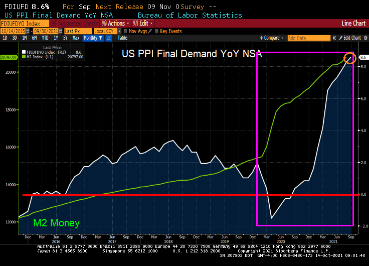
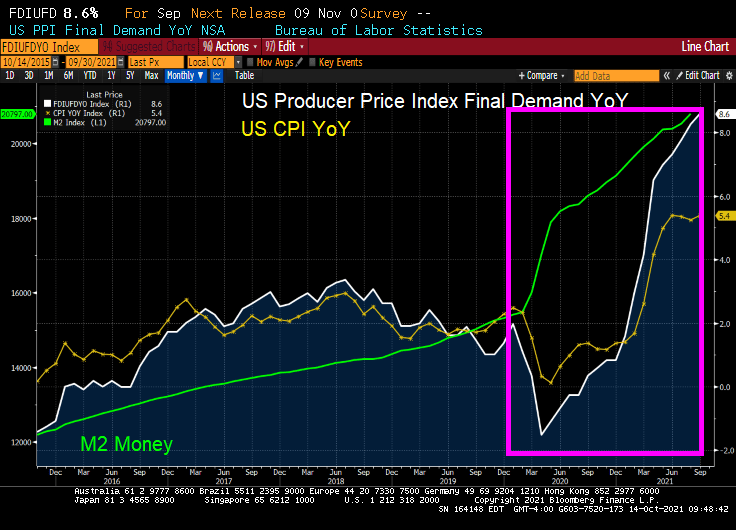
The US Producer Price index (Final Demand) rose to a blistering rate of 8.6% YoY.
Will this translate to higher consumer prices? Of course it will.
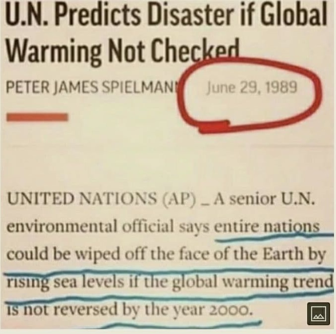
When The Fed or the Biden Administration says that inflation is transitory and will be fixed once we unclog the shipping pipes, remember this warning from the UN that global warming will wipe out entire nations if not reversed by 2000. So, it is too late! I am buying a gas-guzzling Cadillac Escalade with a monster V-8 engine!! (Not really, I am more of a Ford kind of person).
It was great to be a “Master of the Universe” (Treasury and MBS trader) since October 1981 when the US 10Y Treasury yield peaked at 15.84% and mortgage rates peaked at 18.63%. Treasury and mortgage rates have generally fallen ever since. But what happens if Treasury and mortgage rates rise?
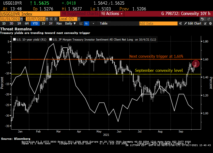
Bond investors are piling back into short positions, motivated not only by the specter of inflation but also by the risk that yields are approaching levels that will unleash a wave of new selling by convexity hedgers.
That level is around 1.60% in the U.S. 10-year Treasury yield, less than 10 basis points from its current mark, according to Brean Capital’s head of fixed income strategy, Scott Buchta. It’s the mid-point of “a key threshold” between 1.40% to 1.80%, an area “most critical from a convexity hedging point of view.”
Convexity hedging involves shedding U.S. interest-rate risk to protect the value of mortgage-backed securities as yields rise, slowing expected prepayment rates.
It’s already begun to pick up as yields stretched past the 1.40% level. Another wave is expected at around 1.6% — a point of “maximum negative convexity” in agency MBS, “where 25bp rallies and sell-offs should have an equal effect on convexity-related buying and selling,” Buchta says.
Signs that short positions are accumulating include Societe Generale’s “Trend Indicator.” Among its 10 newest trades are short positions in Japanese 10-year debt, German 5-year debt futures, U.K. 10-year gilts, U.K. short sterling and U.S. 2- and 5-year notes. Meanwhile, CFTC positioning data for U.S. Treasury futures show asset managers flipped to net short in 10-year note contracts in the process of dumping the equivalent of $23 million per basis point of cash Treasuries over the past week. Hedge-fund shorts also remain elevated in the long-end of the curve, as measured by net positions in Bond and Ultra Bond futures.
“Bond-bearish impulses remain in place,” says Citigroup Inc. strategist Bill O’Donnell in a note, citing tactical and medium-term set-ups. Traders should be aware of short-covering rallies in the meantime, however, he says.
“Potentially extreme short-term positioning and sentiment set-ups could easily allow for a counter-trend correction under the right conditions,” he said.
U.S. 10-year yields topped at 1.57% this week, the cheapest level since June, spurring the breakeven inflation rate for 10-year TIPS to 2.51%, the highest since May. Friday’s September jobs report could add fuel to this inflationary fire, rewarding bond shorts.
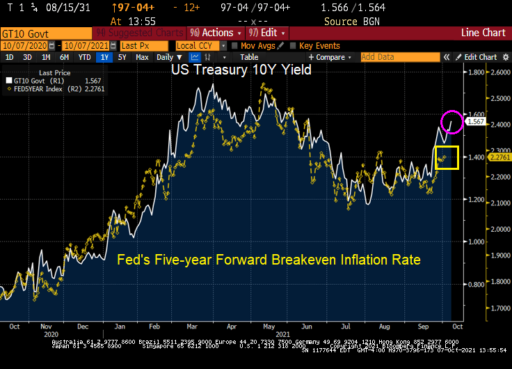
Here is a chart of the rising 10Y Treasury yield against The Fed’s 5Y forward breakeven rate.
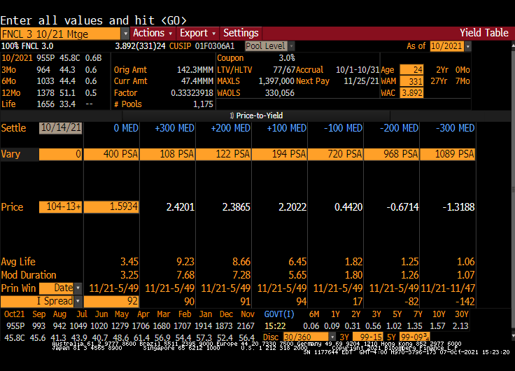
Here is a Fannie Mae 3% coupon MBS. Note the rise in Modified Duration with an increase in interest rates.


You must be logged in to post a comment.